Play game
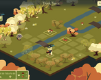
Forest Time's itch.io pageResults
| Criteria | Rank | Score* | Raw Score |
| Sound/Audio | #1 | 4.571 | 4.571 |
| User Interface (UI/UX) | #1 | 4.143 | 4.143 |
| Visuals(Graphics) | #1 | 4.857 | 4.857 |
| Overall | #3 | 3.857 | 3.857 |
| Fun | #9 | 3.143 | 3.143 |
Ranked from 7 ratings. Score is adjusted from raw score by the median number of ratings per game in the jam.
DevLog Link
https://wandering-peak.itch.io/forest-farming/devlog/709771/update-4-levels-reworked
Developer Feedback Questions
Would it be more interesting to see additional characters or more challenges with existing characters?
Leave a comment
Log in with itch.io to leave a comment.


Comments
I didn't play this game on the Feedback Quest jam but I'm glad I tried it this time. It's not exactly my kind of game but I have to admit it's super cute and has a warm and relaxing atmosphere.
I managed to finish all the levels. I agree with GamePasta that it feel a bit too much like a tutorial with new mechanics introduced too often. I feel like you already have enough mechanics and variety to triple the number of levels. If you make new characters / mechanics, they should probably only appear much further down the line.
Great work, especially on the art style :)
Really charming game and overall fantastic job! The visuals are great and the music fits perfectly. For the specific question you asked, I lean towards saying more challenges with existing characters because for the most part, only characters like the forager really shake up the gameplay is a meaningful way. Whereas new challenges/maps are always a fresh addition. An additional note I would say is that the flags outside of the houses are fairly small, I think a better way to show clan houses would be to change the color of the roof so it is more immediately noticeable. I would also add a unique icon or appearance as well just to help with any color blind people.
I really like this one! If there where more levels I would have continued playing. I think with all the character in the game you have enough to build very challanging levels. So my preference would be to add more levels instead of new mechanics. Maybe you could think about letting the player choose the difficulty: tutorial (basically what you have right now, but a bit easier), easy, medium, hard, ...
Another Idea could be to create a random level generator that can create levels of different difficulty ... than you would not have to create them all by hand. But I am not sure how realistic that is...
Thank you for your feedback! I’m glad to hear that you completed all the levels! Generating levels could work, actually. The game mechanics are not that complex, but I never did it before, and it’s not in the immediate plans. I also gradually came to the conclusion that I could at least double the number of levels without adding any new mechanics. This would be the next task here.
Nice game, but you don't really feel the gratification of passing a level. Maybe there could be prizes or something, I don't know :S
Visually very striking, the music is good :) The interfaces too.
Excellent work :)
Thank you for playing! Your idea about the prizes is quite interesting. I thought about achievements for passing challenge levels, and we can make them as stickers. We’ll see. And maybe, we can give prizes even without special challenges. After all, solving a puzzle is already a challenge.
Very clean and polished core game!
I stopped playing around the time the farmer(?) was introduced
Thank you for playing!
Interesting suggestions you have here :) You are right that the game needs some juicy animations, but they are not in our immediate plans. We first want to be happy with our set of characters and levels.
I like your idea about indicating when characters pick up resources along the way. However, showing all the routes at the same time and pre-calculating all the events are not things that we aim for. Not knowing how everything will work together is the main challenge of the puzzle. In Forest Farming, you set up individual farming routes and then run the simulation to see the result.
We can, however, indicate if each individual route makes sense, and this is a good point.
Cute and challenging game. The visuals are perfect! There is obviously a lot of polish put into the graphics, characters, sound and animations making the game feel very professional.
I think the game could be improved if mechanics were not introduced so often. It felt like there was a tutorial on every level. Progression would feel smoother if a mechanic was introduced and then the player had a chance to play with it for a couple of levels before adding a new one. And then add some levels mixing the mechanics.
I also though the human characters preset path made the puzzles feel like trial and error. It would be nice to have some indication on how to solve the puzzle without having to play it through first.
A couple of minor UI/UX improvements: When retrying just reset the path by default. Having to undo the moves seemed like a needless step. Clicking Done and then play also felt like a pointless extra click for the player. Oh and I couldn't find an exit button in any of the menus!
Really great effort! You have a very polished looking game on your hands!
Thank you for your feedback!
I’m glad that you liked the game. The initial levels try to introduce players to the basic concepts. But you are right—they might seem like individual mechanics from the user’s perspective. Afterward, the new characters are mixed in, and it quickly becomes overwhelming. I didn’t think of it before, but now I see that we need levels in between to allow the player to experiment more and see how every piece of the puzzle works.
Your idea about indicating the puzzle result without running the simulation is interesting. However, it contradicts the game’s main idea. In Forest Farming, you plan individual routes for each character without knowing the result, and then you test how they work together and whether everyone gets what they need in the end. I will think about how we can improve ‘build-time’ indications. Thanks for the suggestion!
Good catch with the ‘Exit’ button :) It somehow vanished in the course of development.
Thank you for playing!