On Sale: GamesAssetsToolsTabletopComics
Indie game storeFree gamesFun gamesHorror games
Game developmentAssetsComics
SalesBundles
Jobs
TagsGame Engines

Maui

122
Posts
4
Topics
10
Followers
1
Following
A member registered Aug 07, 2020 · View creator page →

Creator of

Recent community posts

Hello, I enjoyed playing but I didnt get really far. In Dead City, I couldn't survive more than a couple of minutes^^

The zombies instantly charging you in a straight line when they spawn felt too punishing and not very fun : I basically spent the whole time running around like a headless chicken and shooting when I could. But maybe that's the vibe you're going for^^

That being said, I wished they had some kind of idle or wandering state where they still haven't spotted you and you can take your time to aim at them properly.

Also maybe they could stumble on obstacles or at least slow down when they suddenly change direction ?

Like others have mentionned, I would also prefer to have an actual crosshair to aim better. I understand that it's a choice not to have one though. Maybe a slighly bigger hitbox on the bullets to better hit the zombies then ?

Another small nitpick I would have is about the jump. It feels too fast and low. I felt like you should reach a bit higher and stay in the air a bit longer.

Finally, since you asked about how the shooting feels, it's mostly fine but here's a few suggestions :

- You could add a small amount of screenshake (depending on the type of gun) when firing.

- The impact of a bullet on a zombie could be improved, with a more noticeable hit animation and maybe a little more blood ? Also, depending on the gun, they could slow down when hit or maybe even fall to the floor for a second ?


Nice job overall, the game has a decent amount of polish and I like the atmosphere :)

The controls and movements felt a little off and I wish there was a little more to do but the game is gorgeous. I loved the atmosphere and I wished there were more projects like this :)

(1 edit)

So, I did another playthrough with the browser version and I have to admit things made a lot more sense^^

That being said, it felt like there was a bit too much information to be gathered and pieced together. But maybe only fraction of it is necessary to guess the murderer ?

Here's what I found out (spoilers ahead for anyone else reading) :

-The body was dragged in the garden, it seems the murder happened in the study, near the phone ? (there is a pool of blood there)

- I could not make a complete timeline of events but there was an interview with the journalist, then Mr. Hamilton went to have a private discussion with the businessman, then he handed an enveloppe to the butler to deliver to the businessman then I'm not sure. I think he left the house at some point ?

- Basically everyone had a motive to kill him (exept maybe the journalist)

- I'm pretty sure the wife and / or the cook killed him because they both lied or were "confused" about where the wife was when they first heard about the murder. Also, I found a recipe for 'poisoned cake' written by the wife, that feels like a strong clue ^^

Like I said in my first message, I really like the concept. Now I just feel like the amount of information, characters and details to keep track of is a bit overwhelming. I'm not sure how / if it could be simplified though. Having more details during the briefing at the start (the body was discovered at X by Y at Z hours...) would also help a lot.

So I'm mostly of the same opinion of Wandering Peak but I'm honestly curious what other people would make of it.

(1 edit)

I didn't play this game on the Feedback Quest jam but I'm glad I tried it this time. It's not exactly my kind of game but I have to admit it's super cute and has a warm and relaxing atmosphere.

I managed to finish all the levels. I agree with GamePasta that it feel a bit too much like a tutorial with new mechanics introduced too often. I feel like you already have enough mechanics and variety to triple the number of levels. If you make new characters / mechanics, they should probably only appear much further down the line.

Great work, especially on the art style :)

Thanks for the feedback, I'm glad you appreciated the changes :)

I'll probably add a few controls for PC. As for the soundtrack, I definitely plan to add more but I'm waiting to really lock down the core concept of the game before adding the finishing touches (like music, refined UI and improved assets). I might still go for a few placeholder sountracks in the meantime if I find some. Ideally I would have one soundtrack per sector to set a unique tone for each.

Thanks for playing (again) !

(1 edit)

Yes, I'll think I'll do something like hiding the ship or blurring the background to help with readability on the fullscreen map.

Thanks for the feedback and encouragement :)

Thanks for the feedback :)

I'm currently thinking about how to make it more engaging and maybe having something do to mid-flight.

(1 edit)

Here are 2 small examples of what I'm talking about, hopefully it will help you to reproduce the behaviour :

https://www.youtube.com/watch?v=ZYmij3qAh3M

https://www.youtube.com/watch?v=BP4VMGuYJnY

If you're getting very different answers with the same prompts, it could means the response you get from the API you're using is somehow dependent on the client making the request ? I'm just guessing, I have no idea how it works^^

Ah yes, the Cargo thing... I called it Cargo because I wanted it to make more sense (like the ship would actually drop some of it's cargo into space before launching to become lighter) but you're not the first one to mention that it feels bad to lower it because like it might be affecting your score or something (which it's not since there isn't any score right now). I'll probably change the name to "Weight" or "Mass".

As for adding feedback mid flight, I think I could add some notifications like "Warning : collision course detected" or "Collision avoided". But I also don't wanna be too annoying with the notifications... And for interactions I'm not sure, the basic concept was that once you launch you no longer have control and can just relax and watch what happens. I might need to revisit that...

I'm trying to find ways to make the gameplay more engaging while still keeping it a simple mobile game since I also worry that the game might feel too repetitive after playing for several levels.

Anyway, thanks for the feedback, that's very helpful :)

(2 edits)

Ahh, if you wanna make it work for mobile I understand it might be a bit tricky. I imagine the unit's stats would need to be displayed in the "Unlocks" window (so that players know what they are buying) and also in game. It could be just a small "Info" button next to the unit's symbol that open a new small window with stats. I'm honestly not sure about the best way to do it especially if it needs to work on mobile. Something to experiment with... :)

(1 edit)

Thanks for the kind words, I'm glad you liked it :)

About adding keyboard controls, I'll think about it.

I really like the concept of this game. I'm just not sure how well it's working right now.

On a surface level, the AI text seems a bit off at times and characters' stories not entirely consistent. Sometimes, the characters resort to basic langage with words missing like "Me Cook!" or "Wife in kitchen 4 hours ago". I'm guessing it's because of the size of the answer is limited ? Sometimes, the text would literally cut off mid sentence.

Right now, the game feels off because as a player when I get a weird answer, I'm not sure if it's because the AI is not working exactly right or because I caught the character I'm talking to in a lie.

More fundamentally, there is a problem with the information the player gets at the start. I have run through the game many times and I have literally no idea : where the body was found, who found it etc. So the basic stuff I would need to start an investigation... If you try right now and just ask the question "Where was the body found and by whom ?" to every characters, you'll basically get a different answer each time :

    - In the garden maze by the gardener (where you can actually see it as a player, so probably the right answer)

    - Near the old oak tree on the ouskirts of town by some guards

    - The abandonned mansion on the outskirts of town by the caretaker

    - In the ballroom, in the estate of Lord Winston during the midnight masquerade ball

    - In the forest by the ranger

    - In the abandoned warehouse by Detective Smith

EDIT : If you just ask "Who was killed ?" you also get different answers...

If I point out these inconsistencies I get an answer like "There is a twist in this tale" and a convoluted way of reconciling the facts like "Actually the body WAS found there but then moved...". 

So, to be blunt, it feels like every character is making shit up and there is no investigation to be had since there are no facts to start with.


All that being said, I really like the idea and the atmosphere of the game. The presentation (visuals, sound, music) is really good. I would still suggest some minor improvements on that front :

- Adding an in game name tag above the characters' heads, at least once you have first talked to them and they've told you who they are. Since they move around the whole house I would sometime be confused and not know who I was talking to.

- Similarly, I would make the label for each room of the house permanent instead of appearing only for an instant when you first enter

- This is more of a design choice but maybe highlight the interactable objects in some way (like a glow or outline) ? I know some of them are hidden (like the secret key I found in the bedroom) but it could be nice for the more obvious ones like the piano or simply the doors.

- Can the characters please stay in place instead of wandering about when I'm talking to them ? It's very rude xD


In summary, I really like the concept and wish it worked better. If you can make the story more consistent and present to the player basic hard facts about the murder and the body (like who / when / where) that are also known by the all the characters, that would make a pretty compelling experience :)

It was really fun playing this game. I also played the Age of War games quite a bit back in the day :)

Here's a few notes or suggestions :

- The units' lifebars are not always visible when there are a lot of units packed in an area. I'd suggest making them render always in front of the character units (I don't anything about Godot, but in Unity you would use the Sorting Layers for that). And maybe above the units instead of below them ? But that's more of a personnal preference really^^

- A nice addition would be some tooltips or other way to display some extra informations about the units and the upgrades so the player knows exactly what he's choosing. For example, I had no idea what the Rogue did until I read your devlog. And I'm still not sure what the upgrade with a lighting symbol does. Increase movement speed or attack speed ? Or something else ?

- Taking things one step further, a whole stat sheet system would be great. You could see the stats (life, damage ...) of each units and their increase when you purchase an upgrade.

- For the buttons spawning the units, an option (like a sub button or something) to spawn the maximum number of units you can all at once would be great. A strategy I would often use would be to wait as long as possible and then spawn all the units at once so they'd stay grouped up together.

A solid entry overall, good work !

That's fair, I admit the gameplay is mostly trial and error for now. It might not be for everyone.

I'm thinking of how to give the player more agency and ways to predict the course before launching but it's not obvious.  I want to keep it simple enough and without a ton of information so it works well as a mobile game, so that's the challenge... ;)

Thanks for the feedback :)

Thanks for the feedback. I admit I didn't think about color blindness. I'll definitely implement a different icon for the destination on the map to make it more obvious.

Thanks for playing :)

Thanks for the praise !

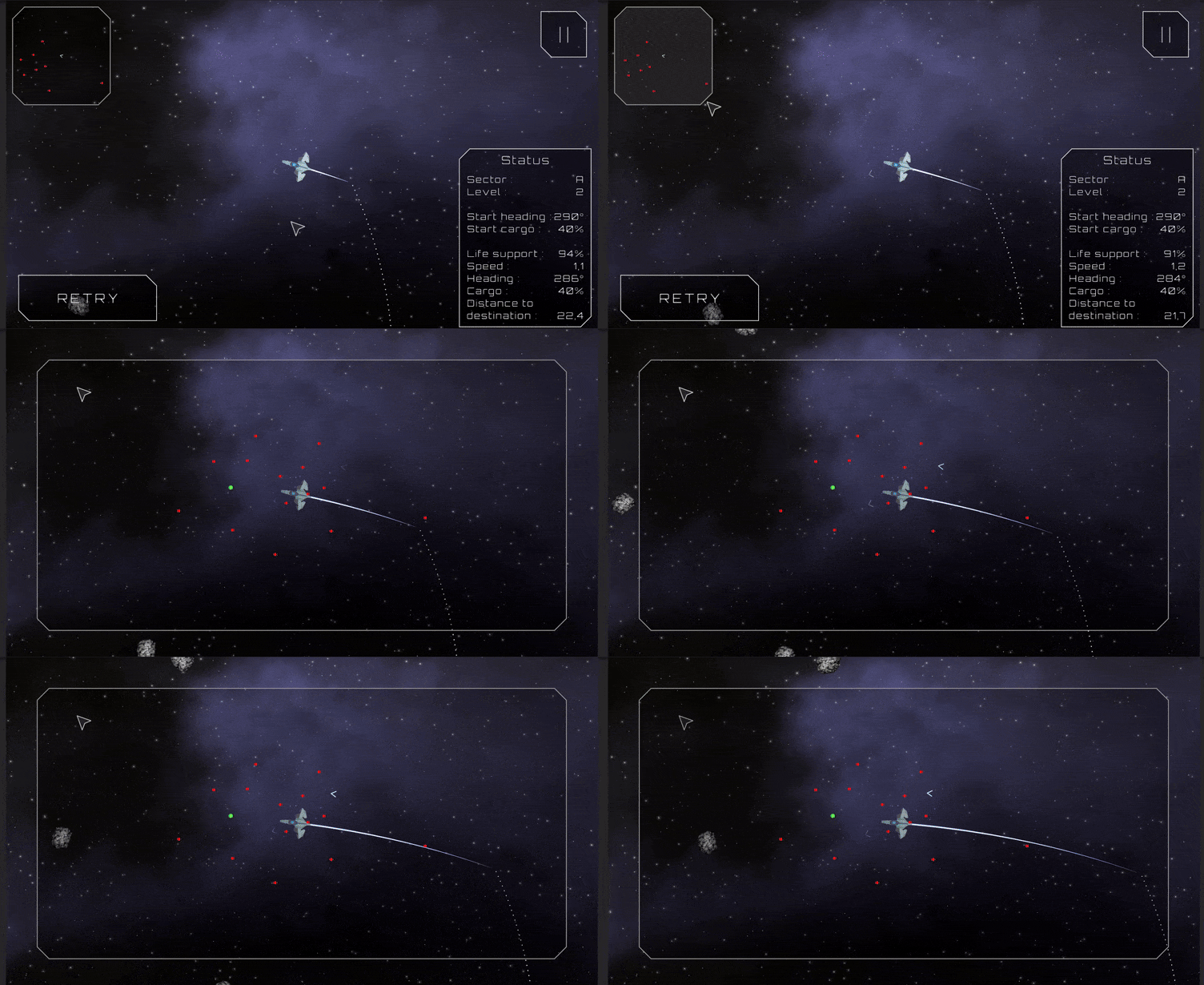
I see what you mean about spotting where the player is on the expanded map. I'll consider blurring the background / ship or something, for now I just added a blinking effect upon expanding the map, that should help a bit :

Thanks !

Oh, I see how this might be confusing playing on the computer but the heading and cargo are not actually sliders. You just swipe right/left or up/down anywhere on the screen to change their value. Its also purposefully kinda low on sensitivity so players can easily select precise values.

Thanks for playing :)

Interesting concept. Took me a while to get it but it has potential. I really like the chill atmosphere and art (the music probably had time to loop more than 10 times over while I was playing but it never annoyed  me, which says a lot).

I feel like the tutorial is a bit too long though. And the game gets difficult way too fast. At least for me^^ I stopped after completing "Case 1  : Red Harrings" by the skin of my teeth with just 1 "time" unit left after 6 or 7 attempts. I don't know if I was unlucky with all those "Red Herring" items or if I just suck...

To be fair, this kind of strategy / puzzle game isn't really my thing to begin with. So I would wait to see what others think before making major changes to difficulty^^

Also, a few minor things :

- The writing speed for the dialog feels too slow (I know you can get the whole text instantly by clicking though). I would multiply it by something like 1.5 or 2.

- You have 2 fullscreen buttons. I think you should keep the one from Unity and remove the one added by itch.io that never works well (it's in the edit game page, the option : "Fullscreen button — Add a button to the bottom right corner of your embed to make it fullscreen").

At least, that's how I handle it for my webGL games :)

- A custom mouse cursor would add a lot to the style of the game I think. Something thematics like a pen or magnifying glass maybe ?


Anyway, great entry overall, good job :)

Thanks for the kind words ! I'll definitely iterate on the UI to avoid information overload (you're not the first person to mention that issue^^) and try to make simpler levels at the beginning.

Thanks for the feedback :)

Thanks for playing. Glad you liked it :)

Thanks ! I'm not sure about story mode given the type of game it is. But who knows... In time maybe.

Depends on the level and situation but try reducing your cargo to be less affected by gravity.

I'm aware the big thing missing right now is a tutorial and first levels with a more progressive difficulty. I'm working on it :)

Thanks for the feedback.

Glad you liked it. I see your point about the game's speed. I'll think about increase it a tiny bit or maybe allow the player to accelerate time or something.

Thanks for the feedback !

Great game, feels very polished.

The only issue I have would be diffculty, I don't know if I just suck but I  could never get past any other car (bots). Is there a turbo mechanic or something that I'm missing  ? xD I might try again another time.

Awesome work overall :)

(1 edit)

Thanks for the detailed feedback. I'll definitely implement some of these suggestions in the near future.

The + /  - buttons to zoom on the minimap is a good idea and shouldn't take long to implement.

As for having data about all the previous attempts, I actually had the idea from the start but decided to simplify things to avoid information overload. I might make a whole "Flight Logs" panel that you would have to turn on I think...

For the annoyance of not being able to retry right away, you're actually not the first person to mention that^^ I just pushed an update that makes the retry button always active.

Thanks for playing ;)

Hey, thanks for the feedback !

I'll see about the game not quitting in the browser. It's a common problem I think but at least it's quitting properly in Chrome for me.

I get your point about the game feeling too slow at time. I was going for a chill / contemplative atmosphere but I guess I could speed things up a bit.

About seing farther, the fullscale map (you can click on the minimap) was meant as a way for players to plan their route beyond what they could see. But letting the player explore the level freely before the launch is definitely an interesting idea :)

For the cargo, I understant it might not be obvious, it's making your ship heavier / lighter. I'm thinking the game needs a tutorial and at least one situation where they have to adjust it to succeed. Like being near a blackhole and needing to reach escape velocity by setting the cargo very low...

Thanks for playing !

Nice little game. With some sound / music and some polish it could be really nice.

I think there is a bug sometime when you reroll, some of the selected cards don't reroll and some of the unselected ones do. Or maybe I misunderstood how it's supposed to work. Also is a draw possible ? I played a game where we both reached 0 at the same turn but it said I lost :( To be fair the enemy did more damage^^

(1 edit)

Interesting gameplay with the tilting of the screen. I imagine the concept could work nicely as a simple mobile game where you physically tilt the phone to play (just an idea).

I managed to complete all levels but it wasn't easy^^

I feel the controls over the tilting could be improved. Maybe with a smoother and more progressive tilt ? I'm not sure but I would often overshoot and end up dying in spikes :(

I'm aware that's kind of the whole point of the challenge though :)

Other notes :

- The music feels way too loud even if I set it at 20%.

- The instruction text for each level should only appear the first time I think. Having to skip it after dying when you just want to retry right away kinda breaks the flow of gameplay.

- Also, a minor thing : In addition to arrow keys, I would add WASD controls for people used to those.

I like the voice acting and story and art you seem to have (from the screenshot) but unfortunately, even after many attempts, I never succeeded in crossing the road at the beginning :(

Cool atmosphere. But I beat the game by just holding the up and right arrow and spamming spacebar ^^

Awesome music too :)

Very good game. Was really fun to play and felt quite polished. Great work :)

Cool little game. I couldn't finish it unfortunately (it crashed when I got the underwater breathing item) but I really like the level design and fast respawn. Also the signs with the instructions were a nice touch. Good work :)

(1 edit)

Hey, thanks. Sorry about the performance issues, I'll upload a windows build once the jam is over. Also, it might depend on the web browser, I find it runs best on Google Chrome for what it's worth.

Anyway, I added a gameplay video on my page so people can  get a feel of the game.

Cool game. I really liked the transition from platformer to puzzle game. Nice job :)

Very short (but I shouldn't complain since my own game also is^^)  but cool concept.

It definitely fits the theme and the mechanics are good. Nice music and atmosphere too.

Good work.

Cool retro vibe, I liked it. Felt maybe a bit too punishing with the tight the controls and the fast pace but I can see how that would be deliberate for a game like this.

The art and music were well done and make a cool atmosphere.

Nice job :)

Screenshot :


It could come from my computer to be honest, I got a warning about my graphics card  having issues with D3D11 before launching the game.
(It's kinda old)

Impressive ! For some reason level 5 was almost all white (but I beat it by going straight) and I found level 6 had a big spike in difficulty compared to the previous ones. In the end, I beat all the levels :)

The art and atmosphere were great and the voice acting at the start was a nice touch.

Great job !