Play game
Marine Mecha Mayhem Madness's itch.io pageResults
| Criteria | Rank | Score* | Raw Score |
| Sound/Audio | #3 | 3.800 | 3.800 |
| Fun | #8 | 3.800 | 3.800 |
| Overall | #11 | 3.400 | 3.400 |
| Visuals(Graphics) | #12 | 3.400 | 3.400 |
| User Interface (UI/UX) | #15 | 2.800 | 2.800 |
Ranked from 5 ratings. Score is adjusted from raw score by the median number of ratings per game in the jam.
DevLog Link
https://velvetlobster.itch.io/mmmm/devlog/744165/somewhat-decent-evolution-first-devlog
Developer Feedback Questions
hmm, perhaps I would be curious to know what aspect of this do you find the most ... potentially interesting? Currently we have:
- exploring others` creations
- creating your builds
- fighting and earning money
- watching other battles (soon to come)
Leave a comment
Log in with itch.io to leave a comment.


Comments
this is a really fun and interesting game! i had a great time playing it.
here're a few notes from my time with it
TUTORIAL
- a popup window with the tutorial and a "skip" button upon game start would be appreciated it. i didn't spot it until fumbling around a bit.
- you can get rid of the "okay got it" button. it's the same as the "x" button except for i kept thinking it was okay/proceed and closing the tutorial by accident haha
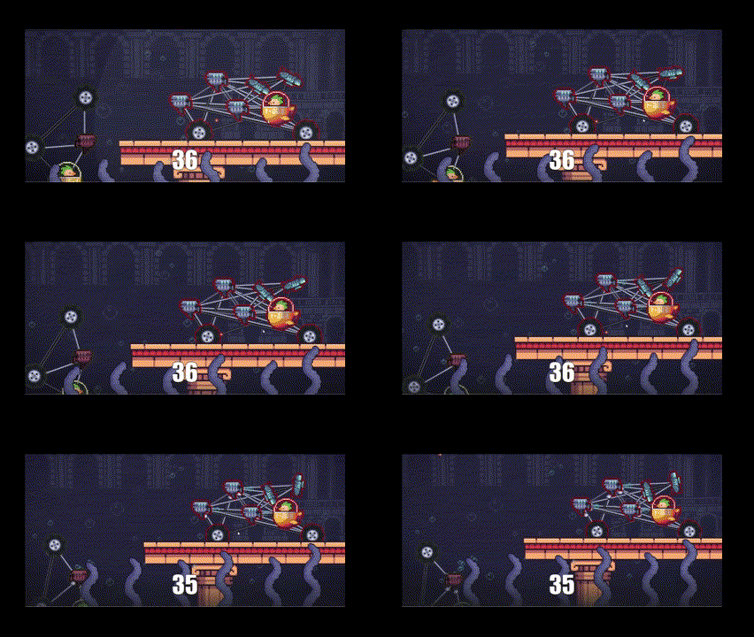
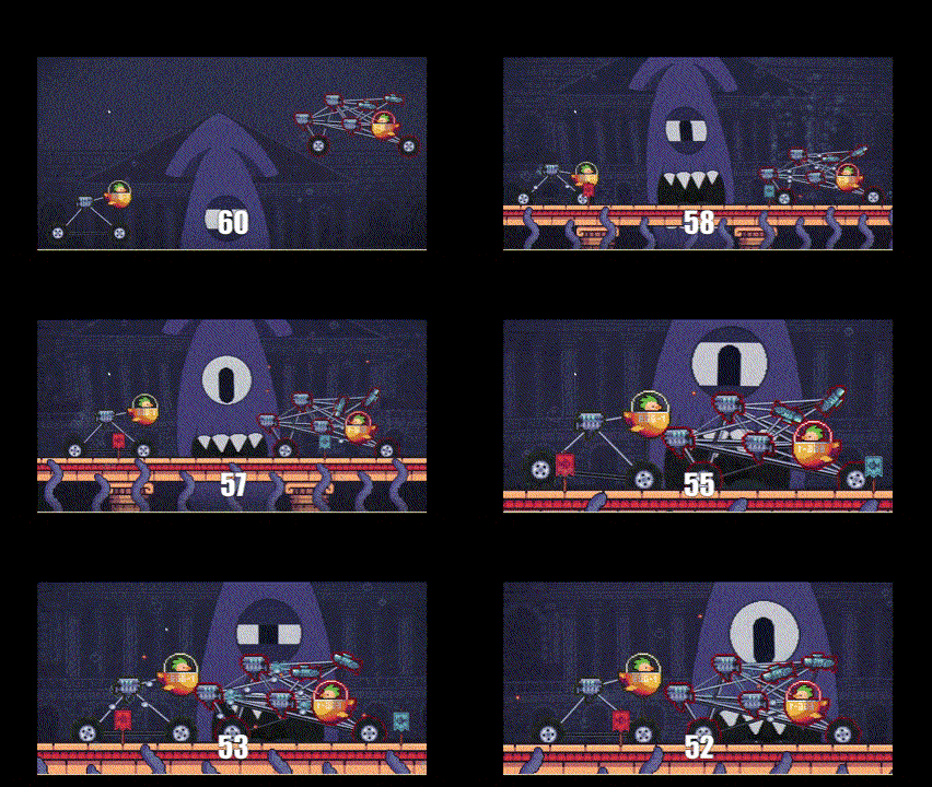
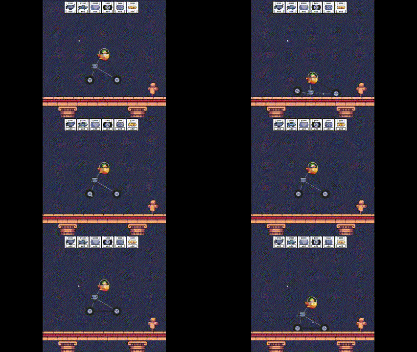
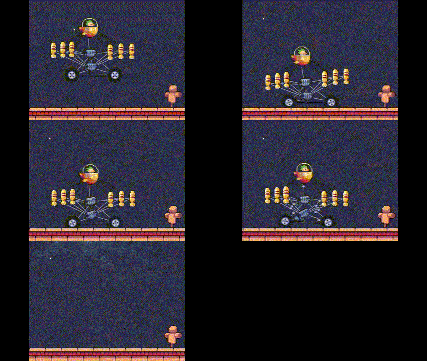
- the instructions themselves were clear and had a good amount of detail. the gifs were very helpful.
BUILDING
- all the shortcuts and controls are great!
- i ran into a bug where the camera become uncentered after a test -- is there a way to pan left/right as well as zoom?
- it would be helpful if your money increased/decreased as you removed/added components to your creation.
- it would be great if the fact you can click on the pieces you can buy to get a description of them was in the tutorial.
BATTLING
- ran into a bug where the camera remained zoomed in after a match and i couldn't see my opponent when betting. the camera remained zoomed in during the next battle and also up too high (couldn't see the floor). i think maybe i didn't have an opponent? i lost from going over the far edge.
- the betting system is a lot of fun, and it's really cool to see other player's creations!
POTENTIALLY INTERESTING ASPECTS
i think more options for things to add to my creation & different kinds of matches (with different goals) would both be fun additions if you're looking to add more stuff :)
thanks for the thoughtful analysis, we really appreciate it.
great tips on the tutorial windows, we really suck with UI/UX
actually there is a pan if you middle click and drag .... tbh dont know if that is a good idea, I personally dont like middle click stuff, but didnt know what to do since we already use the click for selection and are kinda planing a multi selection thing with click and drag on the empy areas of the screen.
money has several bugs, but since its kind of a limitation we chose to move its fixing to later .... but will fix eventually
if you click on the pieces before adding in the menu, you will have a description of them ... but yeah, I guess that is really bad UX lol ... lots of people did not notice it lol
there is something I noticed just recently that happens with the camera in battling that the zoom kinda bugs when the screen is below certain size ... its kinda annoying because its also kinda hard for us to see it happening, I have seen once .... but recently been testing in a smaller notebook to find these kinds of bugs more easily
things that we have been working on:
- live battles on twitch - we already started that, should be going back live in the next few days https://www.twitch.tv/m4arena
- tournaments - probably still this month
things planned:
- open public backlog
- more battle scenarios with different features
- battle modes (currently planning run mode and survival mode)
.... besides all the bug fixing, of course =)
I tried several times on a PC and a smartphone, and I couldn’t play due to severe freezes and low fps of the game. an ordinary user with a budget device will not be able to play, perhaps optimization is needed, measuring FPS and disabling unnecessary things. Only half of the screen is visible on a smartphone.
But the idea has powerful potential for further development, people even love to just watch the show, if it’s fun, then one wins, then the other
yeah you are right, we are learning about performance improvement as we work on this so yeah I cannot promise a super performance for the moment .... BUT, to your next point, we are about to finish a mode that allows matches to be broadcast and we have just created a twitch account to show live showdowns (https://www.twitch.tv/m4arena) .... we started experimenting with this yesterday =) .... a lot of people enjoyed more watching than building .... but one step at a time, next we will look into the performance side of things ..... as of mobile support, well, that would be a massive rework and as I have never seen someone (streamer or non streamer) play building games on a mobile, not sure it is worth to remake this for mobile.
Thanks for the honest comments, we really appreciate the sincerity =)
I love the mechanic where the time it takes energy to reach your mechanism depends on their distance from the engine! Also I may be biased, but I don't think your game is as confusing as some other comments might make it out to be.
One confusing part though is that it seemed like I was able to spend infinite money despite only having $1000 at the beginning? Regarding visuals, all the sprites have pixels of different sizes, which makes the art seem very disorganized/inconsistent. There were also tons of default vehicles that kept popping up in the matchmaking, which made for some repetitive fights.
Regardless, I think this is a very solid concept and I can see myself playing for a long time!
Thanks a lot for playing and for the feedback! We know this is a very niche type of game perhaps, so if you never played autobattlers it might be daunting ... explaining that there is a type of game that you kinda do not play directly .... adding hand guided tutorials is not a simple task and we are always discussing whether doing it is worth the work, for maybe the ones that like this type of game wont need it, idk, still figuring it out. what do you think, do you think its absolutely necessary to add such tutorials?
Yes we did not limit the money for now, so you can go into infinite debt lol.
About the battles being repetitive due to very similar builds, we have some thoughts:
- Until now most builds were made by people that took part in the jam, so its expected that most of them did not spend enough time to do some more creative builds (except for a few players that seemed to genuinely enjoy this type of experience and spent hours to get to the top of the ranks) so most builds are kinda boring for now I see, but I hope once there are more people playing that is going to be solved (hopefully lol).
- We are having some trouble with the match selection algorithm for the moment, so you always end up facing the same builds (that will be fixed soon I hope)
- We plan on having more maps with different terrain and maybe things like rain, meteors and stuff to make battle less predictable
the thing about the art, yeah, I am the one to blame for that lmao ... the artists told that all time but we had no time to fix ... tbh I do not if we will be able to be always consistent in the asset resolution due to it being a simulation and things being enlarged automatically ... that begs a last question, if you dont mind .... do you think we maybe should try to ... not use pixelart? because it would be very hard to guarantee resolution consistency in midst a battle
There is a feature in Unity (and I'm sure can be implemented anywhere else) where you pixelate the output of the camera rather than using pixelated sprites. This means you don't have to worry at all about consistently sized pixels, and the sprites themselves can even be drawn! Although the output might look odd in places where sprites rotate it would probably still look more consistent than randomly sized pixels?
For context I've only ever played one autobattler a LONG time ago, but I still don't think a deep comprehensive tutorial is necessary. If the UI gets cleaned up, I feel even people who haven't played this genre before will get it.
I didn't understand the game at all. There is a tutorial but it doesn't explain much. It explains how to make joints or something which doesn't mean anything if I don't know what a joint is at all. I think an interactive tutorial where it guides you through the process of making a machine and then have it fight against a small AI opponent would explain a lot.
Thanks a lot for trying =) ... yeah we understand that may be confusing, if you dont mind, it would help us a lot:
- have you played auto games such as super pets auto battle?
- have you played sandbox games like instruments of destruction?
- have you played games that play by themselves? Like incremental games where you see numbers go up like cookie clicker
I haven't played any autobattler games. I have played the other kinds of games though. But I don't see the relation between those games and this game.
yeah it seems we are doing a really bad job with the intro then ... noted, will see ways to make that more clear right from the get go, perhaps a few gifs in the intro will make that more clear
I really like the concept, I think the largest problem you will face is just how confusing and daunting the game is. I came VERY close to quiting after trying to grapple with the basics for the first 5-10 min. Once I understood the basics it became interesting, but there are a few major flaws I noticed:
your comments are on point, and make a lot of sense.
as we have no UI specialist among us, do you have any suggestions? In the current UI we tried to hide elements as hard as possible not to clutter it
I'm no expert myself, but I would recommend against putting any buttons in the corners/edges of the screen. I always give it some padding. I find its hard to see buttons placed right in the corner, especially if they are small as the ones you have in the game. My brain kind of just ignores it, assuming that it is some kind of HUD.