Play game
Crimson Moon's itch.io pageResults
| Criteria | Rank | Score* | Raw Score |
| Theme | #27 | 3.278 | 3.278 |
| Sound | #37 | 2.333 | 2.333 |
| Overall | #39 | 2.300 | 2.300 |
| Mechanics | #43 | 2.000 | 2.000 |
| Fun | #44 | 1.944 | 1.944 |
| Art | #46 | 1.944 | 1.944 |
Ranked from 18 ratings. Score is adjusted from raw score by the median number of ratings per game in the jam.
Leave a comment
Log in with itch.io to leave a comment.


Comments
Going for a classic remake might be cool, if done really really good..
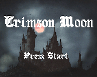
I don't feel it's the case here sadly. The game's thumbnail picture is great and also the best thing here :)
I'd suggest either put more work to the art and design to make it look and feel good - or try to add some twist to it, to make it more interesting and fresh, so the rest won't matter that much..
A little more polish and this game could be fantastic! The art style is pretty nice, and the controls feel right. The platforms would look so cool with textures and/or sprites, and enemy variety would make it pop more. The fact that the game works fine, given the short time, is impressive. Good job!
I agree with the group. The technical implementation and aesthetics need some more attention. But keep working on it and it could be really fun :)
Interesting little game. I like your interpretation of the theme. Nothing crazy there, but your influence is specific and it just gives the game a good feel like it's been made my someone passionate about what they're making.
I feel like both in terms of aesthetics and gameplay though, this could use some more love. The combat with the skeletons very quickly became a bit tedious, and the witch fight felt insane in comparison. And aesthetically, well, I actually quite like the character sprites (especially the witch, who looks a little goofy in a way that is quite charming), but the untextured platforms and weirdly blurry backgrounds feel very out of place and bring the whole aesthetic down to me.
I hope this doesn't sound too harsh; just trying to provide some feedback to take with you as you do more (either more work on this or work on something else).It definitely has a vibe like maybe time got the best of you, which is completely understandable. I do want to stress that what you've put together is still quite impressive for a game jam, and definitely has the potential to be something cool if you're interested in working with it a bit more. Good work!
The toughest thing with game jams is how little time you have to bring a game together and here you can almost feel the time crunch as you play with each element clearly just needing a bit more love and attention. Good foundation.
First I have to say that the character art was awesome! But I think it looked out of place against the platforms and backgrounds, which were of a much lower quality. The music was also pretty cool. I liked the gameplay although I noticed two issues:
1. Sometimes the sword would stop swinging (if this is some kind of stamina system or something then some kind of HUD would make this easier to grasp, or maybe it was just a bug)
2. I found that if you jumped on an enemy's head you could kind of ride it away, which gave me a laugh.
Overall a very aesthetically cool and promising game!
Really nice game, took me back to my Gameboy Advance days :D
The art is really nice for most of the game, and I'm assuming the platforms etc are untextured due to a lack of time, so I'll not be harsh on the rating :)
At first I was going to complain about the controls as I started using the WASD keys for moving, only to realise that W doesn't jump :\, also attack was X under the movements keys which was a tad inconvenient, but then I reliased the tutorial showed the arrow keys, not the WASD ones, so my bad. 2 ways to improve the player misunderstanding is to either stop A & D from moving the player, or allow WASD keys to fully work like the arrow keys.
Regarding the level, I wasn't sure why the platform started going up in the sky when the terrain looked really nice, maybe it would have been obvious if the art was in place, but I kind of felt lot.
Finally the witch fight felt a bit unfiar as I was unable to see how much I had damaged the witch. Also the fallig spikes were damaging me even though they didn't hit me, maybe the colliders were too large resulting in false positives.
Overall, it is a nice game and I'd be up for playing a more polished version, for sure :)