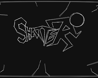
Do I suck at this game or what? Took me a few times to not insta die, I won’t lie haha. It made me want to play more, it has a great “high octane” feel to the game. The artwork is awesome, starting with the cover art. Great job!
Play game
Shatter Download Version's itch.io pageResults
| Criteria | Rank | Score* | Raw Score |
| Fun Factor | #3 | 3.162 | 3.333 |
| Overall | #3 | 3.127 | 3.296 |
| Presentation - Graphics and Sound | #4 | 3.268 | 3.444 |
| Creativity - Use of Theme and Originality | #8 | 2.951 | 3.111 |
Ranked from 9 ratings. Score is adjusted from raw score by the median number of ratings per game in the jam.
What country do you currently reside in?
Trinidad & Tobago
Comments
I am actually super happy you felt like that! The experience we went for was one similar to rhythm games, where there is a really hard song where you want to beat it really badly, so you try over and over till you finally overcome it. The game was made hard, but possible, on purpose to convey that, while also making use of the old NES ideology of "extend your game's length by making it harder". This is especially helpful when, if you already know what to do, you can beat the game in two minutes. The fact that you felt the high octane feeling from the music and movement, you didn't have the easiest time, yet were able to preserver and overcome the challenge we presented to you mean our vision was met! Thank you for your reply!
I played the browser version, I really enjoyed playing this!! Restarted a few times after I lost as I really wanted to win :D I really love this take on the theme of glass shattering, and the art fits into that! The logo is designed really well, and I see that you incorporated the player into it! The black and white theme looks cool. Would have love to have seen some animations for the players, like running. I think you all did an amazing job on this!
Thank you for the reply! A lot of the assets were made by hand, with almost all the art designed by Christian Lee Poy. I will pass your words about the design and art to him because he really is the one that deserves all the praise for that. Sadly, with all the assets made by hand, a lot of things like more in-between animations and more songs/levels had to be scraped to submit on time. As for the difficulty, we were going for a "really hard, but doable song in a rhythm game" sort of vibe, so the fact that you felt the difficulty but want to continue, get better at the song, and win means the world to my team and I. Thank you for the reply!
The idea of making it a mobile game only came up super late into development, which in retrospect we really wish we went with. Thank you for the comment on the art style, it actually took way more iterations and designs than you would think to end up landing on this one, so the fact that you liked that we went with the minimalist art style really means a lot. Thank you for your reply!
Had lots of fun with this one! Some obstacles felt undodgeable but I probably don't have the skills yet
The difficulty was a big aspect of the game, with 2 obstacles in particular placed in such a way that it is possible but very difficult to dodge, as to create a sense of improvement to those that replay the game, and a sort of "clutch" feeling to those that end up actually able to dodge the obstacles. I will admit, the fact that you can slide with the top and bottom character at the same time by holding up and down even after the jump ends was not conveyed well enough, which is something I definitely would have changed if I could. Thank you for your reply!
This is a really interesting mechanic! Took me a while to get the hang of it, but I was definitely motivated to keep trying for a while!


Leave a comment
Log in with itch.io to leave a comment.