Play game
Stale Conversations's itch.io pageResults
| Criteria | Rank | Score* | Raw Score |
| Art | #6 | 4.136 | 4.136 |
| Graphics | #6 | 4.182 | 4.182 |
| Music | #8 | 3.818 | 3.818 |
| Sound Effects | #8 | 3.727 | 3.727 |
| Humor | #18 | 3.364 | 3.364 |
| WTF | #49 | 2.864 | 2.864 |
| Fun | #80 | 2.682 | 2.682 |
Ranked from 22 ratings. Score is adjusted from raw score by the median number of ratings per game in the jam.
What INSPIRED this game?
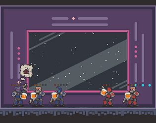
This game was inspired by the awkward conversations we all have from time to time and by the difficulties of socializing. And also by Space Marines.
List any additional team members here.
Leonid Dudakov - art and coding
AnnieOwl - coding, system design and harmonica sounds
Vlad Voronov - music
List the parts of your game you or your team did NOT make. (Pre-existing assets or downloaded content)
We took the main menu layout from our previous LD project, plugin for opening links in browser and fonts: "Press Start" by "CodeMan38" (cody@zone38.net) and "Fipps-Regular" by "Stefanie Koerner" (http://pheist.net).
Other than that all have been made from scatch in 48 hours.
Leave a comment
Log in with itch.io to leave a comment.


Comments
That's actually great idea, but that's pretty unlikely that we are gonna implement it :D
I scored a 58 on my second go, this game was definitely original, very polished, and pretty simple yet fun. Also quite funny, and left a lot to the imagination(like I wonder what these guys are actually talking about), lol. Great game!
Wow, you got a pretty high score there! Thank you for playing our game and for leaving a feedback. Glad you liked it :)
it is a good game but, i notice that it is not for me how to handel on the social level.
I really love the aesthetic of this!
I think its pretty common in a game jam to see games that try to do a lot of different things but lack polish, since people want to hash out their ideas as quickly as possible and move on. Here, its clear that you took a relatively simple single-scene idea and spent plenty of time treating it right, and the results look and sound great. I was also confused whilst playing, but it was such a joyful little scene to watch play out that I didn't mind too much. With a little extra time to spend introducing the player to mechanics gradually, this game would really feel complete.
Thank you very much for your feedback!
We actually were planing on making some sort of "tutorial" at the start of the game, with fewer characters and instructions about the themes and the mood. But mighty Morpheus, god of sleep, got the best of us.
I'm so bad at this game, may be I need to drink... Water... And not in a pub :D
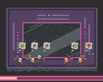
As others have said, the game looks great, but there's absolutely no way the vast majority of players are going to understand what's happening. The fact that you have to go into a separate instructions page to understand the conversation topics is just immediately going to ruin the game for the vast majority of players. This game could've really benefited from some basic text bubbles, as opposed to just little pictures. The reason picture bubbles work in games like The Sims is that the player still generally knows what's going on, since they directly command the action. They're just like little side notifications to help alert the player. But in this, the core content is experiencing the "conversations", yet it's impossible to understand without studying all the symbols in the instructions.
By the end of the second day we knew that there would be a problem with teaching players the meaning of pictures. But there was no time left by then, so we just relied on our visuals and overall funny atmosphere to do the job. We highlighted the instructions menu as important, but yes, I agree that almost nobody is able to remember the pictures and understand the rules right away. So the hope was that visuals and audio would keep the player engaged and interested so he will look up the instructions again and understand how to play.
I love the polish in this game. Feels like a game I bought on app store. However, I don't "get" the gameplay. I tried playing a few times, but don't really get a clear signal if I'm playing well or not. I think the player should be more clearly rewarded. Are gun shots bad? What do the symbols mean? Am I supposed to figure out which symbols go with what? If there is any depth in this game, I seem to have completely missed it. I adore the art style, music, sfx, and animations though, which made me play the game even though I didn't understand what I was playing.
Yes, the gunshots supposed to be a signal of extremely bad or extremely good mood, but we ran out of time.
However, you can look up what symbols mean, if you look in the instructions. ;)
This game simulates conversations in a bar, always somoone is angry and someoone is happy and drunk, loved it!)))
Thanks! We are really happy you enjoyed it!