Play game
Spider Rider's itch.io pageResults
| Criteria | Rank | Score* | Raw Score |
| Audio | #5 | 4.308 | 4.308 |
| Overall | #9 | 4.269 | 4.269 |
| Graphics | #13 | 4.462 | 4.462 |
| Gameplay | #34 | 3.692 | 3.692 |
| Authenticity (Use of resolution restriction) | #44 | 4.615 | 4.615 |
Ranked from 13 ratings. Score is adjusted from raw score by the median number of ratings per game in the jam.
Leave a comment
Log in with itch.io to leave a comment.



Comments
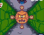
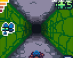
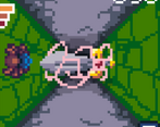
great game feel. Adding the ability to go on the floor, walls and ceiling definitely gives you a unique challenge b/c directions work differently when you're upside down so it wasn't just your typical dodge 3 lanes type of deal. I was totally surprised there was somewhat like boss enemies as well. I appreciated that when the moments where you had the walls with openings gave you a fair chance to see the opening, not sure if the game actually slows down a bit to help you out or if it's just b/c it's so big you can tell earlier (regardless of the method it worked out well) .Really was easy to pick up and play. I thought the tutorial was well done because it gives you pretty much the real game experience just with guidance as a tutorial should do.
I think something like this on mobile would be great
Wow, super impressive entry! The music and SFX were great and fit the tone nicely. The tutorial was really well done. Graphics were gorgeous. Great use of the small space - I have to admit, while most games in the jam look like the graphics could have benefited from a higher resolution, this game felt spot on.
Solid and really polished entry - great work!
Thank you very much! If you're not careful, You're going to give me a self esteem :). Thanks for playing. I'm glad you enjoyed it. I enjoyed your very polished game as well!
Hey, sorry can't play it, do you have a downloadable version?
Sorry no I don't. Will it not play in your browser?
One of the best entries I've played until now. A fun core mechanic, which remembers me a game I used to watch on TV when I was a child (I knew it as Hugo). The visual style, sound effects, and background music set a great atmosphere. It feels like an old game. I loved the design of enemies (oh glob, those swords <3 <3 <3), obstacles, and the tutorial. Excellent job!
- - -
You already played our game: Blind Bird, so we can't do anything but thank you. 」( ̄▽ ̄」)
Thanks a lot! I really enjoyed your game too! Had to look up Hugo I hadn't heard of that before. Now I want to play it :). Thanks for playing and commenting. I'm glad you enjoyed it!
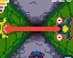
A complete game, and nicely done. I always know a thing is good when my complaints are about things within the game and not the implementation of it. In particular... man, I hate those solid walls with one gap in them. I run into those all the time. Top score of 335, though, which I'm pretty much OK with after playing a bunch of times. The music's good (and fits the tone of the game nicely), and the enemies are varied; this would be a launch title if someone put out a 64px gameboy :) One microscopic complaint: the "death" screen which shows your score has the top score value touching the bottom of the screen, and the "score" and "top score" text in a tiny 3x3 font. This makes that screen look less cool than it should; I think that that having the scores one pixel up, and using a slightly larger font, wouldn't significantly hide the cool background image and would make that screen look so much nicer. That's honestly the biggest complaint I can come up with, which is a good sign :-)
Thanks for playing and commenting! The death screen was definitely a compromise. A drawback of being both the artist and programmer. But I agree there is a more elegent solutuin to make that screen flow better. Probably should make a new bg image to work around a larger font. But in the timed confines of the contest I rolled with the large bg art and small scrunched text. Pro tip for the demon doors: even if the opening is on the opposite surface you are on, you are only two taps away from getting to it. ;) Thanks again!
cool game! reminded me of those sonic mini games, and the art and sound were great. Nice work!
Hey thanks! I had the old Tiger wristwatch games in mind when designing it. I appreciate the comments and glad you like the sound and visuals. Makes all the stress worthwhile! :)
Stupid ghosts! I'm a fan of runners and this was a great runner that worked really well within the confines of the 64 pixel resolution. Great pixels, fun soundtrack, nice gameplay (though sometimes I felt the responsiveness robbed me occasionally - or at least that's what I'm telling myself). Loved the different monster mechanics. Overall, really fun and good looking entry.
Thank you very much! Admittedly the swords are pretty unfair. The ghosts started out much harder but I toned them down when I saw people struggling with them. hoping to tweak the rough edges, add more baddies and make a mobile version. Thanks again for playing and commenting!
Really liked your soundtrack! =D
Much appreciated!