Indie game storeFree gamesFun gamesHorror games
Game developmentAssetsComics
SalesBundles
Jobs
TagsGame Engines

anarbitrarymustache

177
Posts
6
Topics
116
Followers
8
Following
A member registered Aug 10, 2015 · View creator page →

Creator of

Recent community posts

Day 2

I hacked together a very basic prototype for my match game and then spent almost all the rest of my time working on the movement controls and mechanics for my brawler. I think I'm all in on the brawler now. I spent a lot more time then I would of liked figuring out the z-axis movement and collisions. I'm probably on my third engine iteration (basically tearing down each previous version and starting over). Now for some sleep and then tomorrow to start working on actual fighting.
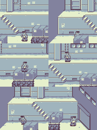

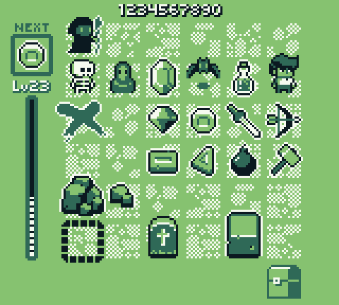
Stayed up well into the morning working on a few mock-ups. I squeezed in a few hours of sleep and everything has passed the "morning after" inspection. 


Up first, is my "match 3" dungeon crawler. I haven't quite worked out all of the details, but the point of the game will be to purely chase a high score by matching pieces on the game board. The twist is there are monsters that will show up that have to be defeated as well. Unlike typical "match 3" games, the pieces aren't already there. Each "turn" you will be given a random piece that has to be placed on the board. The game is over once you can no longer place your piece. Matching some pieces will clear, while others will leave behind a new piece. I envision the monsters movement being kind of like a turn based strategy game - each piece placed counts as the players turn and the monsters will perform their move afterwards.


Option two - my brawler. With clear inspirations from River City Ransom, I still don't have an exact story idea yet (but I have decided I'm going to call it 'Lake Town Rumble'). I seriously think it will just be some big boss has decided to put out a bounty on your character and now all of the gangs are out to collect. Basically beat your way to the boss to clear the bounty. I like the idea of an RCR style "open world" or maybe "metriodvania" is more appropriate term - basically certain paths are block until you have a necessary skill or item and you will need to back track to collect said skills and items until you can access the final big bad. I've created the initial animations for the player character (idle, punch, jump, walk, run), everything I should need to start working on a prototype. I guess we will see if I can get over the obstacle of coding a good foundation for the brawler mechanic.


We'll see where the rest of the day takes me.

GBJAM 7 community » Progress · Created a new topic Untitled Project
(1 edit)

I've been doing quite a bit of tinkering in Unity and trying my hand at 3D modeling as well over the last year. Kind of left my GameMaker and 2D pixel roots in the closet. Lately though, I've fallen in to a bit of a creative rut. When I saw the announcement for this years GBJAM, I felt excited and even a little invigorated. As much as I'd love to attempt a jam with my newfound skills in the 3D world, I'm thinking a visit to an old friend is exactly what I need (I mean, especially for a Gameboy Jam).

So my tools of choice this go around will be GameMaker (1.4.9999, none of that GM2) and mostly Adobe Photoshop for the pixel work.


Hour One

It's late here. Not sure if I'll be digging in now or sleeping first and starting at sun up. I have decided to start jotting down my initial ideas though.

So, my first thoughts:

  1. Breakout/Alleyway clone, mixed with some shooter elements - basically on top of being a paddle and keeping the "ball" going to break all of the blocks, there would be enemies you'd have to contend with. Probably too similar to my previous GB entry. Alleyway was probably my second most played Gameboy game behind Tetris. On top of that, I've never actually made a "brick breaker" style game despite how it feels like it should have been one of those stepping stone games you make when learning to make games.
  2. Tetris re-imagined. I've had this idea that I've wanted to try just to see if I could (and to see if it would even work) where instead of rotating the pieces, you rotate the board. Yeah, after typing that out it sounds even more ridiculous. This feels like the right amount of work for a game jam, as far as the amount of content I'd need to generate. However, this may just be because I'm tired, but figuring how exactly to do "that" doesn't feel like the type of problem I want to solve this go around.
  3. Some other type of puzzle game. I've never attempted a match 3, but I was leaning towards something like that or maybe and match/falling game like Dr. Mario. I'd like to attempt my own spin on the puzzle game meets dungeon crawler, but I'm pretty sure I'd just end up doing a 10,000,000 clone or something. I feel like making each piece distinguishable would be a challenge with the 4 color palette. Not sure how I feel about that. Again, like the Tetris idea above. This type of game doesn't require a lot of content creation (little artwork and no "levels" to have to design by hand). Though, if I go the dungeon crawler hybrid, that wouldn't be the case.
  4. A Beat'em Up/Brawler. I've wanted to do one of these for a while now. I attempted maybe 3 or 4 years back and quickly became discouraged. I'd like to imagine my experience since then would help me get farther this time. Like the "match" game above, the limited color palette means I'd have to find other ways to distinguish the different enemy types. Though, I'm likely that challenge because it would most likely be through animation. Probably end up being more then I can handle in the time frame, but when has that ever stopped me. I don't really have any ideas for a story though. I just know I want to code and pixel guys beating each other up. Hmmm.
  5. Most of my other game ideas I've been hoping to realize wouldn't work in the Gameboy format.

I was hoping as I typed I would find more inspiration. Nope. Could just be I'm too tired. I'm leaning towards brawler. Mostly because of all the fun pixel work. It of course would involve by far the most content creation and I'm not even sure I'll be able to code a working brawler core with acceptable/fun game play. Again though, when has that ever stopped me?

Going to throw together some mock-ups to see if that sparks anything.

Thanks for the feedback. Yeah, I didn't have enough time to properly balance the game play. I had not intended this to be a procedural runner in the beginning - that more came as a result at the end when I realized I didn't have time to design levels. As a result,  I slapped together the random output but only had the chance to play through it maybe 2-3 times before I had to submit to make the deadline. I find the endless runner idea interesting, but not sure which direction (random vs pre-designed stages) I will go if I continue work.

Thanks! I ended up spending too much time on the pixels and not having enough time to really finish the game play, but I was happy with some of the looks I came up with.

Thanks for the feedback! After playing A.L.S.X. in the LOWREZJAM I really wanted to do a Shmup. You're right about not just focusing on the problems and "advertising" the game better. I had so much going on during the end of the Jam and was just frustrated I couldn't put together the entry I wanted. I just haven't had time to go back and clean up the page since. I see if I can squeeze in some screen shots. Thanks for yours in the mean time. Good look with your shmup, I had a blast trying to come up with and figure out how to code different patterns and attacks.

Thanks so much for playing and the feedback!

Thanks! I'm glad you liked it.

Thanks!

Thanks for giving it a shot and the kind words! I will find the time to play your entry. I'm really trying to work through as many as I can this year.

Thanks for the kind words and feedback!

Thanks! I agree about the movement. I think I was too eager to jump over to the graphics and didn't fine-tune as much as I should have. I never did get to work in that secret chain room. That will have to wait for post-jam.

Thanks! I was glad I was able to squeeze in the intro sequence. I always have things like that in my head but they usually never make it in before the deadline. 

Thanks for feedback! Yeah, I think I may have gone a little too fast twitch on the controls.

(1 edit)

Great little entry. I was going to say almost exactly what @stuartlangridge said below, so I'll leave it at that. Nice job. I wasn't even bothered by the lack of sound after a while because it almost added to the atmosphere of being alone in some space station/ship. That was killed a bit when I got outside and it appeared I was not in fact in space. So I guess that can be my only real complaint. I found 260 coins. I was shocked to see there were still ~60 left to go. Great job.

EDIT: Oh man, I loved Pixel Peak last year. Glad to see you're back and still doing good work.

I like the feel of the game. I love that I feel like some out of control tank that can only stop when I hit a wall. Something about my power coming from reckless abandonment is enjoyable to me. This a fun little puzzler with a nice progression of mechanics. The tank tracks are a great, simple add for indicating to the player where the "rooms" exit is going to be if off camera. One little suggestion I would have is moving the first "recall system" so that it can't be missed. I managed to miss it on my first play through. I saw something that looked different and wanted to investigate but was then shot through one of those one-way tiles that sent me to the next room with no way back. Then when I died I was sent back to the first room. This would potentially cause some players to stop playing right there. But really, great job. I'd love to see this continued.

I love your visuals. Everything is readable and looks great at the low resolution. Great overall entry. Two suggestions if I may. Maybe adjust the input controls so that tapping a direction causes your player to look that way, but not move yet. Since direction is important to tool use, I found myself having to do a lot of extra movement to face the tile I wanted to. Another would be the inventory/equipping . Once I got the hang of it, it wasn't bad, but still felt a little clunky. Maybe have a tool equip slot and then maybe a seed slot. So "X" would use your equipped tool, but hold down "X" would bring up your tool change.  Press "S" to use equipped seed, hold down "S" to bring up your seed change. This allows you to do all of your necessary actions without ever needing to enter the menu. Now this wouldn't necessarily scale well if you built on more mechanics/tools, but I think would work in it's current form. Again, great job.

This is a very ambitious first attempt and you've accomplished a lot. A lot of content packed into a small resolution. There were definitely times were I wasn't sure what I was doing. During combat for example. After I choose my action (like attack), is it just background rolls based on stats or am I supposed to be doing anything - like timing a click with that blinking/beeping square? I wasn't sure. So some player feedback improvements could definitely help. Great start. I would love to see where this ends up if you continue work on it.

An interesting start. Definitely have to be quick with that few pixels to react.

I really like the look of this and it's impressive how much you effectively packed into the 64x64 resolution. 

Does have a good feel. Shame about the resolution miscue. You have a fun little base game on your hands though.

Like mentioned below, it appears you left viewport scaled to actual size. I was able to play by zooming in my browser window. 

I think some instructions would be helpful. I had trouble figuring out the mechanic initially. What I came up with was it appears you "drop" pollen when you move/jump. I had originally just assumed the pink particles were just effect to add some flare to your movement. After some testing, the more of the particles I drop by moving I do see my gauge deplete.  It's an interesting mechanic because you now have to use your movement carefully and with consideration, else you wont have enough pollen to complete the stage. A fun little platforming/puzzler hybrid. However, you can't seem to "jump" while on top of the flowers (I'm guessing because you fail the "on ground" check required to jump) and I couldn't seem to find a key that allowed you to just "drop" pollen. So if my initial jump on to the flower didn't leave enough pollen, I'd have to walk off and then jump on again. This isn't necessarily bad, but felt clunky. The mushrooms seemed to react to me pressing the up key, but not always. I like the look and feel of the game. Definitely consider continuing to tweak the mechanic while maybe working on communicating what that mechanic is to the player.

Nice little entry. Maybe consider assigning each tool to different keys instead of needing to swap. For example, "Z" and "X" to swing the pickaxe and "A" and "S" to swing the shovel. 

Nice little entry. I love how much detail you worked into so few pixels. I'm curious how your respawn coordinates are determined, because I managed to get re-spawned in the ceiling/walls, twice. At least that's what I think happened. I couldn't see my character, but based on sound effects,  he was moving.  The way the camera was centered, led me to believe I was in the walls/ceiling. I guess the alternative was the player sprite wasn't being draw for some reason. Other than that, the game felt good.

Cute little entry. Love your frog! Soundtrack is enjoyable and perfect for the gameplay. Something I'd try, is maybe separate the camera scroll from the tongue movement. I think part of what makes it feel a little too slow (and as a result too easy) is when you move the tongue horizontally, the camera stops. This adds no consequences for moving moving long distances left or right. If the camera continued to scroll you are forced into tougher decisions the higher/further you go.  Of course you'd want to make sure to include a system for catching back up with the camera when moving vertically, else you'd eventually be off camera. Another alternative, is the tongue is always moving vertically. Nice entry.

Fun idea. Love the retro design.  Did you experiment at all with differentiating the bugs by color as well? This may have made it too easy, but just curious. This could have helped with the UI on the top row too. The camera, to me,  was a little too sensitive. Nice entry.

Love the game mechanic and the look, but I think the larger viewport version works better. I had unfortunately played it before the LOWREZ version so it felt like taking a step backwards. Not sure how I would of felt had I only played the LOWREZ edition. Still a great concept and entry.

Stupid ghosts! I'm a fan of runners and this was a great runner that worked really well within the confines of the 64 pixel resolution. Great pixels, fun soundtrack, nice gameplay (though sometimes I felt the responsiveness robbed me occasionally - or at least that's what I'm telling myself). Loved the different monster mechanics. Overall, really fun and good looking entry.

Great pixels. I liked your camera transitions as well. A really complete feeling game. I wish the block pushing was a little more forgiving. Maybe a forgiveness counter on the push (player would need to be "pushing" the block for ~5 frames before it actually pushes for example). There would be times I'd try to jump on top of a stack or even a single block but end up accidentally pushing the block off which ultimately resulted in me restarting the level.  Overall, great entry.

So much packed into such a little space. Love your pixels. Gameplay feels really good. I'm not a fan of the "coins" - they make visibility of the enemy bullets unnecessarily more difficult (and I wasn't a fun of the "pickup" sound effect). Really great entry though.

I loved how tiny you went with your pixels. If I could make a suggestion, maybe give the enemies/hazards a different color than the environment - would really help with readability. Impressive scope and amount of work for the jam. Nice entry.

I mentioned this in your devlog, but I feel obligated to repeat it here - love your pixels and gui design! The music provides great atmosphere as well. Nice evolution of missions to teach the units. Plays exactly how I'd expect and want for a tactical game. I didn't initially read the instructions so I felt very confused by the "hack" ability. SO I guess I could nitpick that and say maybe add an in game explanation. Maybe add a slide to your tutorial. But really great entry!

You and I have very different definitions of "very bad condition". You have a really good foundation here. I like your pixels - great scale for the 64 resolution  - everything is readable and the viewport isnt too crowded. If you do continue work on this, some simple things to consider adding: 

  • This game could greatly benefit from a "shoot/fire" sound effect and a "hit" sound effect, at minimum. If you didn't add any other sounds, those too would help provide so much feedback to your players and they are pretty simple/basic sounds to come by.  
  • Camera shake is pretty easy to add (you already have a nice working camera system in place) and adds so much to a shooter.
  • Push Back. For enemies and the player when they get hit. Possibly to the player when they fire. Again, adds so much feedback and "weight" to the gameplay.

Nice entry. Great graphics and really fun music. Since he's a bee, I liked the fact that the jump had a little hover/float at the top. I found a little bit of wonkyness to the camera, at the end of and beginning of sections/rooms (not sure what to call them), but nothing that ruined the gameplay.  The punch animation wouldn't always play, especially when running but the sound effect always would so I was never sure if the punch would still register. Not sure if it was a result of a long load time or the enter key not registering, but I always seemed to need to press the key quite a bit at the continue screen. Great job though, felt like a very complete entry.

I like the concept. I did much better on my second go-around. I feel the difficulty ramps a little too fast (could just be me). And this might be browser related, but movement felt unresponsive occasionally - like I was pressing keys faster than the game could handle.  Maybe if the towers still hand to be manually triggered, but possibly by just walking over them instead of having to press the action key. Then that might make it too easy, not sure. Shortening the tower cooldowns could help with the difficulty ramp too.  This obviously fits the 64x64 theme of LOWREZ but I really like this idea for the LD42 theme. Overall, great job.

Though short, it's a really nice and complete entry. Love your pixels. Really enjoyed the last stage - I think puzzle games need more boss battles. I may have misunderstood what I was supposed to be doing, but it felt like it wasn't always registering the blocks on the targets for the final battle. Sometimes it would cause the boss to lose "hp" and other times it wouldn't - again, may have just been me doing it wrong. 

Also, I didn't read the instructions, so I had fun trying to get out of that "The End" screen. For those that come after me, you press "P".

Thanks! That cover image is my favorite thing I created during this jam. 

The fall-through pipe "mistake" was left in on purpose. Kind of. It was not intended to behave like that exactly, but I liked how the mice enemies would then drop down through there instead of turning around so I decided not to fix it right away. It definitely needs some post-jam tweaking though.

Thanks man! I was torn on putting in a "intro" level that demonstrated a little better how the world and mechanics work instead of thrusting you into the fire. I'd say I didn't because I was emulating the games of old, but realistically I just didn't have time.

Thanks for the feedback! Mark's chiptunes are amazing. I never quite got the feel of the controls to a point that I was happy with. I think working with so few pixels is part of it (though that is more likely me not knowing a proper way to work within my confines). Post-jam I'll probably release a version with additional key layouts. I'm bad at prioritizing what makes it in sometimes and forget how important accessibility can be.

Thanks! I've been leaning towards Wally actually.