Play game
Spookoban (LOWREZJAM 2022)'s itch.io pageResults
| Criteria | Rank | Score* | Raw Score |
| Authenticity (use of resolution) | #168 | 4.349 | 4.636 |
| Gameplay | #191 | 2.985 | 3.182 |
| Overall | #230 | 2.985 | 3.182 |
| Audio | #263 | 2.303 | 2.455 |
| Graphics | #309 | 2.303 | 2.455 |
Ranked from 11 ratings. Score is adjusted from raw score by the median number of ratings per game in the jam.
Did you work in a team?
Game Design - RavipasC
Unity Developer - P-Innwon (https://p-innwon.github.io/)
Artist - G.Nathanat (https://gkasidet.wixsite.com/my-site-1)
Was the resolution a challenge?
Yes, mostly on the pixel art part. We have to re-design the character and level to make it works with low resolution pixel art
What did you learn?
We try using unity webgl for the first time, it can be tricky, but we have manage to follow the tutorial and complete the work.
Leave a comment
Log in with itch.io to leave a comment.


Comments
Pretty short, but I enjoyed what there was. I agree with others that the art could be more intuitive, but it wasn't too bad once I learnt what everything did. Music is nice, sound that plays when you complete a level is less nice.
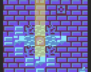
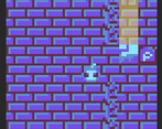
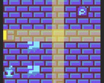
Nice game! Maybe not the best choice for color palette - sometimes was hard to find boxes and switches.
Nevertheless, good sokoban!
Nice fun interesting puzzles. I think the tiles could be made a bit clearer though, because it's a bit confusing to guess what does what.
Nice sokoban. But i wish it was more contrast. Overall, good job!
Yes, i argee with sugrado: art need to be more clear, sometimes i cant understand what i need to do. SFX is too loud, maybe need to add some slider or button to control them. But thanks, this is good game =)
The idea is nice, but the art makes things unclear, I was confused for a long time about what is what. Maybe more colors would be a good thing. After a few levels I got the hang of it and finished the game. The mechanics are solid.
Interesting take on an old classic, I liked the light beams. Several very interesting puzzles (second one was the meatiest) although some felt like they just played themselves. Several visual effects broke the 64x grid. Less contrast in the basic floor tiles (or a more diverse color scheme) could have gone a long way in readability.