Play game
Magical Girl Stop the Transformation's itch.io pageResults
Criteria | Rank | Score* | Raw Score |
Originality/Creativity | #32 | 3.154 | 3.154 |
Engagement/Fun | #35 | 2.615 | 2.615 |
Magical Girl Concept | #36 | 2.692 | 2.692 |
Overall | #39 | 2.431 | 2.431 |
Theme Interpretation | #44 | 1.923 | 1.923 |
Graphics, Audio, and Polish | #45 | 1.769 | 1.769 |
Ranked from 13 ratings. Score is adjusted from raw score by the median number of ratings per game in the jam.
How does your game fit the Magical Girl Genre?
Has magic power
Which theme(s) do you pick?
you fight a magical girl you are the bad guy
How does your game fit the theme(s)?
you are the monster of the week from a magical girl world
Are all your graphics assets made by yourself during the duration of the jam?
No
some of them were purchased; but most are stuffs made during the jam
Are all your audio assets made by yourself during the duration of the jam?
Yes
all of them were made during the jam period
Leave a comment
Log in with itch.io to leave a comment.
Comments
A solid whack-a-mole concept game! Everything works as expected. A little extra "juice" could definitely take this one to the next level. Sound effects, particles, camera shake, basically any additional feedback when the player scores a successful hit.
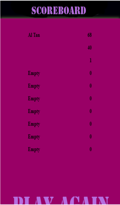
I got a highscore of 53!
Its a nice, simple, and straightforward clone of whack-a-mole with the Magical Girl as the visual theme. There is a lot of potential to be made in this type of game if the developer would invest time and effort into it. The basic mechanics is laid out well and would be a real gem if there is more polish, assets, design, and consideration to improve upon.
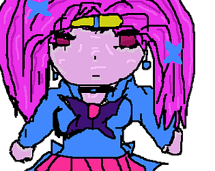
Magical Girl Concept: The magical girl design seems decent and is unique in its own art style.
Mechanics: The mechanics are really well done with no bugs or issue during gameplay. The high score system works fine as it retains player name and local score data with no issues.
Visual: Reasonable effort has been put into the originality and design of the Magical Girl character.
UI: Reasonable choice of color composition and layout but lacks a proper main menu even for a short game jam game.
Audio: There doesn't seem to be any audio being played during the game even when it is mentioned that audio assets is made during the jam.
Theme: The game matches the main theme which is Magical Girl but seems to not have mentioned any of the side themes. From my understanding of this game, I would say the most relevant theme would be the 6) Uncertainty Principle since there is a level of uncertainty where the next Magical Girl would transform and explode.
Challenge / Engagement: The level of difficulty is consistent through out gameplay since there is no noticeable changes in level size or speed when the game begins. The slight difference in design makes it difficult to tell a part from the group of Magical Girls at first but after a few attempts, I am able to see the art difference among all the sprites, the game ends up being easy to play and is basically up to the player's stamina and accuracy. The game is naturally engaging if a player were to aim for the highest score but the absence of variation in gameplay/difficulty and online high score, makes the game monotonous.
Originality / Creativity: The game employs standard game mechanics and nothing notable. The character design seem to be the only redeeming charm for its originality.
Story: No story present in the game.
Overall: I would say there is good effort in putting out the game however it feels like there is almost little consideration in actually creating/improving the game idea/concept. There are a ton of potential that a whack-a-mole clone can establish and would be great if the developer could put their thoughts into it by bringing out the best of its potential.
Suggestions and advice (if you choose to want to improve on the game): There is a lot of room in making this game great since it is mainly on its presentation and level of difficulty. These are some things I would point out that can make the game much interesting. The game could use a simple countdown when the game starts, since a countdown gives player's time to be mentally prepared before the challenge begins rather than dropping them right into the game with little time to even get their bearings sorted. A short tutorial would give a ton of polished to this type of game and it can be a simple "click on the sprite to stop the Magical Girl from exploding". Besides that, being able to resize the playing field or have curated level designs would add a level of variation to the game since it would help change up the play style and difficulty. Lastly, a single sprite may be sufficient for a game jam but having to polish it with several designs would definitely add visual appeal points to the game.
P.s. My highest score is 68.
Thoughts recorded during my playthrough
+ = I liked it
- = I didn't like it
* = Comment/neutral
====================
+ I love the concept! I haven't even started playing the game and we're already off to a good start.
- What's going on? How do I play?
- No music or sound?
+ Looks like a whack-a-mole game. Pretty unique, I don't usually run into games like this.
* The transformed girls are so similar to the non-transformed ones that I have a hard time telling which ones are transformed; fortunately there is a little bit of "motion" due to the differences in the art so there's a bit of a hint.
- It's game over pretty quick.
- It's not clear how many misses I get before it's game over.
- "Play Again" is kind of off the screen. This is true both in window and full screen mode.
Summary
This is a quick, unique game. The concept is simple and is fairly easy to pick up, but it lacks polish. Also noteworthy: it's not clear which theme this game is using.
its a great simple game with nice art and sure it may not have all the fancy stuff it is fun to play and to have a challenge of how far can you go. I feel like this game is for all ages and also for anyone with limited hardware. overall its a simple functional game witch is nice to see. Great Job !
Thank you so much, I will keep working hard.
This submission does not appear to have picked a theme, and is ultimately a game of whack-a-mole where it is difficult to see what's actually going on. One mistake, and you're out.
Clickteam... now there's a name I haven't heard in a long time.
For what it is, it works, and it's surprisingly fun, but there's just not a lot of game here. I think the only thing I really didn't like was the browser text box popping up to enter a name- it just feels really janky compared to having one in the game itself. As a small "what can I build with this technology" project it's fine, but... yeah, I just really don't have much to say here.
This message is directed to those who answered "No, some of them were purchased" to any of the last two questionnaires. Due to some complains regarding to the last two questionnaires, I have updated it to compensate for some circumstances in which those two questionnaires can't capture the full picture. I have updated the questionnaire so that it can slightly capture some more nuances (in particular, those who only used one or two outside assets but made the rest themselves). It definitely is still flawed, but because there are a lot of submissions already, for this jam, this is the best I can do.
If you don't mind, please honestly assess whether or not your responses (the answers themselves have changed) still apply; and if not, please click "Edit Your Submission" to refill your questionnaire.
I only used one outside asset
Understood. Then I suppose your answer already fits.