Play game
Magikard's itch.io pageResults
Criteria | Rank | Score* | Raw Score |
Engagement/Fun | #30 | 2.963 | 3.714 |
Graphics, Audio, and Polish | #34 | 2.621 | 3.286 |
Overall | #36 | 2.689 | 3.371 |
Originality/Creativity | #39 | 2.849 | 3.571 |
Theme Interpretation | #39 | 2.507 | 3.143 |
Magical Girl Concept | #39 | 2.507 | 3.143 |
Ranked from 7 ratings. Score is adjusted from raw score by the median number of ratings per game in the jam.
How does your game fit the Magical Girl Genre?
The protagonist is a girl that has magical abilities
Which theme(s) do you pick?
Conservation
How does your game fit the theme(s)?
It's about the Conservation of environment and you got to conserve card to do some kind of combo
Are all your graphics assets made by yourself during the duration of the jam?
No
some of them were purchased; but most are stuffs made during the jam
Are all your audio assets made by yourself during the duration of the jam?
Yes
all of them were made during the jam period
Leave a comment
Log in with itch.io to leave a comment.
Comments
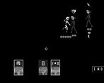
I'm surprised the game is surprisingly a gem in the lot because its a magical girl card game with procedurally generated level selection and has solid gameplay with its card mechanics. The developer seem to have went with a retro pixel art style in a monotonous color scheme which is alright considering that the sprites is consistent through out the game. The game doesn't have a tutorial or even a description on its main page then its an added challenge to the player to figure out the game and what each card actually do. The pictograms on the card is pretty obvious with the common attack and defend but there are some special card among the starter deck which I think increases attack power and some I have not been able to try out since I can't get past the second stage bandits.
Anyway, this is a surprising find in the game jam entry and although the objective is clear wiht the beginning of the cutscene, I hope the developer could furnish the main page with some details about the game.
I really means a lot. I was a little upset about the result so I left the game away. Thanks a lot for your comment Altan : it helps a lot.
Hi Cemus, no problem and I do highly apologize for my last minute review or your game.
Besides, I now have a reason to keep an eye on you so be sure to send in another magical girl game hopefully in the next MGGJ session (─‿‿─)♡.
I really like the concept on this one!
I enjoyed the card-base RPG approach, and it was cool to see the battle play out rather than just clicking on cards and seeing damage. The exploration/path element was interesting too, outside the battles.
I did find that I really, really need a tutorial. Even if it was just a readme text file, or instructions on the Itch page... I could figure out a lot of the basics, click on a card, select the target, attack, defend, etc... but some cards were a total mystery, and some of the other mechanics with the deck, magic, etc, I didn't understand at all.
I'd love to give this one another spin with more instruction. It's already fun without entirely knowing how to play, so I imagine I'll enjoy it even more with instructions!
I should have listen to my gf advice but I didn't implement the tutorial in time. My fault. Thanks for your review and your amazing game as well. :)
- Game needs a tutorial
- i give it go............ but i dont find card collection / deckbuilding based games fun.
it's pretty boring in all. Don't get me wrong, theres plenty of huge huge deckbuilding games out there
Just not for me.
i don't really get how this fits the magical girl theme also. it just seem's to be another pokimon / yogi-oh card battler
Thanks for your comment :)
Thoughts recorded during my playthrough
+ = I liked it
- = I didn't like it
* = Comment/neutral
====================
+ Quick-and-simple opening story
+ I like that there's a custom cursor so I know to use the mouse to interact
- Game needs a tutorial. I have no idea what any of the cards do or what the symbols mean.
+ There are action sequences when you play cards! Cool!
- The lack of tutorial makes gameplay confusing. What are my resources? What are my limitations? How does each turn work?
+ I like that playable cards have a bolder outline than cards that cannot be played. It gives me a better idea of what I can and cannot do during a turn.
- I seem to have broken the game by clicking "End" during an action sequence.
- Clicking the pinwheel icon in the bottom-right corner of the screen causes the battle to restart, but the previous instance of the background music continues to play while a new instance of the music plays; this makes the game unplayable.
- It's not clear to me why I would choose forest, sea, or city. Without proper explanation it basically boils down to a random pick.
- I like that there appears to be a route picking mechanic, but it's not clear at first that there are separate routes. I line running through each possible route would convey this better.
+ I like that the enemies' intentions are displayed above them before they perform their actions each turn. It works for Slay The Spire, and it works for this game.
- Even after a second playthrough I couldn't fully understand the mechanics of the game. Why do I get to play 2 cards on one turn but only 1 card on another turn? What do the "X 2" cards do?
Summary
This is a cool deckbuilding concept that appears to be inspired by my current obsession, Slay The Spire. The mechanics need to be better explained so players can understand how the game works and strategize better. The concept at the core seems solid, so I hope this game gets updated.
Thanks for your accurate review. I was indeed inspire by Slay the Spire and Baten Kaitos as well ;).
I really liked the game, so I'm going to be nitpicky.
Speaking of what I liked.
Overall, this is a very solid entry. Very nice job indeed.
Thanks, it means a lot. I agree with everything and I will take a mental note for potential future games.
I wasn't sure what to expect going into this one, but it's a pretty neat concept! Magical girl protecting the environment, card-based combat, and a retro aesthetic I don't see very often.
This kind of game lives and dies by its UX, and this one is more the latter. I was able to figure out how to move in the overworld, but it wasn't immediately obvious, and I could figure out how to attack but I still have no idea what half the cards do or what the symbols on them need. This is a program that needs a manual and doesn't have one. For the most part I enjoyed what I could play, but it was clear there was a lot I was missing and that hampered my progress through the game. At the very least it needs a textual tutorial, ideally I'd like to see better UX. Unfortunately I think the black and white retro aesthetic really hinders the readability of the UI.
I'm kind of on the fence about the aesthetic in general, to be honest. On one hand, it's unique and different. On the other hand, it's kind of hard to look at, and I like colours a lot. In the end I think it's better to try to differentiate, so I guess I'll fall on the "more a good thing" side of that fence.
The long and short of it though is that as much as I like the idea of this game, the poor UX and lack of instructions render it a much less enjoyable experience than it could be.
On a side note, the executable requires running as administrator, but is probably just an installer because extracting it with 7-zip yielded a game executable that does not. If you can find a way to avoid this, that would probably get a few more people trying it.
I appreciate your pretty accurate review. Everything is right and precise. I will keep your precious advices in my mind. :)
Short but with lots of depth. The retro aesthetic is nice and feels clean. I just wish there were an explanation on how the cards work and the mechanics.
Thanks a lot for your comment.