Play game
Fists of Magic's itch.io pageResults
| Criteria | Rank | Score* | Raw Score |
| Graphics | #1 | 4.500 | 4.500 |
| Magical Girl Concept | #6 | 3.833 | 3.833 |
| Overall | #7 | 3.696 | 3.696 |
| Polish | #7 | 3.583 | 3.583 |
| Engagement/Fun | #7 | 3.417 | 3.417 |
| Audio | #7 | 3.750 | 3.750 |
| Genre Mashup Incorporation | #12 | 3.333 | 3.333 |
| Originality/Creativity | #16 | 3.458 | 3.458 |
Ranked from 24 ratings. Score is adjusted from raw score by the median number of ratings per game in the jam.
How does your game fit the Magical Girl Genre?
The Player Character
Which genres from categories A and B did you choose?
Shut'emUp and Beat'em up
How does your game mash those genres?
Mix the mecanichics
Were the graphics/audio assets for your game made during the jam?
I made everything excepeted the sng
Leave a comment
Log in with itch.io to leave a comment.


Comments
Gorgeous pixel art and good music! Some of the mechanics are a bit wonky, for example I did not see the purpose of the dash since it did not seem to have any invincibility frames. Also it took me a while to realize I had combo strings because the window for continuing the combo seems very restrictive. The hitstop upon striking an enemy was a little too excessive as well and may have contributed to the trouble with comboing. With these difficulties, it feels impossible to dodge enemy attacks and thus to get very far in the game. That said, it's a very good looking core! I hope you continue with this.
Thanx a lot! I Didn't have time to polish the game and adjust somet things like the dash for example, but I'm working on this now without the limit of the jam. Thanks for the observations! :)
Seems pretty well done and already fairly polished. Needs some refinement on the gameplay mechanics like others said and I personally think the hitstun when the player punches something is a bit too strong and it makes the game overall a bit difficult.
I took the time to try both versions, the jam submission version (v1.01) and the current version (v2.01). For rating purposes I will comment on the jam submission one first, then I will give feedback on the latest version.
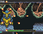
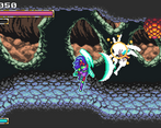
The graphics and animations are very impressive. It’s a pretty fun beat’em up, but really not much of a shoot’em up at all. The hits feel great and I like that there is a follow up punch animation when the enemy is near. The explosions of the enemies when they die feel very satisfying. Gameplay is minimal and the magical girl concepts can be fleshed out more, but understandable since it was made in a couple of days. There is one big problem with the fighting - the punches are static and cannot target enemies who are of a different elevation from you. Worse, you can’t get to the same elevation if there are obstacles/walls, so in some situations it can be difficult to even get into a fight. Nevertheless, I had a decent amount of fun beating my way through to the fire-breathing boss. Well done!
Now this is completely separate from the jam rating, just some feedback for v2.01.
The things addressed right in the current version:
The things worsened in the current version:
If I was rating v2.01, although all the added graphical assets and animations are awesome, I would probably give it a lower score than v1.01. Fists of Magic has great potential, and I can see it being really fun with more refinements to come. I look forward to seeing more of it. Keep up the good work!
Very interesting analysis, thanks for the feedback. I'm still polishing and refining the gameplay, so all comments are valid. :D
For a quick weekend project, this is pretty good.
I played the web version, I'm not sure what version this corresponds to.
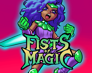
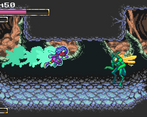
The art is definitely what stands out here. It's very nice retro pixel art that I could see coming from a SNES or Genesis game. The title card/key art is a different style, and it too is very nice. There's a surprising quantity of it, with detailed backgrounds and a decent variety of enemies, too.
The audio is whatever, but you've got to limit scope somewhere.
The gameplay, on the other hand, is really rough. It feels... stuttery, I think is the best way of describing it. I don't think this is a performance issue but just how the game is designed. I think this is because your attack leaves you locked in place for what feels like an eternity, and some attacks can stunlock you, too. Meanwhile, the enemies can pound on you. It doesn't feel fluid and it doesn't feel fun.
I didn't find the dash all that useful, but it is something I'd expect to be pretty situational.
I think one thing that's missing is an incentive to actually stand and fight versus just rushing past enemies as much as possible. A lot of beat 'em ups forced you to clear a section before moving on, if I recall, and something like that might work here.
I'm a sucker for narrative, and this game doesn't scratch that itch, but I don't think it was supposed to, so I won't hold that against it.
Thanks a lot for the feedback! I'm seriously thinking about putting these stops on the screen for combat, which will require a better balance of combat. As for the game's story, I'm writing the base that will be used in a comic book as well, so I'll apply the cutscenes when it's ready.
As I'm a graphic artist, this point ends up standing out from the others, but I'll try to work better on the rest. Thanks again!
Really nice game! Doubly impressive that it was all make in a weekend!
The graphics looked really nice, along with fitting SFX and music that gave it a great classic SNES/Sega Genesis era feel.
The gameplay was pretty good, though it would be nice to have a little more attack variety to spice up the beat-em-up feel. Also, and maybe this is personal preference, but I would have liked to still be able to move while punching. The boss was pretty simple mechanics-wise, but it worked well enough.
Having a story, or a little bit of background scenario or lore would also help pull me in too.
I think most of my critiques are things you might have addressed if you had started earlier in the jam, so this is still an impressive game! Really great work.
Also, a fellow Construct user! High-five!
Thanx a lot for the feedback! Gradually I'm making updates where I'm adding things that I didn't have time to put during the jam, like more attacks, story, and better moves for the boss. And Hi5! o/
This is a cute (and short) shoot 'em up/beat 'em up mashup. It's not without its flaws, but there's plenty to like too.
Things I liked:
Things I didn't like:
Thanx for the feedback, I'm working in a lot of changes for the new update, including more speed to player character and a second style of controls for keyboard. the spike bug is indestructible, i made a glowing reflection go through it when it gets hit but i will do something that makes it clearer for that.
Presentation-wise, this game is pretty massive with how animated and colorful everything is.
The idea of having a flying player in a platformer-like environment is interesting, however I felt the player was fairly slow to move around due to its low speed and having momentum (outside of the dash which needs to be recharged), and its main attack being fairly weak (the regular green enemies take a ton of punishment, eventually started running past them instead of trying to kill everything).
Thanx for the feedback! In response to everyone's requests, I will increase the character's speed in the next update. Green enemies will gain more attack range but will have less health.
Pretty solid game throughout. The graphics are incredible—I could tell from the moment the title page appeared. Responsive controls, fluid animations, great enemies. I can't believe you did this in a week!
Thank you very much! The base of the game, the alpha version, I did it in a weekend, just 3 days. Now I'll put more things to improve it.
reading the other comments, there is not much to add,
Overall: solid game play, but short and not challenging, pretty good for 3 days, specially considering you made all the art.
Keep it up, add a bit of story, its looking good.
Thanx a lot for the feedback. I'll put a little introduction in the beginning, maybe in cutscenes.
The player controls great and the mechanics are mixed in really well. I think this would work well if it was expanded to include more levels and bosses. The boss was very easy to beat, so it felt kind of anticlimactic after the stage portion. It was still fun to play, and the pixel art is really well made! Good choice of music too.
Thanx! I made the whole game in just 3 days by myself, so I couldn't put everything I wanted until the end of the Jam, but I'm going to work on it now! including a better Boss and more levels :)
Yo....This game was really good!!! It looked and felt great. I died once and then was able to beat the boss. I have a few issues
Using WASD was really tough when you needed to make quick decisions.
You need a pause button.
Other than that, fantastic job!!! You've gotten the highest marks from me so far.
Thanx for the feedback! Soon I will put an option to change the keyboards commands between WASD or Arrow Keys. :)
This was a cool game that I was engaged with right away. It has a lot of potential but at the same time a lot that could be expanded upon/improved to really hit a high.
First the basics:
The controls were very weird to me, while they were basic enough to not be an issue arrow keys + z x c feel like a much more natural fit for the type of game this is. Of course any control scheme will have someone complaining until you make them fully customizable and this wasn't a huge deal.
The art was great, it pops out and is easy to understand but still exciting in a lot of ways.
The one oddity was the boss, who looked like they were from a different game due to not having a dark outline, using dithering for shading, and using a generally less saturated palette than the other characters.
For the player feel: overall good, albeit slow. The dashing was very satisfying although it didn't really seem useful in the level outside of getting a head start against the boss to fit in more punches before needing to move again.
The enemies were cool but didn't feel threatening given as long as you were punching you were basically untouchable since there range was shorter than yours and punches stunned them.
If the player had faster movement leaning in on enemies that shoot at you while you generally need to get in close to punch could be a really cool dynamic.
Speaking of faster movement I feel like the entire game could be speed up 1.5x and feel a lot smoother.
Being said the core mechanics felt good, and it felt good having this character beating up bugs, with the character design being a big plus in it being engaging.
Thanx for the feedback! The base of the game I made myself in just 3 days, so I couldn't put everything I wanted (the boss would be something completely different for example). I plan to make future updates where I already intended to apply some of the things you mentioned, including adding more Shmups elements. Thanks again! :)
This was a cool game that I was engaged with right away. It has a lot of potential but at the same time a lot that could be expanded upon/improved to really hit a high.
First the basics:
The controls were very weird to me, while they were basic enough to not be an issue arrow keys + z x c feel like a much more natural fit for the type of game this is. Of course any control scheme will have someone complaining until you make them fully customizable and this wasn't a huge deal.
The art was great, it pops out and is easy to understand but still exciting in a lot of ways.
The one oddity was the boss, who looked like they were from a different game due to not having a dark outline, using dithering for shading, and using a generally less saturated palette than the other characters.
For the player feel: overall good, albeit slow. The dashing was very satisfying although it didn't really seem useful in the level outside of getting a head start against the boss to fit in more punches before needing to move again.
The enemies were cool but didn't feel threatening given as long as you were punching you were basically untouchable since there range was shorter than yours and punches stunned them.
If the player had faster movement leaning in on enemies that shoot at you while you generally need to get in close to punch could be a really cool dynamic.
Speaking of faster movement I feel like the entire game could be speed up 1.5x and feel a lot smoother.
Being said the core mechanics felt good, and it felt good having this character beating up bugs, with the character design being a big plus in it being engaging.
Cute game. MC a bit slow. Sometimes enemy will "stop" by the wall. Maybe intentional?
It's not intencional, but I think I know the problem to fix that. Thanx for the feedback. :)
Visually a great game, working controller support is a big plus. The player character feels underpowered; her movement speed is slow, killing enemies takes too many hits, the dash takes a long time to recharge and is slightly too short. The grasshopper enemies have about as much range as you, and when you dodge past them, they turn around and hit you from behind. Not fair!
Overall it's fun for a prototype, although a pretty conventional way to genre-mash.
I didn't have time to do the combos and special attacks, in the end it ended up making the character weak, but I'll work on that in the future. Thanx for the feedback! :D
I think the mechanics were unfinished didn't really feel the shmup part, except the 1inch range, but okay fair enough it is still a range attack. But I thought there was gonna be more on the fist magic part to be honest. I can see it definitely being more fun when you have combos added, movement increased, fist attacks being bigger. Has potential.
In only 3 days I can't put everything I want to do in the game, but I'll work on It. Thanx a lot for the feedback :)