Indie game storeFree gamesFun gamesHorror games
Game developmentAssetsComics
SalesBundles
Jobs
TagsGame Engines

CROW'S NEST

169
Posts
465
Followers
366
Following
A member registered Jun 15, 2020 · View creator page →

Creator of

Recent community posts

Does it let you type when highlighting the box then pressing the shot key? [Z on keyboard / A on gamepad by default]

cute game

Thanks for playing!

Could you post a screenshot of the cropped screen and what your resolution is?

(3 edits)

Thanks for playing!

The player does actually respawn with bombs in a sense, in that you drop a lot of bomb items when you die and you keep your bomb stock from your previous life.

This way, on top of the fact that extra lives are consistently available every 1 million points, dying on purpose to regain bomb ammo (especially during boss fights where there are no ground enemies to get bomb items from) is encouraged.

This is one of the reasons that dying is perfectly fine here and that lives should be treated as a disposable resource, with the other reasons being that the death explosion can be used offensively (by purposely ramming into enemies to do a ton of damage), and as a combo extender (due to it working like a bomb scoring-wise and freezing the combo timer while the player is dead).

Thanks for playing!

It seems that the issue with the dialogue system being too slow is caused by high refresh rate monitors dropping inputs for the “next” button (it works fine at say, 60hz + VSync), so this should be fixed by the next update.

Being able to bomb spam on bosses was definitely a big regret, so I’m looking to address that too.

Cute aesthetic and fun to read what’s there so far. The fast, automatic walljumping felt kind of strange at first but got used to it after awhile. More obvious effects for what picking up the crystals actually does would have been nice, I think the most I noticed was the second boss’ health being reduced(?) a bit, assuming that’s an effect of it.

The main train gimmick is quite unique and leads to interesting ways to deal with patterns outside of raw movement.

I found the camera while not sprinting to be too close to your character, and the camera movement when moving from one side of the train to another was pretty jarring and gave me a bit of motion sickness. I ended up handling a lot of patterns by sticking to one side of the train for as long as possible (to avoid dealing with the camera movement caused by doing so) unless I was forced out of position.

3D danmaku (and signposts) is fun to see as always though I had a hard time with depth perception, especially with the pattern where it descends on you since the bullets have no shadows on where they will land on the ground.

Do you happen to be using a VPN?

See this thread for more details: https://itch.io/t/667208/getting-connection-refused-error-in-frame-for-unity-html-game-xeewolf

(2 edits)

Thanks for the report!

That’s unfortunate, I may end up delisting that build for now until a fix happens (whether it’s on my end or Unity’s end is another story, seeing how naming is disabled on the WebGL build due to what seems to be an issue with Unity’s implementation) if it gets really out of hand.

[EDIT] Should be fixed now! Download v1.1.1!

(1 edit)

After a few more plays, I think the player could have benefitted from being a lot faster (either from unnormalized diagonals or just faster overall), noticing that if I’m not losing medals to areas locked off by a bomb, I’m losing them from being too slow to keep up with them.

The gravity applied to medals is also a bit much, especially if the medal is spawned high and flies above the screen, meaning once they finally come back into view they are moving crazy fast.

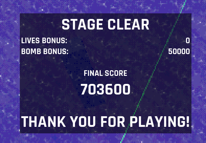
Oddly enough I’m now also having trouble replicating my 700k score from before despite maintaining a 128x medal chain until the last few waves with the repeated 4 large enemies and clearing with lives in stock, often getting anywhere from 300k-500k instead.

(1 edit)

Thanks for playing!

Unfortunately the dash seems to suffer from an issue where the input can be dropped at high framerates (and also low framerates in the case of the web build), so if you happen to be using a high refresh rate monitor try playing at 60hz on the desktop build instead.

Thanks for playing! :>

On the last bit, my favorite (official) Touhou game is Mountain of Faith for its fast stage pacing and (most of) its scoring system.

Deflecting stuff is a lot of fun and has a lot of creative effects, just wish there was more to certain parts of the game like having enemies move around instead of functioning like turrets and having some kind of scoring system.

(1 edit)

Visibility is definitely one of the bigger regrets with this game, with your sprite and/or your hitbox easily getting lost in a game that asks you to dash directly into where the bullets are coming from.

Gameplay-wise, the game is generally more intended to be forgiving in the casual survival department (namely with the fact you can’t actually die, so the only way to lose is to run out of time - this in itself may have gone too far and probably should have had a lives system to make survival more meaningful), and emphasize difficulty and replay value with scoring instead.

Spamming dashes is quite effective for DPS/survival purposes, but not necessarily for scoring purposes since dashing at all resets the secondary multiplier gained from killing enemies with dashes. The intended (optimal?) strategy regarding dash kills is to start a big juicy dash kill multiplier by dashing through a group of weak enemies, then maintaining that combo by only shooting enemies until that combo expires since another dash will end the multiplier early. Only once the dash multiplier expires (or a better combo opportunity presents itself mid-combo) is it a good time to dash again. But overall, both circle-strafing and liberal dash usage are both valid strats with varying effectiveness.

Taking a hit is basically a non-issue when it comes to survival, but when it comes to scoring it can be problematic due to the short timers associated with the scoring systems now being taken up by your character being stunned. Originally the scoring penalty was even harsher by immediately killing the timers for both multipliers.

Though of course if scoring isn’t really your thing then none of this really matters (though as long as you could enjoy some parts of the game casually then it at least wasn’t a total wash); the intended audience is really those who like pushing/replaying short, arcadey games as far as they can.

(4 edits)

Yeah, unfortunately visibility ended up being a bit of a wash especially on Lunatic - easy to get tangled up in everything when the scoring revolves around dashing directly into danger along with not having any i-frames or bullet cancels the moment the dash ends.

As for the controls, what keyboard layout do you use and what dash key(s) would a better choice have been for you? This game only really had an American QWERTY layout in mind, so I ended up going with keys that I often see being used for dashes in other games (though the V key now that I think of it might have been an alternative to using space), with the exception of right clicking being an option since aiming/shooting doesn’t use the mouse.

Welcome to the top 10, by the way. :>

(1 edit)

Neat concept with some pretty creative level design and music sync. Oddly enough I found the first stage to be harder than the second. It would be nice if the player had some i-frames, because it’s far too easy to get hit repeatedly the same bullet across multiple characters.

And somehow I forgot about a really important one: 8-way shooting instead of a full 360 degree aim.

Unfortunately it seems like the dash bug comes from either high FPS (from high refresh rate monitors) or low FPS (from the WebGL build). I recommend capping the game to 60 FPS (and playing the desktop build) to avoid that.

Unfortunately it seems like the dash bug comes from either high FPS (from high refresh rate monitors) or low FPS (from the WebGL build). I recommend capping the game to 60 FPS (and playing the desktop build) to avoid that.

Gold drops for a few seconds immediately after a dash kill, and this time is extended slightly by quickly killing more enemies afterwards.

Assuming you’re on a high refresh rate monitor, the game tends to drop dash inputs at higher FPS so you would have to cap it to 60. Though if you were playing on the WebGL build, that tends to just have bad performance and drops inputs there too.

(1 edit)

The theme was used on a few aspects, though the only really overt ones are the limited timer to clear a stage and limited play area where mostly everything fits into the camera. In a less obvious case, the player can actually only have up to 12 shots onscreen at once (equivalent to firing 4 times), encouraging pointblanking enemies so you never hit that limit.

Subtler uses of the theme comes from the scoring system, all of them being different flavors of time limits (a timer for the long-term gap kill main multiplier, a timer for the short-term dash kill multiplier, and timers to collect the gold spawned by dash kills before they despawn).

(4 edits)

Up front, the aesthetic and soundtrack are crazy good, and the black hole mechanic shows a lot of promise. Unfortunately, I had a handful of issues with both that mechanic and enemy design.

The black hole is fun to use when you’re already in position to land a shot, but otherwise the combined very slow move speed while charging it and the fact that it can damage you if charged too long make it a chore to use. In practice, I used it less for the actual laser attack and more as a small bomb by spamming short charges, minus the times where I was forced to use it to deal damage at all.

I found the enemies and bosses quite tanky, especially the small square enemies that I thought would be popcorn enemies at first. The bullets for a lot of enemies also had visibility issues, either because they were the same color as the player’s shot, or because they were to dark against the background.

(1 edit)

[hard version, beaten up by boss 3]

So on the surface the game is quite pretty and the the soundtrack is quite nice, but unfortunately gameplay-wise I’m quite mixed.

The walls instantly killing you is extremely nasty, and wish they just bounced you away while dealing survivable damage or something.

The stages themselves are paced quite too slowly, which when combined with how tanky every enemy is (and the absence of any popcorn) makes them kind of a slog to go through even if they’re not necessarily hard, especially if you’re trying to replay them after getting suddenly vaporized by a wall during a previous run.

The player is rather plain to use, with a fairly static shot (unless you choose the wide shot upgrade at which point you can start pointblanking things), and no other mechanics to play with like other weapons or scoring systems to interact with. I also noticed that if you continue the game strips you of your weapon upgrades, which I wasn’t a fan of.

The game definitely picks up during boss fights and makes use of the walls in fun ways, but the aforementioned one-shotting from the walls also hurts. Unfortunately the bosses also share the same kind of tankiness as the stage enemies, making them overstay their welcome by a bit.

Pretty cool overall, the Cho Ren Sha influence is definitely strong here.

I ended up ignoring the limited weapon system for the most part because I was doing the item carrier trick instead, which let me just brute force my way through tougher parts with bombs and the bombs given by those carriers’ extra lives.

A few gameplay issues I had came mostly from the enemies - it didn’t feel like there was a lot (or any?) popcorn throughout the stages, and it felt like an unusually large amount of enemies coming from behind existed.

A technical issue I had is that the game was locked to a small window on my screen, with no(?) way to put it in fullscreen.

Pretty genius use of theme, with a lot of fun to be had in how you move the wheelchair, especially the fact that whether you roll backwards or make U-turn affects drone positioning.

The idea of slowly powering yourself up in a dim environment to fight a tough enemy over a long period of time is nice, but unfortunately the way it was executed fell a bit short.

What it eventually boils down to is holding down both fire buttons (which after awhile takes a toll on the wrist) the entire time to chip away at a mostly non-threatening big enemy and mowing down tons of smaller enemies.

Had a lot of fun with this one for the most part, chaining recharges especially is really cool.

My only real gripes come from the player’s main gun, where powering down completely when you die is a bit annoying, and the gun itself is a bit plain to use (maybe if you could pointblank with it with a wider shot or shot limit?).

On the technical side, I felt like I was squinting the whole time because the resolution/fullscreen options didn’t work for me, so the game only filled a small part of my 1920x1080 monitor, on top of occasionally clicking outside the window when trying to shoot at distant things.

Enjoyed this one a lot, its bombing system and medals were fun to play around with, and the visual style is really neat.

One minor gripe I had though is that the player’s shot feels rather static, where even though it’s technically a wide shot you can do things like hit the boss with all parts of your shot while half a screen away. Perhaps if it had a shot limit or wider spread?

It would also be nice if using a bomb could be used to bounce a medal upwards to bring them back to somewhere reachable, considering bombs will eventually start cutting into your ability to collect medals.

(1 edit)

Nice to see a game that encourages speedrunning! Though I think in this case how rarely the player’s ammo spawns is a bit at odds with it, with a lot of downtime happening before an enemy fires its blue bullet pattern again and letting you keep progressing, on top of the player’s shot being rather slow and hard to hit with in the first place.

Pretty fun overall, only real gripes is that the game could really use an autofire toggle since you’re basically holding down the trigger the entire game, and that not only are player and enemy bullets the same color - the player’s bullets are drawn on top of the enemy’s bullets.

Story was short but cozy, though it did feel a like a cliffnotes version of itself at times with how fast/short some conversations and thoughts went. Got a bit of a chuckle of out of the “similar looking coffee shop” scene with its flipped background.

As for gameplay, I felt pretty unengaged with trying to dodge most of the time since your health bar is so massive you can just facetank the game’s patterns, a lot of which is either difficult to read because of coming from multiple directions at almost all times or walling you off unless you use a bomb/med.

While this game is quite pretty on the surface, gameplay-wise the mouse movement felt way too sensitive (especially on WebGL, desktop less so), and aiming parries felt very strange to the point where I basically selected every boss by accident. Oddly enough, during the actual boss fights it felt like my parries were aimed at the boss every time.

While it’s true that the dash is strong and can be spammed for survival purposes, it’s actually very bad for scoring purposes due to the fact that it resets your dash kill streak.

Think of your dash as a combo starter, and your shot as what briefly extends the combo afterwards. Repeating that cycle after the kill streak expires is what rakes in bigger gains.

Unfortunately from what I can tell, it seems anytime the game performs badly (visible stuttering despite high FPS, or just low FPS - the former from a second-hand account from a player with a high refresh rate monitor and the latter I’ve experienced on the WebGL build) it becomes liable to swallowing dash inputs.

I really wanted to add an input buffer for dashes to counter this, but for now it seems the only way to avoid this is to play the desktop build with a 60hz display (and also just not letting too many enemies fill the screen).

Hilarious premise and presentation - though as for the actual gameplay it would be nice if Dimitrio’s gun moved into place before firing rather than immediately snapping into position, would help with reading his increasingly faster shots.

(1 edit)

[casual cleared, extra died]

Having a 3-color version of a polarity system is interesting, but in practice quite difficult to manage.

I had more fun with patterns where large patterns were using single colors of bullets (such as rings and lines), and had a lot more frustration with patterns that rapidly alter which color they’re firing mid-pattern. The latter is at its meanest during the extra stage, where lines of multi-colored bullets are used, which when mixed with another pattern that was already happening made reading the pattern at all pretty hellish.

Unfortunately I had to turn down the sound after awhile, as it is very harsh to listen to.

[got walled pretty hard by the boss after the ascent section]

Very nice presentation and the main homing attack mechanic is interesting, but as a whole the game is quite difficult to get to grips with.

Initially I had a very hard time with the controls, so I went and used JoyToKey so I could use an Xbox gamepad instead which felt a lot more natural.

Afterwards, the controls made more sense during the grounded sections, but when the ascent section happened it made me wish more that you were just flying by default.

Limit Breaks being tied to your ammo/graze meter in practice meant I basically never filled the graze meter that high unless I intentionally milked an enemy due to how slow it fills. Perhaps if it was its own resource entirely instead of sharing it with your ammo or if ammo was unlimited?

Bullet visibility is rough at times, namely anytime the background is the indoor rocky area and the bullet is grazed/darkened.

(1 edit)

[tried hard then normal, got slapped by the very last pattern]

The mechanic of shooting and retrieving your shot is pretty fun use of the theme, though I wish there was an indicator for where it is offscreen similar to the boss. I did find the boss quite tanky (despite it only taking 8 hits every pattern) during later patterns due to how much downtime there is between shots and the space dodging puts between you and your shot.

3D danmaku is always fun territory to explore, but unfortunately here I was having a lot of depth perception issues. Bullets are hard to parse with their lack of shadow and lack of an indication of what direction they’re facing, and the ribbon attacks are even harder to parse due to being almost featureless.

[Rapid shot type, 2 death clear]

Really dig the game’s presentation, would be nice to see an expanded game with this visual style.

My main critique is that the stages are quite slow-paced and there aren’t any real mechanics to dive deeper into the game with (scoring systems, player mechanics, etc).

However what the stages themselves lack the bosses make up for with interesting patterns, though they do die a bit too quickly to really appreciate them.

Pretty cool overall, only real rough point I can think of is the first boss’ final pattern being a bit obnoxious to hit and wondering how things would play out if instead of the medal loop system existing, you were just allowed to keep max value medals for as long as you could.