Play game
Magical Eviction's itch.io pageResults
| Criteria | Rank | Score* | Raw Score |
| Magical Girl Concept | #26 | 2.722 | 2.833 |
| Audio | #29 | 2.402 | 2.500 |
| Theme Interpretation | #31 | 2.242 | 2.333 |
| Originality/Creativity | #31 | 2.082 | 2.167 |
| Gameplay Polish | #33 | 1.601 | 1.667 |
| Overall | #33 | 2.116 | 2.202 |
| Engagement/Fun | #34 | 1.761 | 1.833 |
| Aesthetics | #35 | 2.002 | 2.083 |
Ranked from 12 ratings. Score is adjusted from raw score by the median number of ratings per game in the jam.
How does your game fit the Magical Girl Genre?
We have two magical girls harnessign the power of the elements
Which theme(s) do you pick?
6. "This entire city must be purged."
How does your game fit those theme(s)?
The Magical girls need to destroy a facility that's abusing the Earth harnessing the power of the elements.
Were the assets for your game made during the jam? Elaborate as you see fit.
No purchesed assets was used.
Leave a comment
Log in with itch.io to leave a comment.


Comments
Great music, kinda reminds something Sega/Touhou would do (do mind to share it?). I found the model cute. No facial features but I think it fits to the enviroment. I don't mind it being lacking textures, it just needed some outline. A hard game but you can try as long as you keep gaming and the enemies stays at the same place as before. So as soon as you get the hang of it, just works. Camera is a bit hard to understand sometimes. I get the isomeric nature but it took awhile, I managed in the end (I reached the teal thing but what do I do next?). Iddle animation happens as soon as we stop moving, a bit distracting.
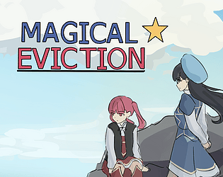
Hey this was pretty interesting! I kinda liked what you did with the camera, I think it makes for a pretty interesting perspective - it's kinda like a side-scroller but not. I guess? I don't really know how to explain it. I think the only issue with it is that something definitely become hard to see, and you can have enemies really get the drop on you if there's no way for the camera to see them. There's a lot of areas that could use some polish, most notably the blank obstacles were pretty difficult to tell apart which made it difficult to navigate the level, and sometimes the little sphere that was the cursor would be up against my screen instead of aiming at the enemy (I imagine it might have been an invisible wall? But I'm not too sure.) I liked the designs of the characters though, and I think the opening graphic was very nice.
Thanks for uploading!
so many broken things, controls, anims, effects ... Good effort ! Next time keep it simple ?
Yup, we aimed pretty high and then just everybody got lazy!
I liked the preview of the game. The game lacks textures, I literally didn't know where I was. And with a static camera it's very awkward to control the character.
yup i just totally got lazy about the props and textures also!