Indie game storeFree gamesFun gamesHorror games
Game developmentAssetsComics
SalesBundles
Jobs
Tags
A jam submission

Out Here AloneView game page

A minimalist sci-fi/horror roguelite, featuring space combat, exploration, and local co-op multiplayer.
Submitted by BlackVoidMedia (@BlackVoidTytan) — 1 hour, 47 minutes before the deadline
Add to collection

Play game

Out Here Alone's itch.io page

Results

CriteriaRankScore*Raw Score
Overall#14.4054.405
Progress#14.5714.571
polish#14.4294.429
Audio#14.7144.714
Graphics#14.7144.714
Innovation#24.2864.286
Fun#53.7143.714

Ranked from 7 ratings. Score is adjusted from raw score by the median number of ratings per game in the jam.

Devlog (optional)
https://blackvoidmedia.itch.io/out-here-alone/devlog/524600/marathon-jam-3-pre-alpha-demo

Leave a comment

Log in with itch.io to leave a comment.

Comments

Submitted(+1)

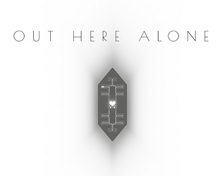
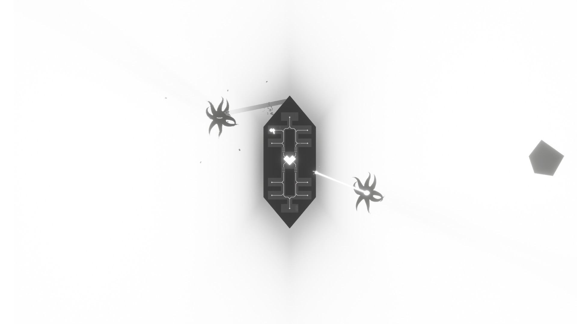
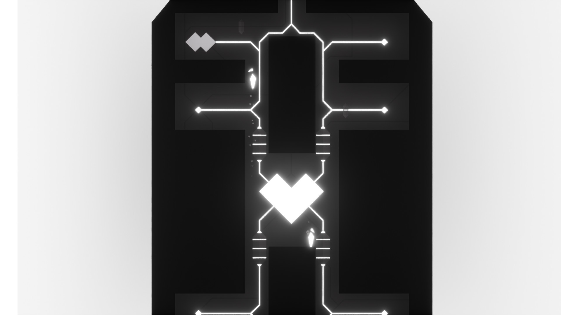
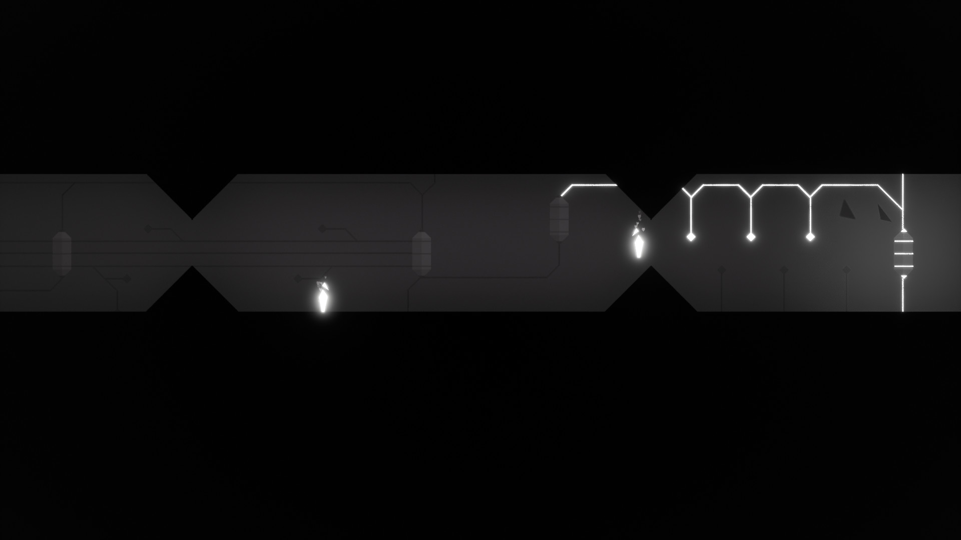
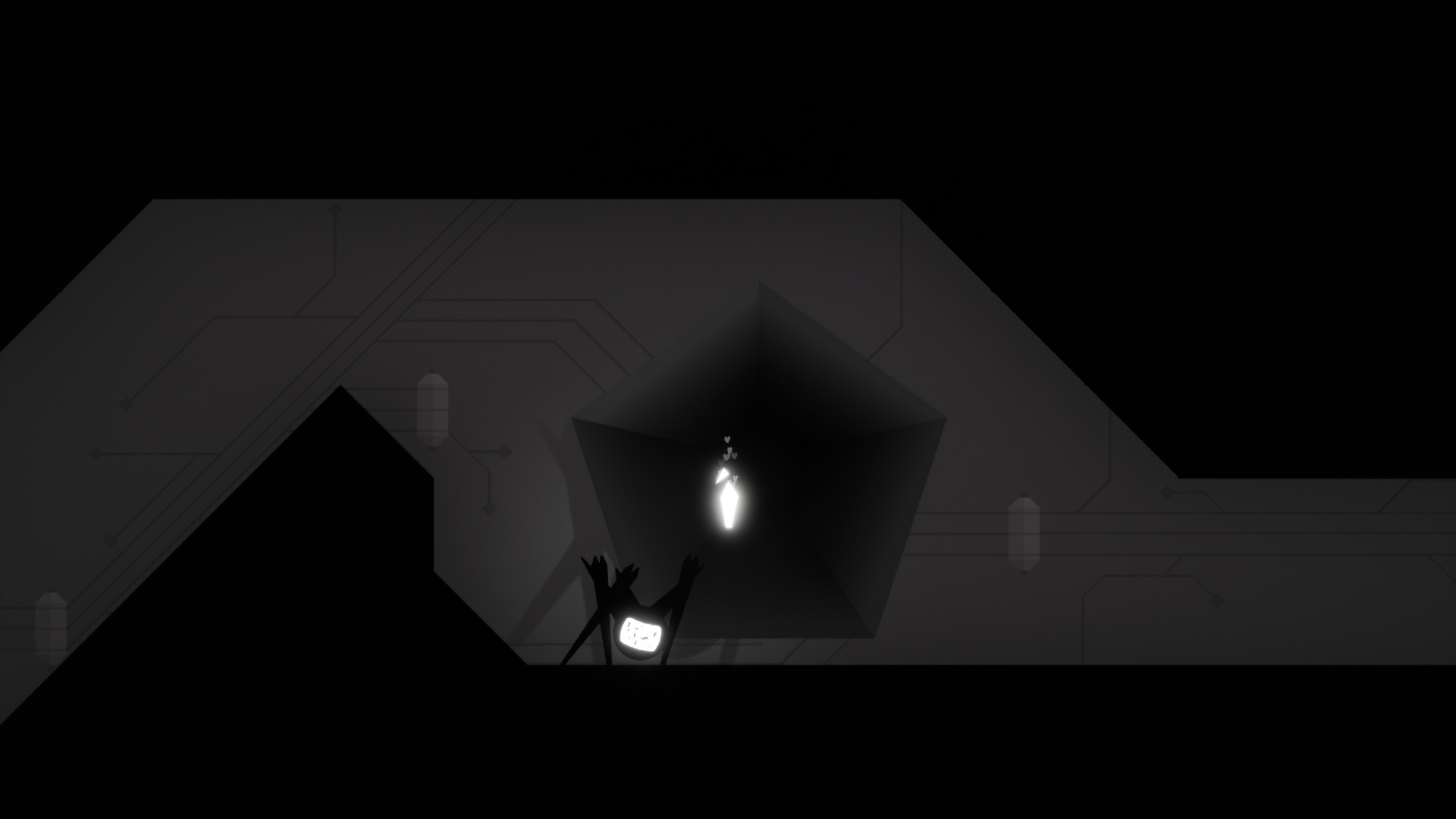
Amazing demo. Mood, atmosphere, world building and narrative are all top notch. I didn't get to finish a run yet. When the control node got damaged and it needed to be repaired, I didn't know where to find the minerals to fix it. I found them earlier in the run. Unsure where they were stored.. When went to interact with each of the nodes, nothing appeared to happening. You got me hooked though and want to finish to see what's beyond the gate. I enjoyed having waypoints and exploring. It was exciting not knowing what I was going to find.

A couple things I could see improvements on.

Tutorial

I would like more guidance. I didn't quite get the split mechanic yet and probably missed a few more things. I could see a "control panel" on the ship with "tutorial" of current task, what the player to do and reminder of the control would being useful here.

Enemies

Love the art and effects. Attack is simple and the point. One thing could be improved was that they
overlap with each other. Looses it's immersion and "danger" when they are clumped up.
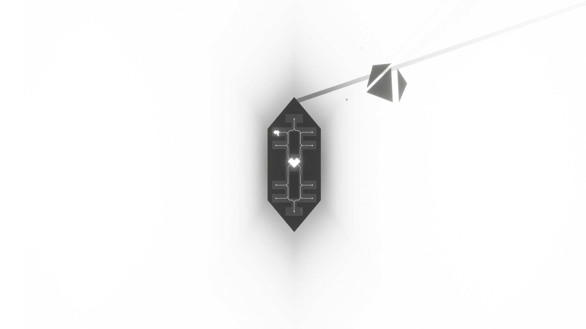
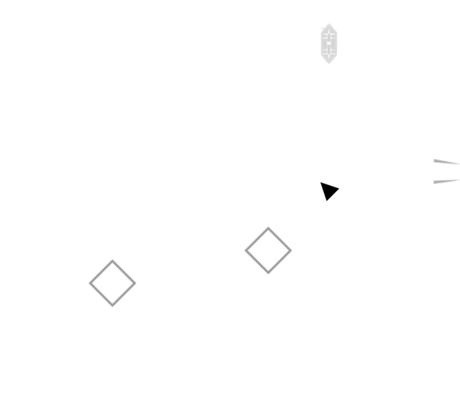
Weapon

Two small nit-picky items.

First is knowing where you shooting. You start the beam and adjust your aim accordingly. Having a cursor or something would be nice.

Second, if you turn on beam, turn off beam, move mouse (say down), and turn on beam again, the beam starts in previous position and moves/rotates to the new one. I don't think that give the intended effect of the weapon, I would expect it to be snappy and powerful. It makes it feely sluggish by needing to "wait" for the beam to point to where I want. Adds an unneeded delay. The worst case would be a full 180 by, for example, aiming on right and quickly switching over to the left. I have to wait for the weapon to get there. 

Once it hits the target, it's very satisfying.

Sound Fx are really good for everything and can't wait to see more. Great Job!

Developer(+1)

Hey Aaron, thanks for much for playing, I'm glad you enjoyed it! I should have made it more obvious but the split mode is basically multiplayer mode :) And to fix a node, you just shoot it with your character's beam, no minerals required (minerals fix the ship's hull).

Definitely seems like the tutorial needs work and yeah, fixing the clumping enemies is on my list already haha. I'll also make a note about the beam position, that's great feedback and something I hadn't thought of, thanks!

Submitted(+1)

Awesome game, very atmospheric and polished. Love everything about the art, music and the font used!

To echo the previous comments, the tutorial dialog definitely needs a complete next line rather than a total skip for the beginning dialog as its basically a muscle memory for me (and I assume others) to do that on dialog boxes so I missed a few things. 

Just few suggestions:
It was a bit hard to tell I was moving in the ship at the very beginning, confusion increased by accidently skipping relevant tutorial text (I actually think the speed of the ship is a good pace, it feels like you are travelling). A zoom out when you are piloting it might be cool, it possibly feels a bit too zoomed in.

Death 1:
On my first run, the first enemy I found was one of the "4 hp" cubes and it killed me, Not necessarily an issue as its fun to learn, but some notes on death 1:
1) I wasn't sure what my HP was 
2) It looked like I did no damage to it after a short channel, and then THOUGHT it required directional damage onto the squares to turn them off, which my 2nd run taught me it doesn't.
3) I tried to run past it into a long dead end corridor 

Death 2:
I got past a space combat, entered the derilict spaceship a different more scenic way, killed a small cube and a big cube and then got to a fancy floating quest objective, where the narrator started talking to me about how I'd reached the energy source. As I was drifting around reading the narrator, the mysterious energy source oneshot me XD

I was going to suggest checkpoints but I see its actually a roguelike from the description.

 Did you consider having this a roguelite instead with some kind of checkpoints? I think its a bit of a clash between it being pretty calm and exploratory with permadeath.. but it could just be a skill issue.

I think having to go from the very start again with the ship control / tutorial feels annoying, but I guess it depends how often the player dies.

Developer

Hey, thanks so much for trying it and for the awesome feedback! Yeah, I think it definitely needs to be more obvious when you're dealing damage to certain enemies. Also it's interesting that the energy source one-shot you as that shouldn't happen haha... was there an enemy lurking in the same room? I may need to prevent enemies from spawning in that energy source room.

Regarding checkpoints, I'll see how that feels in the final game before making a decision on it - for the demo level I'm spawning in all enemy types as I wanted people to experience them, but in the actual game a lot of those stronger enemies won't appear until higher levels. So hopefully the difficulty will ramp up slowly. There will also be powerups and upgrades to help you. That said, if it still feels too unfair at that point then yeah I might consider some kind of checkpoint system :)

Thanks again!

Submitted (3 edits) (+2)

Hey Tytan, great job! 

👋

Standout features: 

 -Art Style: The aesthetic design is great, it has a sleek, sci-fi like feel to it that helped me feel immersed into the game’s environment.

-Ambiance: The ambiance is great, I felt a sense of suspense and as though I was diving into an unknown world that was wanting to pull me into its abyss.

-Minimal UI: This is a hard one to pull off as some players need more info than others, but for suspenseful games like this, the minimal UI works very well.

-Mystery: The game provides a certain degree of ambiguity and mystery that leaves me intrigued with what might lie just around the corner.

Recommendations:

Show current objective (Maybe): I like the abstract nature of the game, so perhaps this doesn’t have to be so direct, but there were times were I was still trying to process the instructions/controls I was being introduced to during dialogue and ended up forgetting what the current objective was. Perhaps some sort of indication (could be slightly delayed if you want the player to try to find out what they need to do first) of the current objective could be helpful.

Display node name and function when overlapping it: This is similar to the show current objective situation, while processing which controls do what, I was also trying to keep track of which nodes do what, and which shape represents which node. Perhaps showing this information could be helpful, but I get the sense that one of the aesthetic traits of the game is minimal UI, so not sure if this is a no-go for you in that regard.

Perhaps you could show it, and once they indicate understanding of the node, you no longer show it. For example, the node that allows the ship to move, it's info could be hidden after arriving at the first destination. The targeting node, after selecting the first destination, Etc.

Potential bug when spamming the q button to split: Unfortunately I was not able to easily reproduce this one, but it did happen on both of my playthroughs. When spamming the merge/split method the character appears to get stuck in the merged form, the split function is disabled, and the character continuously veers to the left side of the screen even with no key input occurring.

Complete dialogue rather than skip: During dialogue, some people may prefer to read at a faster rate without entirely skipping the text, I recommend that the first click of the interact key (E in my case) auto-completes the current dialogue, and then the next click moves to the next dialogue sequence, this allows for fast readers to absorb the info at their desired pace, slower readers to click nothing, and those that want to skip to still be able to.

Arrow placement upon selecting a targeted destination: I think this might be a bug, when selecting a destination I noticed the arrows showed up for destinations that were more horizontal rather than vertical, I wonder if the arrows are placed using a constant distance value, considering the view-port height is less than the view-port width it might be that the arrow is there but off-screen, if so I’d recommended setting the arrow placement based on the minimum between the two or bounding the arrow to always be within the view-port.

Arrow placement after reaching and completing a destination: (noticed this mostly with the mineral destination points) the arrow placement will remain showing despite completing that destination potentially convincing the player to continue in that direction despite having no active targeted destination.

Here is an image of the ship at the furthest right it can go, yet the arrows still point to the right:


This is great work Tytan, I'm looking forward to further developments on this project! 

👏

Developer(+1)

Hey, thanks so much for trying it and for the awesome feedback! The direction indicator is indeed a little buggy at the moment, as is the split mode, PracticalNPC found some interesting bugs there too :D

It does seem like some kind of objective indicator is needed, I'll try to think of a way to include it subtlety as I do want to keep that feeling of mystery and encourage the player to explore. As you mentioned, it could be something that prompts the player after x amount of time.

Thanks again!

Submitted(+1)

I wish pressing e once shows all text on the dialogue first,then press again to continue the text.

Developer

Noted, thanks for the suggestion!

HostSubmitted(+1)

This already felt well-polished! great job!

Things I liked:
- the animations, aesthetic, lighting, and shadows were really well done
- the world-building shows a lot of potential, I loved how the Ship was sentient (AI?)
- The sound design was amazing

Improvements I think should be made (just my opinion):


- ship travel was a little too slow

- The combat wasn't too engaging, I thought it was too easy/mindless

- something to remind the player of their objective if they forget 

- I know it was a demo but I wish there was more to it!


All in all, great work so far! I'm excited to check out your future updates! 

Developer(+1)

Thanks for trying it and for the feedback! Yeah in the full version I'm planning on having more "stuff" going on as you are piloting the ship, and also a bigger variety of enemies, which should hopefully help with your first two points. An objective reminder is a great idea too, I'll figure out the best way to include that :)