


Play game
Rise of the Soulmancer's itch.io pageResults
| Criteria | Rank | Score* | Raw Score |
| Overall | #2 | 4.071 | 4.071 |
| Graphics | #2 | 4.571 | 4.571 |
| Progress | #2 | 4.286 | 4.286 |
| polish | #3 | 4.143 | 4.143 |
| Audio | #3 | 4.000 | 4.000 |
| Fun | #5 | 3.714 | 3.714 |
| Innovation | #7 | 3.714 | 3.714 |
Ranked from 7 ratings. Score is adjusted from raw score by the median number of ratings per game in the jam.
Devlog (optional)
https://1stepcloser.itch.io/tbd/devlog/526912/00063-00071
https://1stepcloser.itch.io/tbd/devlog/527456/00072
https://1stepcloser.itch.io/tbd/devlog/528632/00073
Leave a comment
Log in with itch.io to leave a comment.
Comments
I played this for two hours last night. This is such a labor of love that scratches a ton of itches. Keep it up!
Wow, that means so much to me shiftBacktick!
Thansk a lot ❤️.
Really loved this game!
Beatiful music, Funny voiceovers, Pretty artstyle, Innovative Gameplay mechanics (Like the blue bar to show the order of attacks)!
1 little point of feedback is the many interruptions to explain things during fights, I would love to see less of these so the player can figure stuff out themself.
I was really impressed by this game, there must have gone tons of time into this masterpiece! Keep up the good work! ;D
Thank you so much for taking the time to play it, Lonely Goat Studios!
"1 little point of feedback is the many interruptions to explain things during fights, I would love to see less of these so the player can figure stuff out themself."
Thank you for this feedback and I agree! I'm currently looking at how to better space out the tutorials and reduce the amount of dialogue per tutorial.
Your comment means a lot, thanks again.
❤️
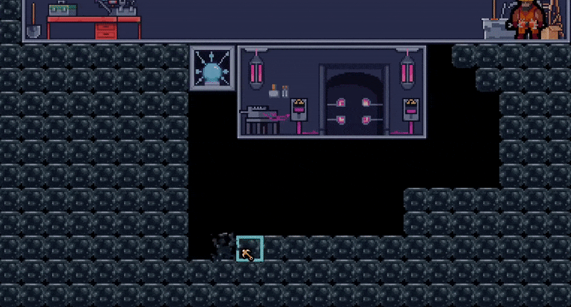
puzzle rooms are bugged out and doesnt show the entire room,they also lack any penalty when you give a wrong answer
i do agree the tutorial is too instructive and over explaining everything
other than that,the elemental advantage system never felt like any use since the teammates i get each run is randomized(and the enemy also)
Hey Imagine Traveller!
👋
Thank you for the feedback!
"puzzle rooms are bugged out and doesnt show the entire room"
I'm not sure what you mean by this, there is currently only 1 puzzle available, once completed you encounter a reward chest.
Can you explain more about what seems bugged out and not showing the entire room?
"they also lack any penalty when you give a wrong answer"
Upon getting the puzzle wrong, one of your party members loses some HP, but upon testing this again, I see it needs to be more noticeable thanks!
"i do agree the tutorial is too instructive and over explaining everything"
Thanks, are you able to specify which tutorial feels too instructive and over explains everything as there are multiple tutorials spread throughout the game.
"other than that,the elemental advantage system never felt like any use since the teammates i get each run is randomized(and the enemy also)"
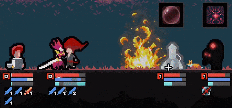
Here is how you can utilize the elemental system:
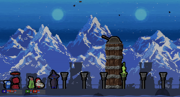
You pick your team, let's say you pick 3 Fire and 1 Water.
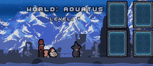
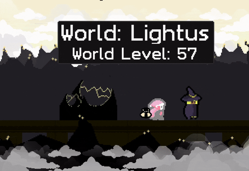
In the outerworld, let's say you've unlocked 3 worlds (Wind, Dark, Water).
Considering your team is comprised of mostly Fire and that Fire is strong against Wind, you'd prioritize entering the Wind World to gain an elemental advantage in battles.
Now let's go with a less obvious case:
Your team is 2 Fire and 2 Earth:
Now let's say you enter the Wind World.
Considering Earth is weak against Wind, during battle you'd prioritize buffing up your Fire based creatures (Attack Buff, Crit Chance Buff, etc.) and protecting your Earth creatures since they are more vulnerable (Shield, Healing, Cleanse etc).
Does this make any sense to you?
Thanks again Imaginary Traveller!
👏
>tutorial
dont rmb,already forgot everything lol
>elemental
all of that make sense,but the early game doesnt allow me to do any kinda of team building since i only have 3 souls to choose from most of the time
a small UI thingy that reminds you of the element cyclein battle would also be nice (if one doesnt already exist)
Thanks for the reply Imaginary Traveller!
👏
"dont rmb,already forgot everything lol"
Fair enough, well I'm going through the tutorials again and I'll try to reduce/shrink it down where possible, as I can see how it's a bit wordy at times.
"all of that make sense,but the early game doesnt allow me to do any kinda of team building since i only have 3 souls to choose from most of the time"
Would you rather new players have several different characters to choose from from the get go?
Potential consequences (at least from my point of view):
-Too many characters to choose from for a player that's unsure of which character suits them best at this point in the game.
(Choice paralysis)
-Limits the upgrade mechanics for the # of souls to choose from if a player already has a larger amount to select from.
"a small UI thingy that reminds you of the element cyclein battle would also be nice (if one doesnt already exist)"
Thanks again for the feedback Imaginary Traveller!
👏
s
Woahh nice find! I've yet to experience this. Time to investigate!
Can you let me know the size of your screen (for eg. 1280 by 720)?
Update - I can trigger this on my end, thanks a bunch! (clap)
Updated the game, should be fixed now, thanks again Imaginary Traveller!
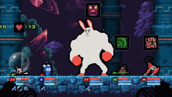
I loved this game the last time I played it and it's clear you've put a lot of time into polishing everything. The animations are awesome and the artwork in general is beautiful. The audio fits really well too and I appreciated the addition of voice acting, not something you usually find in solodev projects! (personally I loved the slightly cheesy nature of it, I thought it fit the game really well)
I did find the sheer amount of stats and interfaces a little overwhelming but I think after playing it for a while it started to click. I could definitely see me putting a bunch of hours into this and trying to unlock new creatures to join my party :D
Hey Tytan , thanks again for streaming the playthrough!
I was looking forward to you trying it out. (^^)
Also, thank you for the compliments, as well as the feedback.
I'll see if I can squeeze out some more quality of life improvements to help reduce the odds of feeling overwhelmed.
The game is actually solid! But it is very annoying to play...
- Tutorial and random voiceover pop-ups that lock me out of playing the game are really annoying. Tutorial should not describe every little thing about the game. It should teach while playing the game.
- The voices are incredibly overdramatic.
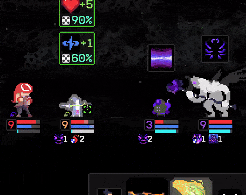
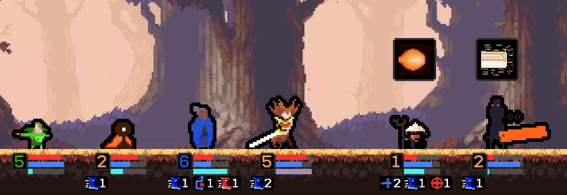
- Everything is way too small with a lot of empty space around. All the icons can be made twice as big easily. Health and other bars are very important, but are made two pixels wide and near the edge of the screen.
- Hovering is used too much. In order to know what an attack does, I have to hover over it, wait, hover over every affect, wait. Can I just right click to open all attacks descriptions somewhere on the side of the screen?
- Why can I know exactly the chance for some insignificant (de)buff to proc, but not how much damage an attack deals? Also are any of the (de)buffs significant enough to not spam the strongest attack?
- After a puzzle level, what is the point of fighting a chest?
I mean the game is a solid foundation for a roughlite, but UX needs a lot of polish.
Hey SmartAIGames, Thank you for the feedback!
I'll try to address each of your points below:
"Tutorial and random voiceover pop-ups that lock me out of playing the game are really annoying."
There is a skip button for all tutorials located to the right of the dialogue.
"Tutorial should not describe every little thing about the game. It should teach while playing the game."
Thank you for the feedback, there are actually several tutorials throughout the game that I've split up based on exposure to different game mechanics, but it seems I need to split them up even more, I'll see what I can do here.
" The voices are incredibly overdramatic."
I'm sorry to hear you don't like the voice-acting, you can mute all voice-acting in the settings menu.
I'll try to improve in this area, specific examples would be helpful here as some sequences are intended to be more dramatic compared to others.
"Everything is way too small with a lot of empty space around. All the icons can be made twice as big easily.
Thank you for this feedback, due to the constraints of pixel art, conserving pixel quality while scaling up the assets is not that feasible. To address this scenario I'd have to redraw the assets in higher resolutions.
You mention everything is way too small, but perhaps you have some more specific examples that I can focus on as a starting point?
"Health and other bars are very important, but are made two pixels wide and near the edge of the screen."
Indded they are important! The bars are 16 pixels in width (perhaps you meant height?).
I'll see if I can increase the bar sizes a bit without presenting overlap issues.
As for the near the edge of the screen, the main reason for this is the vertical space is needed to display the effects that occur in battle.
If I were to center the battle closer towards the center of the screen to bring the bars further from the bottom edge, it would result in the effects being cut off in top view of the screen.
I'm open to ideas to resolve this issue.
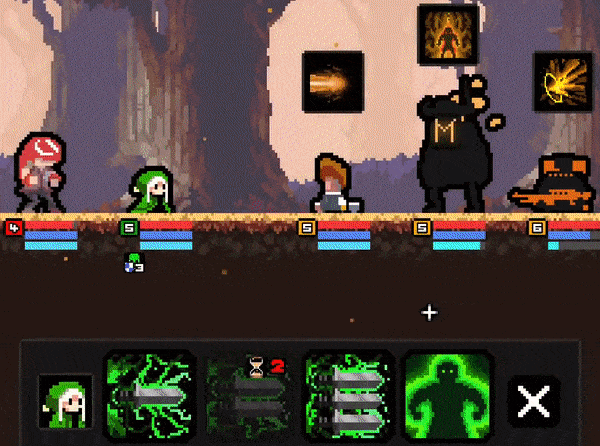
"Hovering is used too much. In order to know what an attack does, I have to hover over it, wait, hover over every affect, wait. Can I just right click to open all attacks descriptions somewhere on the side of the screen?"
This is a good point, I'll test out different ways I can show this information without it getting in the way of the battle.
(Continues on next reply ->)
(Continuation):
"Why can I know exactly the chance for some insignificant (de)buff to proc, but not how much damage an attack deals?"
Damage values are indicated explicitly on interface panels.
If you mean in the battle itself, I used to show this info, however it resulted in an overwhelming amount of info for players.
Since the health bars indicate the scale of damage, I thought this was a solid compromise to prevent information overload while still showing roughly how much damage is being dealt.
"Also are any of the (de)buffs significant enough to not spam the strongest attack?"
Skills are balanced by cooldowns and mana cost, you can't spam your characters' strongest skills because they will be on cooldown after use and you have to balance that with available mana as well.
Also, some skills are AOE vs single target, if your strongest skill is AOE and there is only a single target present then another skill might be more effective in that case.
In terms of if de(buffs) are significant enough, this depends heavily on the circumstance, if the enemy is about to shield itself and your character has shield prevention on one of it's weaker skills that might be more effective than your strongest skill.
"After a puzzle level, what is the point of fighting a chest?"
I could make the chest auto-open in certain circumstances, however later on in the game you'll be exposed to chests that have mechanics that make them more difficult to open, it's a way of fighting for the reward it contains.
Thanks again for the feedback SmartAIGames!
I'll try to improve the project based on it.👏 (clap)
"There is a skip button for all tutorials located to the right of the dialogue." - but I don't want to skip all tutorials! There may be something I don't know. I just want them to be less intrusive.
"some sequences are intended to be more dramatic compared to others" - I mean even "left click to move to the next dialog" is pronounced as if it is the final boss battle :) While enemy voice sounds more like a parody then an actual voice.
"You mention everything is way too small, but perhaps you have some more specific examples that I can focus on as a starting point?" - e.g. character upgrade menu - you can just make every icon twice the size.
"The bars are 16 pixels in width (perhaps you meant height?)." - yes, I meant height.
One more general suggestion: Your battles are very close to JRPG battles. There are a lot of pixel-art JRPGs, some with very low total screen resolution. A lot of them have incredibly well-designed interfaces that present all the info to the player, allow to decide and execute attacks quickly, and avoid being cluttered. Take a look at how they do it.
Sorry, I know I sound harsh. I can see a potentially good game here. But it is impossible to know behind all this interface.
Thanks for the reponse SmartAIGames!
"but I don't want to skip all tutorials! There may be something I don't know. I just want them to be less intrusive."
By this I mean at each tutorial you can skip it or go through it, it's up to the player, it's not toggling off all tutorials.
"I mean even "left click to move to the next dialog" is pronounced as if it is the final boss battle :)
Yes, I wanted a booming voice type for the narrator. ^^
" While enemy voice sounds more like a parody then an actual voice."
The voices vary based on the enemy type, smaller, more minion-based creatures have a cuter/less intimidating voice type and larger-boss type creatures have more booming/intimidating voice types.
I'm not particularly sure what to take away from the parody critique , realism isn't necessarily what I'm going for in terms of voicing them.
" e.g. character upgrade menu - you can just make every icon twice the size."
Not sure which menu you are referring to here, if it's the skill tree, then you can zoom in and out to dynamically alter the scale of the icons.
"One more general suggestion: Your battles are very close to JRPG battles. There are a lot of pixel-art JRPGs, some with very low total screen resolution. A lot of them have incredibly well-designed interfaces that present all the info to the player, allow to decide and execute attacks quickly, and avoid being cluttered. Take a look at how they do it."
Thanks! Any specific recommendations?
"Sorry, I know I sound harsh. I can see a potentially good game here. But it is impossible to know behind all this interface."
No need to be sorry, I see harsh feedback as the stepping stone towards progress.
Thanks again SmartAIGames! 👏 (clap)
"Thanks! Any specific recommendations?" - I am not that big of a fan of JRPGs myself, especially older pixel-art ones. You can probably get a few good suggestions on https://www.reddit.com/r/JRPG/.
Thanks SmartAIGames!
Hey SmartAIGames!
👋
Based on your feedback I've:
If you get a chance, can you let me know if any of these changes help at all?