Play game
RogueStarRiver's itch.io pageResults
| Criteria | Rank | Score* | Raw Score |
| Creativity | #10 | 3.905 | 3.905 |
| Story | #11 | 3.476 | 3.476 |
| Presentation | #12 | 3.429 | 3.429 |
Ranked from 21 ratings. Score is adjusted from raw score by the median number of ratings per game in the jam.
Leave a comment
Log in with itch.io to leave a comment.


Comments
Spoilers i guess:
Someone appears to be a Kamen Rider fan. I'm not quite one of those, but I hang in those adjacent spaces, which is why I was kinda wanting more for the designs. You set me up (and I AM more of a fan of magical girl works), and then I was just whelmed at the appearances. I do appreciate the work into doing custom spritework as someone that is also not quite as adept at the visual arts, but I think you missed some attempts at embellishments that would have taken even simple designs further. Like a quick googling of Kamen Rider designs usually shows like a breastplate often. Or maybe we could have had more splashes of color corresponding to their solar body, like in an armband? Gray vs Black isn't the most striking palletes.
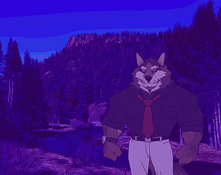
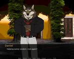
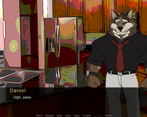
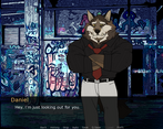
I do, however, appreciate the background filters you did. They gave a nice aesthetic to the piece and a good ambience. On the other hand, your characters ages were ambiguous and felt like seeing the adult actors in a CW piece, sorta outa place. Alternatively it felt like the drug dealer crashing the preppy kid's parties in Life is Strange-- something uncannily off.
You had some clunky dialogue at place, and the romance never quite reached fruition (as per the terms of the game jam), and I'm still kinda confused at Daniel's "adopted" son status in Xavier's family? I maybe could have benefited from more of their interpersonal relationship being explained in lieu of the opening soccer scene?
I don't know how well a monster of the week narrative applies to a visual novel if it's lacking like the corresponding visuals accompanying it-- the fighting felt a bit clunky in the sense of "mark did x, daniel did y, mark did z." We needed some internals to break up the flow or alternatively, Sfx/visual cues of violence to help smooth that over.
I still do appreciate your take on the narrative, as it stands out a fair bit from the others. This was a solid attempt and I think shows where your vision could do with perhaps another set of eyes to note out some fine details that slipped past your own (a classic issue that I know all too well).
I AM RATING THESE ALL THESE JAM SUBMISSIONS RELATIVE TO ONE ANOTHER. THERE ARE HIGH HIGHS AND LOW LOWS BUT PLEASE DON’T TAKE THIS TOO PERSONALLY, AFTERALL, WE ALL ONLY HAD A MONTH.
Story (3):
So time for the truth. I was unfortunately spoiled about the main twist of the VN. I saw other people posting the custom sprites but I thought it was going to be a twist where the WOLF was an alien, not a anime.
It accomplishes what it sets out to be which is a small taste of what the main plot will be.
I hope that the MC gets to be able to fight instead of just being on the side-lines.
Presentation (2):
The fight scene was great and so were the drawn sprites but I really could not take this VN to the appropriate level of seriousness because the sprites don’t look like high schoolers.
I do appreciate the attempt to make your VN stand out a little via the background filters.
Creativity (3):
Well, I can’t really think of any other FVN’s are an Anime World Battle Royal but the vast majority of it is just an homage to Route 65. (My least favorite thing that Echo Project has ever made.) The only Anime World Battle Royal that I’ve watched a lot of as kid was Zatch Bell!.
So I think that specific Monster of the Week style, concept can go pretty far and become easily episodic.
Total (8):
I’m looking forward to whatever you decide to turn this into.
Whatever it does become, I know it will have a dope UI and dope effects.
FUCK IT UP VANILLA!!!!!! this rocked htcgthd
The writing does not feel particularly strong with the frequent punctuation errors, but there is some good dialogue. The two plot threads don't necessarily come together; there are a couple of thematic connections that are orbited around, but the payoff isn't as explicit as it maybe should have been to make this kind of shortform work feel cohesive. The presentation, meanwhile, is a bit plain – the custom sprites clash with the art style of the game jam assets, and the lack of movement and animation makes the fight scene feel static. Good music choices, though.
A cute duo, fumbling their way into some sort of sentai fighting competition
A very fun story of what I hope is a taste of what's to come!
Story: Was initially leaning for 3 stars as it does end a bit abruptly, but then I realized I really want more! 4 stars it is for this category! The story we do have is fun, if a bit stiff with the writing itself. It is very tight and well paced, though. I enjoy the two leads we got, with Xavier serving as an excellent MC/POV for the reader and Daniel a fun, overprotective best friend. If ya continue on with this I'm sure we'll get some more meat to sink our teeth into! And damn that twist was AWESOME! Definitely looking forward to more (if ya make more, which ya should. The VN scene needs more of this genre)
Presentation: 4 stars. I really liked the filters you had going on with the backgrounds, both the coloring for the outside areas and the pencil sketch style. Provided a unique backdrop and a nice vibe that meshed will with how the story ended up. I especially liked the contrast that developed from the coloring of the home and the outdoors area. Not sure if it was intentional or not, but it kind of lends a feeling of "stepping into the unknown" for Xavier. Love it.
Creativity: 5 stars, and I don't wanna go into why too much cause it'll spoil the twist. LOVE IT!