Play visual novel
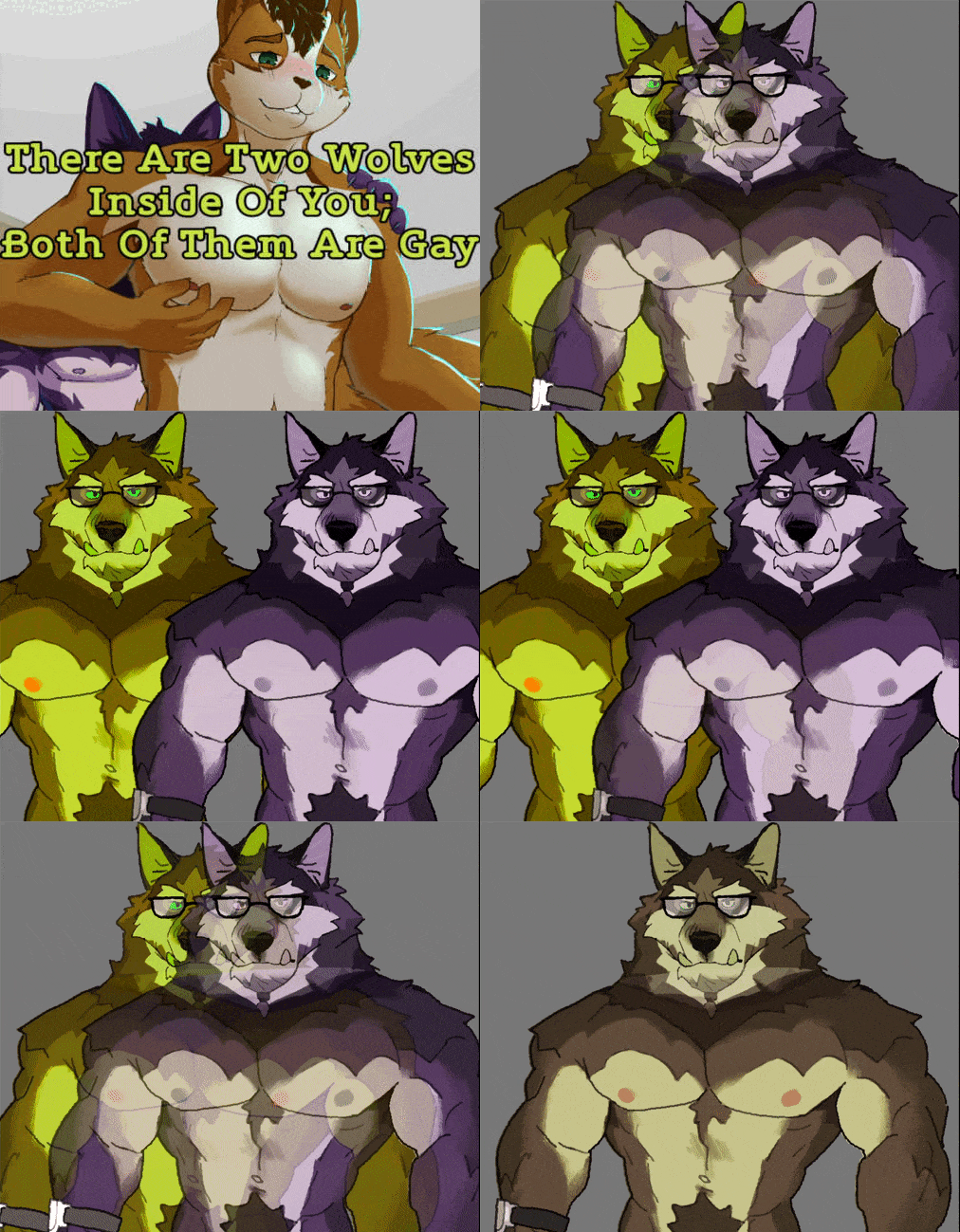
There Are Two Wolves Inside Of You; Both Of Them Are Gay's itch.io pageResults
| Criteria | Rank | Score* | Raw Score |
| Creativity | #3 | 4.667 | 4.667 |
| Presentation | #10 | 3.619 | 3.619 |
| Story | #10 | 3.571 | 3.571 |
Ranked from 21 ratings. Score is adjusted from raw score by the median number of ratings per game in the jam.
Team Members
Cetus The Otter
SnekkyForbread
Leave a comment
Log in with itch.io to leave a comment.


Comments
Should I comment on my own Jam? /s
Edit notes: minor grammar fixes & closing unclosed parenthesis and updating a concern/argument after rechecking the game's renaming screens.
This is... difficult to comment on.
You straddle the line between like camp and like an earnest kitsch (and of course, your kitsch is in conversation with your own works, even in the naming convention being primarily the acronym(?) rather than the extended name... there is not quite many other comparable medias that have this same vibe or works with a similar sense of camp (that anime Shinzo which took me like 10 minutes to find because "anime where people fuse with cards" KEEPS bringing up Yu-gi-oh results which was NOT what I was thinking of and even then it's not quite the same, it was just the first thing that came to my mind when remembering "fusion" based anime with distinct personalities underneath... megaman's battle network fusions aren't quite the same vibe and DBZ has them as distinct characters but I digress in this aside)) and frankly, that's a hard line to walk and I think your aim of like... cult classic creation (for I'm not sure how else to explain some of these choices) isn't aided by some of your visual choices.
When I think of cult classics, the presentation isn't meant to be working against me. There are choices that feel like they're made purely because you can (the amount of highlight layers for the names or highlighting the text alone. You chose like a size 40 text. It was already pretty visible to read), as opposed to like aesthetic reasons that moved the narrative along. I would have understood the highlighting for the text more if you had two layers (ugh) in the textbox for a unmorbed character, and one layer respectively for each of their morbs, as garish as that would have been. It would have served the story in its presentation as opposed to just feeling like a strange aesthetic choice (and if you did this with the name plates... they were so visually noisy and so secondarily a focus I have missed it and it didn't stay in my memory as much as the garish yellow highlight).
The story is strongest when it deals with this disability/gender tale (perhaps most evidenced with what I think was your strong prologue of the birth scene) but it feels like you're dropping the ball with your earnest desire to like shitpost in the midst of a scene that's meant to push the narrative along. I was thinking during the stream that like it was an analogy test you see on the SATS-- Rag : References :: Unagi : Shitposts. We saw the relic of your shitposting placeholder that made it to the final build for the contest (e.g. Morbing instead of twaining for the renaming system. You caught it in the work itself but it lingered in the other section, out of sight, out of mind. The names themselves felt haphazard when going through the rest of the renaming elements-- why did the culture not explicitly evolve to be conscious of the naming conventions given the splitting of the child? You addressed many of the other elements which were great, as I'll shortly thereafter address, but missed out on building more into the naming for a worldbuilding element that essentially triples the amount of characters).
There's a lot of worldbuilding elements that I think are fantastic, like partially unmorbing to quickly share memories, the driver's license having three slots for all of the forms and how the government is giving the protagonist a double wage (because most people morb into two and work two jobs (which is honestly tragic. A world where there's two of you and you BOTH have to work. I can't believe you would enforce capitalism even FURTHER in this narrative of yours)).
Those are the parts of your work that are singing the loudest, when you're leaning into the premise and the natural conclusions that draw from it, but then you just as earnestly in the same breath have one of the characters make an off-color comment about eating cats or TAKING the plot from bladerunner instead of the book YOU MONSTER THE PLOT MEANINGFULLY CHANGES BETWEEN (this part isn't as big I'm just malding as PKD stan). Or the "booba" dream. My man is speaking like a 13 year old. I'm wasn't laughing with him, I was like, cringing at how it felt unironically used, like some sort of developmental failure from his inability to morb, which I doubt was intended in this circumstance.
I suppose the most damning thing I can say is that we don't really quite get the romance, in the build you have. I missed the exact beginning but it's my understanding it essentially fulfills the promise of the title "There are two wolves inside of you" but sex isn't quite romance. It can be a byproduct of romance but like, we don't get to see that on the screen. We get an implied bi-directional crush (which funnily enough, isn't quite enough in the morbin universe when a relationship could contain up to like four people? and we only get the implication that the yellow wolf is into our protagonist via his own subconscious). It's not necessarily `wrong` that a romance takes a while to brew, but per the parameters of the game jam, we only get the implication of the romance. We're informed there's romance. We don't see it on the screen (double dicking down, again, isn't explicitly romance. The dragon roughly offers to do the same and the protagonist rejects that, which I think is proof enough for this claim).
I feel like you were more focused on your gags and shitposts (like literally having us play through endless iterations of rock paper scissors tentatively instead of like... simplifying it to a coin flip (which is still random chance as you wanted and what could have been the actual results behind the curtain instead of programming a theoretical statistically improbable softlock of endless rock-paper-scissors)) then taking the story to the conclusion of where the fascinating premise you set up wanted to go. It feels like you're focused on the shitposting and the garrish visuals to the detriment of the story premise you setup, at least, that's how it seems to me.
I can't help but feel, as is evoked in some of the other comments, that you're like appealing to continuing your branding of suspicious visuals and endless shitposting, but I don't know if the shitposting elements feel smoothly integrated? That, or they stood out more against a garrish backdrop of extravagant unnecessary highlighting.
It's like the critique they say sometimes on drag race-- usually more is more when it comes to drag, but sometimes some of the girls have TOO much and they need to edit it down. I feel like we could have gotten to your romance narratively if you didn't spend so much time with some of the visual and programmatic elements you wanted to introduce (because some of them worked really well! The baby's failed morbing attempts at the start-- that was chefkiss. It meaningfully helped move the story along with its visuals).
It's got a fascinating skeleton, but TATWIOY;BOTAG's "flesh" coating obscures some of the fantastic silhouette you devised with some instances of misplaced focus and choices that felt like they were done simply because you were made aware of them instead of diagetically fitting into the plot (we got it for the visuals for the morbed chars, but not their text too).
Your peaks and valleys for presentation made it difficult so I averaged out to the center of the bell curve for that, and your creativity is a fantastic premise, but I feel like your story fails to meet the base requirements of one of the game jam's fields in its "game ready ready state""-- the romance is informed, underdeveloped and not adequately experienced with the length of the game.
Still, it's quite a curious experience and it serves as an introduction for what I can only presume the Unagi aesthetic continues with your other works, and you definitely cultivate a presentation that appeals to those with the energy to endure it.
Oh, gosh, there’s a lot here.
Googles Shinzo Looks at Google Images Attempts to refrain from Googling for the rest of this comment
The Morb Status for the characters after the prologue is indicated by the rotation of the their name. If it is rotated to the left then it is a Yin and vice versa.
Morbing was not a shitposting relic, I just honestly couldn’t think of a better name until a few days before my submission.
I haven’t seen Bladerunner. I’ve only read Do Androids Dream of Electric Sheep?. I have no idea what you’re talking about. Also don’t think too hard about the dream sequences, IBWHIP will metaphorically murder you if you do.
Hopefully the rest of the VN when I release it will satisfy your romance needs.
The rest of your comment can basically summed with “You might be getting Unagi-ed!”
I think I responded to everything that I had to fortitude, 6 weeks into this jam, to respond to.
If there is something you need more clarification on then please let me know.
I will COMMAND GRAB you for only fixating on the androids part of Do Androids Dream of Electric Sheep and putting that foot first in the narrative instead of the dichotomy of the androids in tandem with the empathy boxes of the Mercerism religion not as a tale of AI overtaking the role of man but in terms of what does it mean to be human, when there are machines with the same feelings as man and man forced to use a machine to feel empathy-- it's a tale of what does it mean to be human not a cautionary creed about the AI uprising you MONSTER.
You could have just like... referenced Megan at this rate. Your reference pulls in the opposite direction of the dialogue you penned for that scene.
I am, however, living for your commentary of "I pretend I do not see it."
SPOT DODGE!
Well now, i understand your pfp. I was so lost all month, and faithfully refused to ask. I always enjoy your surprise premises, and execution. You inspired me to make my meme novel, honestly. I am envious.
Thank you.
to whomever it concerns please don't brigade me for this one, last time was enough lol
There's a lot to unpack on this one.
First of all, while I get the shitpost value Unagi has gone for, it's overdone and unpolished.
UI and accessibility
The UI has some huge scaling issues. In the main menu there's lines too close to text and the contrast level of the main menu makes it so people with lowered sight literally cannot see it: It's grey text on a grey background. I suggest looking up HTML Webpage contrast guides - they translate very well to VN and game UIs. This also goes for some of the nametags; Wilberto/Haris's nametag are both overlayed with white, this kills the contrast needed for easy reading.
Next up with the actual ingame UI, some parts suffer the same issue. Yellow text on white background, or black spinning text whenever an advanced text-tag is applied. This is fixable by reading the documentation of Wattson's text tags, and definitely within the authors skillset.
Following; The narrator text is underlined, which makes it very difficult to read for me. I read quite fast generally, but the underlining of entire sentences makes it difficult. I'd suggest changing the color of the textbox or so instead.
There are broken links in the about section of the game, throwing errors instead of actual sources. On a side note, for music files: If you're licensing something in a way where you cannot redistribute, you *need* to package em. A .rpa package is fine, but you cannot have the actual tracks available without any kind of obfuscation or pickling.
And to finish off my UI review; It's too large. Some names cover half the screen, and the textbox is more than a third of the screen with white-ish transparency which makes it very brutalist in style - it's hard to take your eyes off it to see the actual game visuals.
Art and in-game visuals
First of all, aside from the pre-made sprites for the Jam, the one added sprite and the CGs are quite good. There are however some issues (most likely due to coding, but art issues in the end nontheless). Mainly with the main character's (Preston) eyes: they overlap whenever he has a shirt on in most expressions.
The transitions are kind of cool, and the twaining visuals are clear.
That said, it'd be interesting to see what it looked like with a clear direction for transitions: A theme. This swaps scenes, this affects characters and so on. Progression, if you will.
It's clear Unagi has had a lot of fun making them, so spend more time polishing the presentation, not just the transitions next time and you'll hit higher!
Story
Right. We're thrown in without a lot of explanation, and there's pronouns to keep track of in a way that's not just character based, but lore based: as well as the entire concept of twaining and what benefits it might give. To put it bluntly: Thrown in to learn it as we go with hints can work, but not when there's this many things to keep track of. It just makes it difficult to follow, paired with the underlined narrator text I had to spend more time trying to understand what the text was, than what it meant.
What I did appreciate however was the puns. Pro-twain (protein) and citrusy (spelled citrussy pls!) was funny af.
Also, a very arguable note: Being 29 does not make someone a daddy.
Coding
Just took a quick look since your files are unobfuscated, you might want to look into repeat and advanced ATL blocks. I also feel like a screen could have done the transition texts (timeskips etc) more justice than the nvl mode.
All in all, it'd be interesting to see what Unagi could do if he actually tried avoiding the shitpost status and took reference from successful things. He's clearly quite innovative, but it seems to more often than not channel in a downwards direction and then spiral on itself.
All in all, it's a little disappointing because it shoots itself in the foot by going too far in so many ways; Base ideas can be good, but if you don't polish your base enough and mix too many things together it's like mixing too many colors: it just becomes a grey goo.
The thing that stuck out, and could have carried this was the twaining concept - it's a cool one, and Preston's struggles can easily be tied to how many people feel in their lives; and that's not even mentioning being gay. It's all a little undeveloped though; Add more story *details*.
2/5 total.
The creativity of this one is unmatched: I love your dedication to breathing life into this starting idea until it becomes a believable and coherent alternate reality. I wish more people read this story, just so I could use "WHY WON'T HE TWAIN" as a meme and be understood. And in terms of mastery of Ren'py, Unage remains in a league of his own.
The story on its own is a bit too direct and simplistic though, so I'm afraid that if the story stretches for too long, the novelty of the good worldbuilding will eventually wear off. My advice would be to keep it short and sweet!
Thank you and yes if I go over the 25,000 word jam limit then please slap mwe.
Unagi's unique vision never ceases to absolutely floor me. even the ugliest parts of TATWIOYBOTAG feel essential to the look and feel of the abomination. While I think some elements could be refined to make my eyes bleed less, I found myself charmed by the awful giant block of a gradient that makes the textbox, and how it framed the character sprites as they move around the scene. Not to mention, the wacky vfx i have come to expect from unagi are all on point here, everything felt right! (minus the cobbled together Preston sprite but... it wasn't so terrible that it ruined my ability to appreciate the character.)
Honestly though, the real star of the show is the concept of a world where people can twain, and Preston can't. The consequences this have for language, culture, and Preston as someone who isn't able to split are deeply interesting. I also just, like- have never felt more seen in Unagi's work. the intersection of disability on a physical and mental level, and even the vaugely trans feelings of a sense of self that is in conflict with the world gives me a perspective character that I feel like I can truly understand, and who navigates this alien world in a way i feel i might too.
Unagi's other VN, IBUWHIP already won my heart, but TATWIOYBOTAG ripped it out of my chest and held it hostage. You better finish this as soon as the jam is over cuz I NEED more!
(also im going to destroy you for that opening. It was perfect.)
Thank you for the kind words. I am actually going to be programming the finalized sprites today before I start to stream Loudo’s The Flying General.
Which you can see on my Twitter right now.
https://twitter.com/WagleUnagi/status/1666809976906715139?s=20
I think the URL worked. I hate posting links on itch.io
If you want to fund my Graphic Design classes with BowserPuma then please poke him until he does so.
Also it is IBWHIP not IBUWHIP.
And I am still hoping to get through finishing programming Day 2 today.
I have no idea where to start.... so I'll just list out my thoughts in a disorganized way.
Those are my thoughts. This VN gave me the best headache.
Can’t wait to play your MAY WOLF on Saturday!
I'm in awe. While the story is hard to judge in this state, TATWIOYBOTAG sold its central concept perfectly – it is examined from many directions in a pretty small amount of words, and there are already plenty of fun worldbuilding tidbits, such as a pronoun system that would make Jordan Peterson cry.
Visually, it's kind of an attack on your eyes sometimes (what on earth is going on with those speaker labels?), but in a way that feels consistent with using recolored sprites to represent people splitting in twain in its playfulness. I cannot wait to see more, and as a game jam entry, it's safe to say that it represents an interesting, original take on the MY WOLF subject matter.
Thank you so much!
It really mean a lot to me. I gotta remember comments like these after the Jam Rush is over to keep up my motivation to finish it.
I hope you check out the other part of the current Unagi Chipmunk Trilogy.
What a follow through and execution on the "two wolves inside" you idea