Play game
Advanced Bipedal Battle Armour: The Name of the Game's itch.io pageResults
| Criteria | Rank | Score* | Raw Score |
| Visuals | #4 | 4.611 | 4.611 |
| Audio (Does not apply for Physical Games) | #9 | 3.944 | 3.944 |
| Originality | #10 | 4.167 | 4.167 |
| Overall | #11 | 4.056 | 4.056 |
| Fun Factor | #27 | 3.222 | 3.222 |
Ranked from 18 ratings. Score is adjusted from raw score by the median number of ratings per game in the jam.
Is your game a video game or a physical game?
Video game
Was your game made solo or in a team?
Team: Sean S. LeBlanc (code), Michael Hetman (art), IAN MARTIN (music)
Did you use any third party assets, if yes what assets did you use?
No
Does your game contain 18+ content (Nudity, Gore, Language)?
No
Leave a comment
Log in with itch.io to leave a comment.


Comments
It looks really unique and is fun to play. The difficulty level felt pretty good, just hard enough to keep you trying but not so hard that you felt like you'd never win. My only criticism was that it was quite hard to judge the distance which made attacking and dodging a bit of a guessing game.
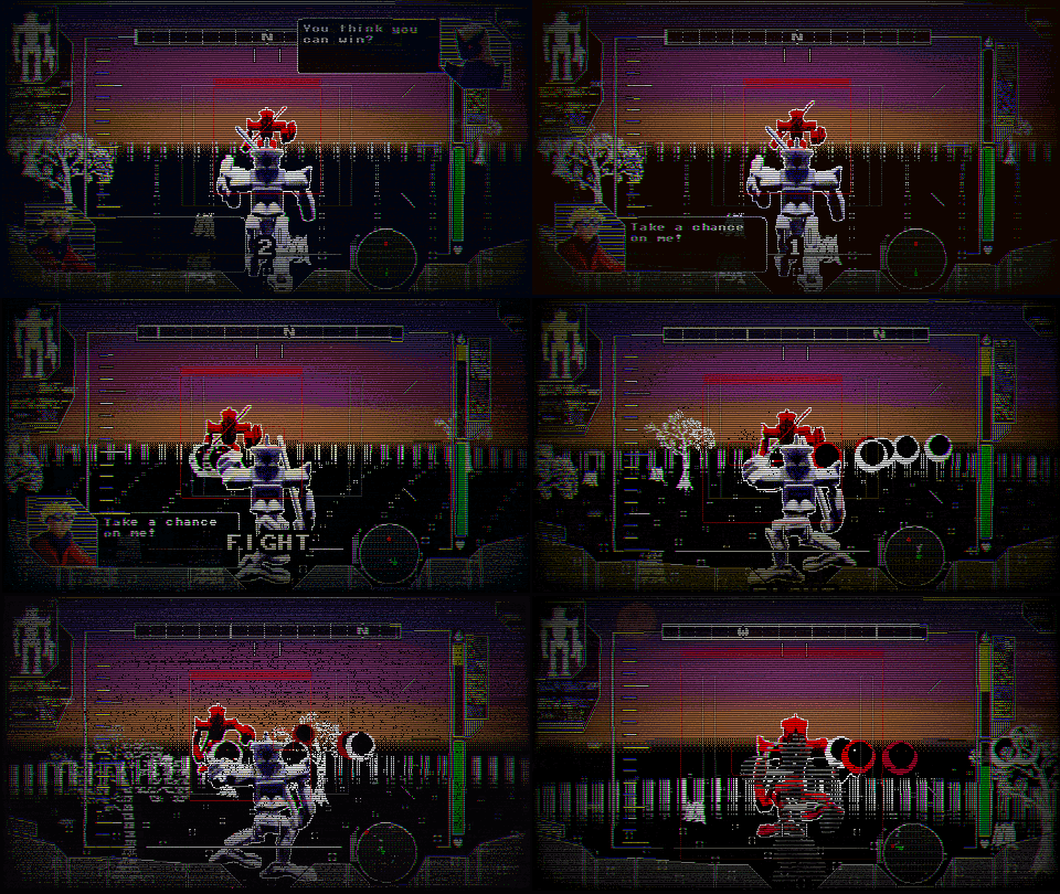
GORGEOUS UI and shader, having the enemy health above the reticle was such a good choice!!!
I'm not kidding when I say that this is one of the best looking games I have ever played!
Absolutely love the visual style, it reminds me of a combination of vintage anime and playing with my robot toys as a child. If that makes any sense...
makes 100 sense
Really brings out the "Mecha" in its overall feel! The appearance of the text alongside the music makes everything feel like an epic robo clash as portrayed on a retro-futurist monitor. Only issue is the gameplay can be a bit difficult to get the hang of. Great otherwise though!
So stylish, the billboarded fake 3D style works so well & I love the HUD overlay aesthetic too. Great music to go along with it. The trash talking is fantastic and a lovely touch
Amazing work!
The game is really fun and leaves you wanting more! The gameplay was a bit confusing at times, but once you get the hang of it, it makes sense, the audio was pretty good but sometimes a bit jarring, the graphics are really cool with the filters and effects very imaginative! Although the dialogue was a bit blurry to see, but as a package the game is really cool and I could definitely see it becoming a lot more.
This game's aesthetics are absolutely on point and want drove me to play this one! The game looks fantastic. All of the small touches really added a lot to the experience. Gameplay wise, it was kinda hard to figure out what I was doing at first, but after messing around for a little while, I got the hang of it.
The game feels a tad basic. For me this was mostly because I didn't really feel like I was in control of the game. Due to the lack of aiming and slow projectile speed, shooting has no strategy outside of trying not to overheat. The only thing to do really is dodge the enemy attacks, which I found pretty easy.
Overall, a nice brief experience with fantastic art.
This OOZES style. Great visuals, and great audio.
So cool, what did you use to make it?
Hi!
The game was made with PixiJS, Blender, Aseprite, and Clip Studio Paint
The game looks amazing and the game has an amazing vibe, i just found it pretty tough to control and hard to see what i was doing at times
Game looks awesome ! I love the overall aesthetic, and music
I like how this feels like a mix between the mode 7 snes Mech Warrior game blended with a dash of MDK, but all in a one on one fighting game.
Controls are simple and intuitive, however the game has a bit of a learning curve.
The dash felt a bit weird as i didn't really knew if i was getting a speed boost to dodge.
My one issue would be that, while the visual style is awesome and i like the scanlines and distortions on the image, i think it doesn't really help with the game's readability.
Other than that it's a really cool entry, with some pretty unique gameplay ideas :)