Play game
Coalescence's itch.io pageResults
| Criteria | Rank | Score* | Raw Score |
| Presentation | #21 | 3.432 | 3.600 |
| Design | #26 | 3.051 | 3.200 |
| Enjoyment | #26 | 2.956 | 3.100 |
| Overall | #35 | 2.717 | 2.850 |
| Metroidvania | #68 | 1.430 | 1.500 |
Ranked from 10 ratings. Score is adjusted from raw score by the median number of ratings per game in the jam.
Engine
Unity
Team/Developer
Me
External assets
Some sounds and music from OpenGameArt.org
Leave a comment
Log in with itch.io to leave a comment.


Comments
Impressive work here! The visual effects are really neat and the controls handle well. I liked the shield mechanic. My main criticism is that the gameplay gets a little repetitive with the abstract and linear level design. The sound was not bad but I felt like there were some missing/too quiet effects. Like others, I was a bit thrown off by the wall morpher explosions. A quality entry overall.
Good:
Bad:
Overall, this was a very enjoyable platformer, and I'd love to see you make it into an actual metroidvania. The upgrades you have would make great optional upgrades to encourage exploration. Maybe add some movement abilities that allow access to new areas. You have really cool graphical tech in this game, so it would be good to see abilities that tie into that. Maybe morphing through certain walls, or melding into walls to climb them.
not much of a Metroidvania but a fun and stunning game nonetheless
great work!!!! 👏👏
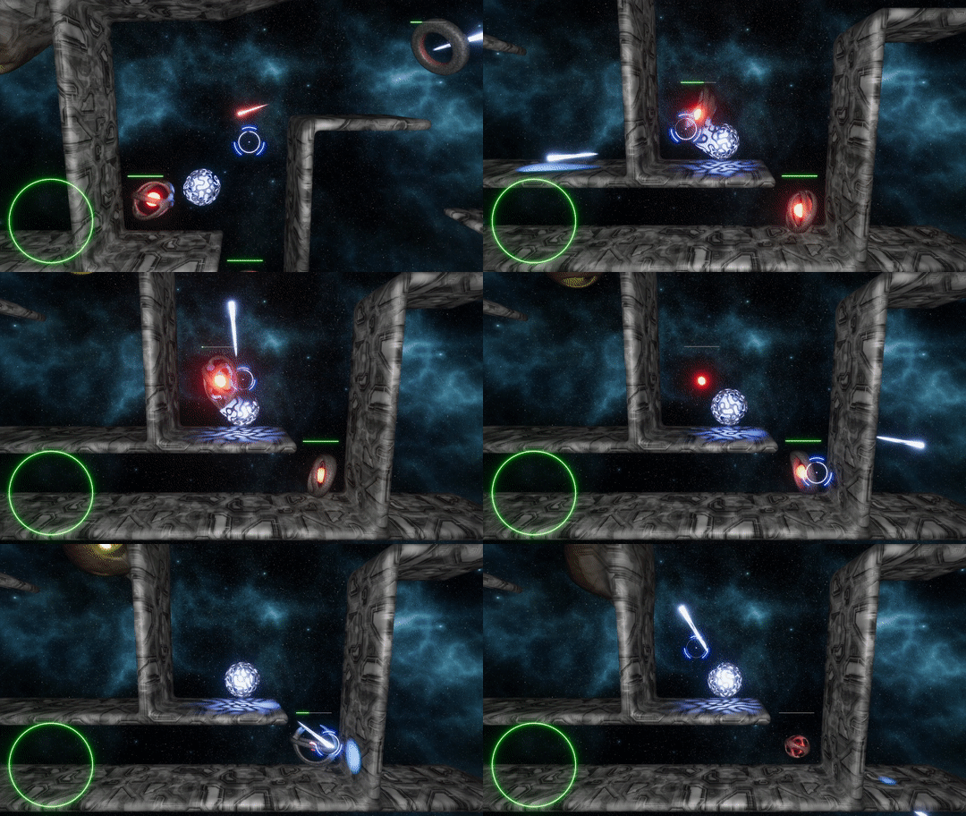
This is a fun little game! I really liked the raymarching effects where enemies and the player would kind of all blend together with obstacles, and it looks really nice. A simple concept that you executed well!
Man, I wish the controls were left hander friendly! This looks so cool! As it is, I didn’t get very far and so can’t really give a lot of feedback other than that.
I wouldn’t blame you for not playing our game, but we’d still love to hear what you think! Are our controls lacking? Or visuals? Design? Any feedback you’d be willing to give, we’re willing to listen to. Thanks!
I like the vibe of the game and the effects. It lacks on the metroidvania department (and so does my own entry, for that matter), however it's very unique. I'm super curious about how the effects are implemented.
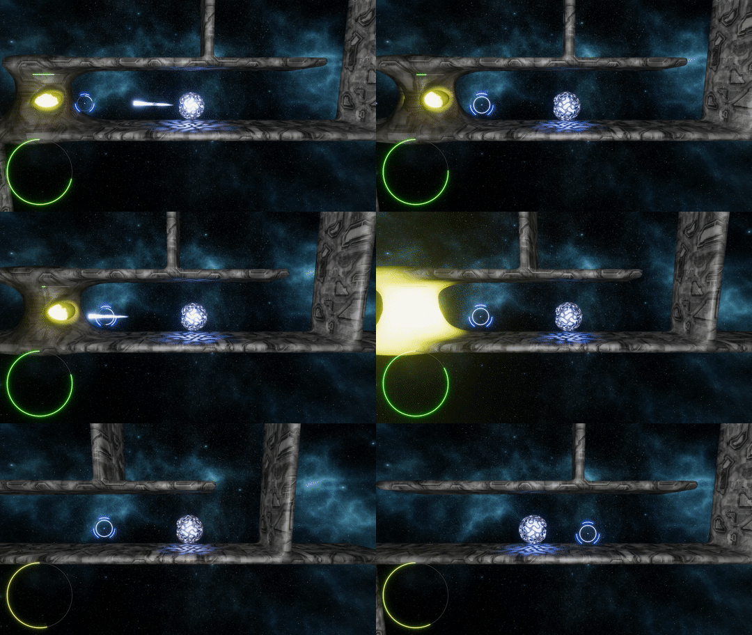
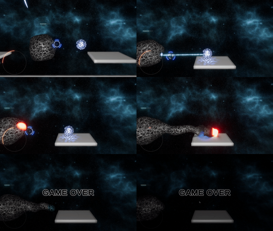
That shader was on point! I have no idea how you pulled that off. I love how your ammo shot holes that healed in the environment. Great effect!
That shader was on point! I have no idea how you pulled that off. I love how your ammo shot holes that healed in the environment. Great effect!
Very good game, I am impressed by your shader first time i’m seeing this type of shader enemy integrate plateform, juste beautiful. Ray gun is too powerfull he give the possibility to kill the last bost without see him.
Very good job.
It's not really a metroidvania. You just go through a level, kill enemies and occasionally get a upgrade for combat.
The level design isn't that inspired and there is no theming.
But I like how the game controls. The jump feels nice and the shooting is decent. The best thing about this game by far is the blending effect between enemies or the player and the environment. No idea how you did that.
For the combat design:
If you only care for reaching the end, the shield is by far the best option. The fact that you can move while shielding and the regenerating health make the game way too easy. Maybe you could decrease the movement speed when using the shield of disable the jump.
The regenerating health in general isn't that good of a design decision. It promotes a playstyle where you go in guns blazing and then sit in a corner, far away from the enemies and just wait. It would have been far more interesting to have health pickups or some other way to gain back health.
Despite all my issues this was still an entertaining little game. Congrats for finishing it.