Play game
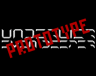
UNDERLIER: Even Deeper [UNFINISHED PROTOTYPE]'s itch.io pageResults
| Criteria | Rank | Score* | Raw Score |
| Presentation | #16 | 4.000 | 4.000 |
| Design | #73 | 2.375 | 2.375 |
| Overall | #73 | 2.531 | 2.531 |
| Enjoyment | #84 | 2.125 | 2.125 |
| Metroidvania | #107 | 1.625 | 1.625 |
Ranked from 8 ratings. Score is adjusted from raw score by the median number of ratings per game in the jam.
Engine
GB Studio
Team/Developer
Grave Reaper Cushions (just me)
Leave a comment
Log in with itch.io to leave a comment.


Comments
Great art! Font is tough to read, but a really cool concept. I was digging the story, but I felt like it was difficult to figure out what was going on really during the descending bit. Hope you continue developing this, I'll keep an eye out :D
Oh, forgot to say but the sfx and music is great too. Love the droning right after the fall, super sick.
Thank you very much!
There'll definitely be more where this came from... 👍
You have solid game art and character animations, i won't comment on font, a lot of others already said what I have on mind. I can see how this could be interesting story driven, station exploration game with unlockable powers that lets you progress further, but I guess from the dev note (which I couldn't read through) you had to skip to the best bits that you had. Nice try, I liked what I saw, good luck in the future if you decide to keep working on it!
Thank you very much 👍 Further development is definitely on the cards
I'm not sure this is a Metroidvania.
It was going to be a Zelda-like - so Metroidvania-adjacent(?) - but I ran into technical issues I didn't have time to fix.
This looks promising. Beautiful graphics, and a well-developed sense of pacing. I enjoyed the opening scenes of the unfolding mystery.
Unfortunately, the game ends before the action really begins. There really isn't much gameplay per se, so it's hard to judge this as a Metroidvania in particular.
Also--for a story-based game like this, with tons of written dialog, you simply cannot use a font like this:
Reading this is like doing a Cryptoquote. I zeroed in on the short words and then, by process of elimination, figured out which letter was "E" (the most common), etc. Do not do this to your players! :D
Can you believe the font used to be even less readable? 😌
I think I'm about three for three on comments about it, so that's some pretty definitive feedback right there 👍
I hit some technical roadblocks when it came to building the main parts of the game, and I knew I wouldn't have time to fix things before the jam deadline, so I figured rather than scrap it, I'd close the loop and upload as a prototype.
Ha, it's hard to imagine, but I believe you. :)
This project looks interesting. Maybe you should develop it further.
But even if you choose not to, hopefully this experience will have been useful to you in your gamedev journey. I always feel like I learn a lot with every jam.
Jams are a fantastic way to learn - I'm flinging myself at loads of them at the moment... 😅
I'm seeing Underlier as kind of a flagship series at the moment, so as well as fleshing this one out, I have a bunch of other spin-off ideas in the pipeline - ultimately I'm after putting together a hybrid 6-degrees-of-freedom FPS/ first-person survival horror immersive sim with a PS1 aesthetic in Godot...
I seem to really be into giving myself a ton of homework... 🤨
I couldn’t figure out what the game-play is/what, just seems like a bunch of rooms that you may or may not be able to go down the stairs
Things I Like:
Things I Would Change:
Broken Stuff:
Ah, the font... 😌
The font you're seeing in the current version of the game is something like the third or fourth iteration, and I'd been wondering about its legibility still 🤔😅
The character walking without player input might be a quirk of the emulator that GB Studio uses: it doesn't like Shift or Caps Lock basically. I'd guess you may have caught Shift on accident which confused the whole thing 🤔
Regarding the intro length, I'd say the issue with it is it's unskippable at the moment. Whenever I'd finish the game, I'd be bracing myself to mash the A button to get through those text boxes to get back to the title ASAP, so that'll absolutely need an overhaul.
I liked this old-school style this game has! Had some problems with understanding font, so plot is what I probably missed :D hope you will work on this more! I'm can't wait to see more metroidvania style gameplay here :D
I was wondering about the font 🤔 - I changed it a few times before this version of the game, so this is the most readable it's been so far(!)
I'm definitely planning to build on this one 👍 Thanks for the positive words 👍👍