Play game
Shadow Circuits's itch.io pageResults
| Criteria | Rank | Score* | Raw Score |
| Presentation | #12 | 3.750 | 3.750 |
| Use of the Limitation | #21 | 2.875 | 2.875 |
| Overall | #25 | 3.063 | 3.063 |
| Concept | #30 | 3.250 | 3.250 |
| Enjoyment | #44 | 2.375 | 2.375 |
Ranked from 8 ratings. Score is adjusted from raw score by the median number of ratings per game in the jam.
Team members
Nathan Thompson (@NathanWroteThis - Twitter)
Software used
GameMaker
Use of the limitation
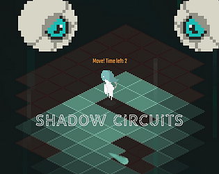
When the player dies the tile in that spot gets erased, making the next attempt more difficult
Cookies eaten
100
Leave a comment
Log in with itch.io to leave a comment.


Comments
really enjoyed the graphics, this is a pretty cool way of handeling a platformer, like most said, hit boxes can be a bit janky. also would be nice to restart with the left click rather than enter just so I dont have to swtich over to my keyboard but thats just a nitpick. Otherwise was a cool and unique game!
Thank you! Glad you enjoyed. I think I'm going to recreate the game in 3D at some point. That was the original plan, but I knew I wouldn't have enough time to make the 3D assets for the jam.
The sprites and the music are great, but the hitboxes are very very janky. I was constantly dying out of nowhere even though the bullet that "hit me" barely scraped my head. The hitbox should be on the lower half of the player as this is an isometric game, which is why the deaths feel and look so unfair.
Other than that, I liked the concept and the game was good!
Yeah, I just realised I made the hitbox square instead of the same shape as a tile. So the corners of the square hitbox sometimes clip on the diamond shaped tiles. Big oversight on my part haha. Glad you enjoyed it!!
I like the visuals very much! But the gameplay feels unfair, I am always dying out of nowhere, even if I click on the neighborous tile.
I loved the art and the music , but when I started off, I did not know what killed me every two or three steps. I would've loved an instruction set to know what is happening in the game before jumping in, but I kinda figured it out once I played it enough. Overall I loved the concept ! Nice work !
Great aesthetic! The rules seem simple but most of the time I'm not sure what killed me. The additional input on the keyboard is really jarring; it seems small but it really affects UX. I love the concept! Nice job!
Thank you! I agree, I should have made it click to start instead of using the keyboard. The characters hit box is a little big I think, I need to shrink it so you don't die by just clipping the edge of an empty floor tile xD
I'm pretty sure that's what kept killing me. It's always a good idea to size hitboxes to favor the player.
Hi everyone! This is my second game jam. I really struggled with the limitation on this one, so I'm eager to hear some feedback! I tried to stick to the theme of 'deception' by creating a limited FOV so you can't see enemy attacks as you move around. I hope that fits haha. Anyway, enjoy playing :)