Play game
Project K's itch.io pageResults
| Criteria | Rank | Score* | Raw Score |
| Creative use of art assets | #98 | 3.705 | 4.429 |
| Overall polish | #170 | 3.466 | 4.143 |
| Overall | #186 | 3.386 | 4.048 |
| Engagement | #332 | 2.988 | 3.571 |
Ranked from 7 ratings. Score is adjusted from raw score by the median number of ratings per game in the jam.
Leave a comment
Log in with itch.io to leave a comment.


Comments
This felt and looked so cool! I hope to get to this level of polish in such a short amount of time in the future.
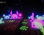
Wow that skybox is top tier! The gameplay also feels nice. The floor appear effect is cool but has an issue, that you don't know when the map ends. I fell down many times cause of this. Also after some time the game feels a repetitive. Nice work!
Yeah, i really feel like the game has some serious pacing issues. Both progress wise and actual-game flow wise. I did intend to add a "render distance" setting but I couldn't add it in time ):
But i'm glad you liked it! I really tried to give my best on the game-feel and the visual aspect, so having that pointed out on basically every comment makes me really happy. Thanks for playing! I'll be playing yours when i get off work!
Game looks gorgeous, and feels quite good. I think the screen shake on fire could be toned down just a tad. Most of what could be improved has already been said, so i'll just say good job! :D *and if you couldn't tell from my game, i dig the neon aesthetic!*
Thanks a lot! As i've said on every response, the game feel and visual aspect of the game were my main focus, so i'm really happy that people are finding it as good as i see it. And the screen shake is indeed an issue (mostly with the shotgun lol), but it's too late now, i guess hahaha
Thanks a lot for playing! As son as i get off work i'll be trying yours <3
More juice than the leading brand, you def nailed it! Nobody expects game jam games to be perfect. Functional is a success in my book, and if your goal was pleasing aesthetics, you have that in...*puts on sunglasses* spades. :D
WOW
This is the most Visually/Auditory/Everything striking game I've ever seen, so a lot of points for that.
A few gripes though: 1. Some levels are laggy despite me having a higher end PC, so optimization can be done, but since it's a game jam, this might be passable 2. The fighting was fun and impactful, but the enemies do nothing to stop you from getting the card, so it's either you get it done quickly, or you force yourself to fight enemies who's options of fighting back are very limited and uninteresting (assuming you coded the players guns modularly, giving some enemies guns would be quick fix)3. All this fixed, the game was a little too long, unless you added a lot of content, I feel like a good challenge and not too overdone would be 5-10 levels 4. QOL like remembering which gun you chose last
Anyways, incredible submission
Thanks a lot!
I really wanted to do my best looking/feeling/sounding game yet, so i put 70% of the effort into that, so i'm glad everyone up to now has enjoyed it. And yes, the game is rather poorly optimized. The way i handled some things were not.. ideal at all ): I have a full-time job and use the weekends to have some relax time, so i only got to put in 33 hours into the jam (including planning and project setup)
The original plan was to have 13 levels (only one deck of cards) but I figured that I could add all 4 decks and padd up some content. But i also feel it became a bit over-done, but I was afraid that 13 levels were not enough levels.
I really didn't like the enemies either. I feel they're really bland and somehow i forgot to add a hit effect to the player to give him feedback that he's being attacked. I did plan on making long-distanced enemies but again, didn't had the time to finish implementing them.
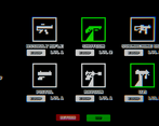
There could be a lot of QOL improvements. Saving loadots was one I wanted to implement, but didn't get the time. I also wasn't able to add option menu (for resolution and Post-Process settings) and I'm pretty sure the most optimal loadout is shotgun-uzi because I really didn't have the time to balance every single weapon tier there is
I really loved how it turned out, and I do have plans to keep it updatedand fixed. So keep an eye out for that!
np, I'd love to see more games from you, I definitely expect a game jam game to show a lack of polish, but yours shows a lot of potential too
keep up the great work!
Dude this is amazing, the aesthetic and the level of polish is incredible! Love the glow and the level start effects.
I also like how the guns are varied and the bullet impacts etc. feel so satisfying. Sound is good too, and using the deck of cards as level select is a cool idea.
I would tweak one or two things - like dead enemies should be a bit more distinct so they aren't so similar to live enemies. And having a bit more guidance at the start on what I need to do would be useful. Shorter, snappier levels might keep the pace high as well, otherwise there's a bit of wandering about.
But overall, I've played a bunch of the games from the jam and this in the top #3 no question. The level of polish and stuff is awesome.
Thanks! I also fell in love with most of the effects hahaha
My main goal was to experiment and exploit every single ounce of game juice i could, so my main focus was on making every action feel good, so i'm really glad to see people saying it feels great to play!
I did forget to guide the player. Most people go directly to the King's card because it's the biggest and most "showy", but that's actually supposed to be the last one to get!
I also didn't enjoy the dead enemies. I tried disabling the glowing on the dead sprites, but the change was way too sudden and i felt like it ripped the player out of the experience.
Thanks a lot for the feedback and honest review!
Still playing it but wanted to give my thoughts after a few levels:
-The level pop-up effect is so cool. I've been playing through Divinity OS 2 again recently and it made me think of that - such a nice polished touch to have in your game that makes the encounters sudden and unforeseen. Love that.
--And polish, on a more general note, is top notch for the most part. Super creative use of assets. And the right amount of game juice. The sounds are chunky.
--The overall concept is super fun, too. A crawler/arena shooter where you go up the deck of cards? Awesome. If you were using your own art you could see how this easily lends itself to themed levels and the like, so overall that's super solid.
--One critique I have is that I'd make pickups automatic. It's so fast paced that I don't think you need to press E to pickup health and ammo. I think it'd keep the flow better if it was triggered on collision.
--I also think a bit more indication when you're getting hit would be nice - a screen flash our sound effect.
Overall, I really like it! Gonna get back to playing it now :)
I'm loving the fact that up until now, everyone has enjoyed the game and all it's visuals/effects!
As i've answered on previous comments, my main goal was to make the juiciest game I could, where very action felt good in every possible way. And i'm happy to see that everyone's enjoying that!
Actually I didn't notice I forgot to add the hit effect for the player. I have the sound effect, but no other kind of feedback is given to the player and I can't believe I forgot lol. And i tired the auto-pickup, but I felt that it made the game way easier than it already is ): but I might experiment with that later.
Thanks a lot for playing! This was done in 33 hours and has some SERIOUS performance and balancing issues, so if you liked the game, keep an eye out because i'll try to update it as soon as i can!