Play game
Another Wor(k)Ld Shop's itch.io pageResults
| Criteria | Rank | Score* | Raw Score |
| Music/Sound | #2 | 3.654 | 4.143 |
| Theme/Limitation | #5 | 3.150 | 3.571 |
| Overall | #5 | 3.276 | 3.714 |
| Graphics/Animation | #6 | 3.402 | 3.857 |
| Technical Implementation | #6 | 3.276 | 3.714 |
| Fun/Design | #10 | 2.898 | 3.286 |
Ranked from 7 ratings. Score is adjusted from raw score by the median number of ratings per game in the jam.
How does your game apply the limitation (and optionally, the theme)?
My game use only 2 button of the mouse and the scrolling of mouse wheel. And it implemented the theme Another WORLD
Team Size
Solo (1)
What main engine/tool/language did you use to construct the game?
Unreal Engine
Which diversifiers did you use, if any?
None
Leave a comment
Log in with itch.io to leave a comment.


Comments
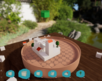
Really well done! Great polish and overall feel. Sometimes the pieces felt like they sat a little high when in the preview which made it difficult to gauge height in some levels.
Yhea i need to make a better adaptive camera based on actual height of the puzzle and place the preview piece accordingly.
I'm impressed how polished this game is. This feels like one of those "The Room" puzzle games you can buy for a few bucks. I can't really say anything bad about this game. Cool concept and amazing design / implementation. Great job.
thanks a lot for the compliment. I think it miss some feature and more puzzles.to be sold but could be i agree
Wow thats incredible. Especially for only 10 days,
thanks a lot. Was a bit hard to achieve it as i work also during the days.
very fun, the font was a bit tricky to read sometimes, but the game was well made
yhea i agree on font as i said tough choice readability or estethic. Maybe i was a bit wrong
yea, fonts can be tricky
Wow, absolutely loved this entry. Everything was well polished and felt so smooth to play! The puzzles had a nice difficulty curve as well as you introduced new pieces.
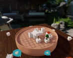
I do agree with the other commenter that the font was a little hard to read, especially in the main menu (making the font a bit darker might have helped with the main menu at least). I did get a little confused by the set of instructions regarding the green pieces, it took me a little while to understand that you were saying the green blocks were essentially the guiding and pivoting point of where your blocks would land when they were placed.
Overall though this is an incredible entry for this jam, I really enjoyed my time playing it.
thanks a lot for the feedback. Yhea i got an issie with the text material. Maybe i would have to set it as emmissive and not base color so it would have pop more.
and also i see for the green bloc. I always got trouble with tutorial it's so hard to make everything clear for everyone
Amazing presentation!
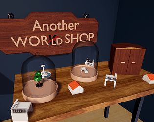
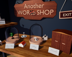
The graphics and setting are beautiful, and even going so far as to including diagetic elements in the menu!
I did have trouble reading the font that was chosen, despite it being a good choice aesthetically.
yhea i understand was a tough choice but i feel that the found match more the universe and the thematic.
But you are right i just doesn't get time and skills to create my own font ;)