Indie game storeFree gamesFun gamesHorror games
Game developmentAssetsComics
SalesBundles
Jobs
TagsGame Engines

Nia_prene

9
Posts
20
Followers
A member registered Jan 15, 2021 · View creator page →

Creator of

Recent community posts

awesome arcade game Fisk, just top notch. I played it for a couple hours before I beat it, and kept going. The sound design is crisp and adds a sense of tension and focus. Loved the music starting over, it added a lot of character and sense of continuity.


Honestly it was perfect, I wanted more. More graphics, more levels, (more color lol), etc.. I suppose thats the hallmark of a great game, leave people wanting more.


Bravo, not only an excellent entry, but an excellent game. It felt complete and polished, thats hard to do in that short amount of time.

this was awesome. I can't believe you were able to pull this off. I am a huge fan of the "boomer shooter" and I love that you brought it to the NES. It runs really smooth too, I have no idea how you did it.


I know this is a proof of concept, but I feel the 3D enemies and height differentials make it a little confusing. I feel like having it be single plane with sprite enemies (like wolfenstein 3d) would have made it much more playable for longer periods of time. I got lost pretty easily and didn't know what was a hill or a wall or an enemy, it all kinda smooshed together.


Still, so much potential here. I'd love to blast stuff in an NES FPS. Awesome job 

Great little arcade game, loved the 3D feel of it. The theme selection is a nice touch. Hit detection felt spot on and it wasn't bogged down by menus or unneeded UI. Liked the enemy variety and the endless play of it.


The lock-in-place-and-shoot mechanics felt a little weird / clunky to me. It would have felt more fluid for me if you could lock the direction but still allow "strafing." So A button would still lock the shooting direction but the dpad would allow for movement. I am sure there are reasons for your design choice though so take this with a grain of salt.


Overall great entry, loved it.

Hey thanks! I was hoping I'd get a playthrough from you! Can't wait to show you the full game.

Thanks for the feedback and the kind words! Yes I agree the static background aren't incredibly engaging. This is actually my first NES game (and the first piece of software I've ever written outside of a few tools I've made for the game), and to keep myself on task I chose and NROM Configuration and I decided not to update backgrounds while scrolling. I really wanted to focus solely on the gameplay. Next game will feature dynamic scrolling backgrounds along with a larger cartridge space as I will feel more comfortable with the hardware and programming.

Thank you so much for playing! I appreciate the kind words

thank you for the feedback! That is definitely on my list of niceties for the final release

Wow thank you so much! I had so much fun making it and I'm glad you enjoy all the little details  :) I can't wait to release the full game, the other 3 levels are just as vibrant!

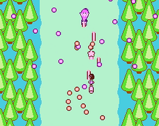
Thank you so much! I've always wanted to see a danmaku on the NES and it was quite a journey getting it to work with the system. 

I very much appreciate your feedback and I have noticed the same issue , especially when playing with my arcade stick, where I can tap with two fingers. I'll keep posting revisions of the one level demo so these controls feel polished to the players, so stick around!