Play game
Echoes of the Unread's itch.io pageResults
| Criteria | Rank | Score* | Raw Score |
| Overall Impression | #5 | 3.703 | 4.000 |
| Gameplay | #10 | 3.086 | 3.333 |
| Art and Style | #10 | 3.626 | 3.917 |
| Originality | #10 | 3.318 | 3.583 |
| Sound | #10 | 3.318 | 3.583 |
| Polish and Completeness | #10 | 3.472 | 3.750 |
| Overall | #10 | 3.420 | 3.694 |
Ranked from 12 ratings. Score is adjusted from raw score by the median number of ratings per game in the jam.
License Agreement
Agree
This game may be used in a physical and digital multi-cart release and distributed by jam organizers as part of a digital archive (ZIP).
Leave a comment
Log in with itch.io to leave a comment.


Comments
Really solid game that reminds me of hub-world collectathons like Mario 64 and Banjo-Kazooie. The movement feels smooth, the style is amusing, and it looks like there's going to be a lot of variety. I enjoyed discovering the singing mechanics; there's a lot more to it than it first seems. I'm eager to see more of this game in the future.
There are a few things that I think could use a little polishing. The button inputs seem a little inconsistent: the menu cursor and singing ability both respond when releasing the button instead of pressing it, and holding select prevents jumping from working. The enemy hitboxes feel bigger to me than collision with backgrounds, and that made me take a lot of hits right on the very edge that I didn't expect. The options screen is a little awkward with the full-screen flicker when changing options and the cursor resetting to the first entry. Finally, the wavy effect when entering a book has a random single-scanline glitch related to $2005 writes landing around dot 257 (you can test this in Mesen with Settings -> Emulation -> NES -> "Enable PPU $2000/$2005/$2006 first-write scroll glitch emulation"); writing on that dot causes X scroll to change to $20 for one scanline.
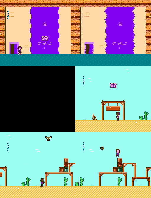
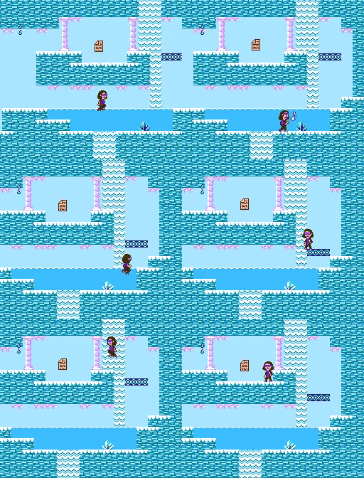
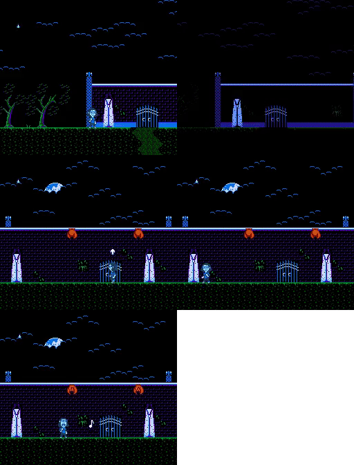
I loved the player sprite and colorful environments. The gated progression was quite confusing but definitely inspired me want to explore, which is what the purpose of a demo is so I can barely fault it for that. However, I wouldn't have included unfinished areas in the screen shots, that confused me quite a bit.
The sound was especially well done and matched the theme and character of the game nicely. I love those pitch bends in the melody channel. Good sound design overall.
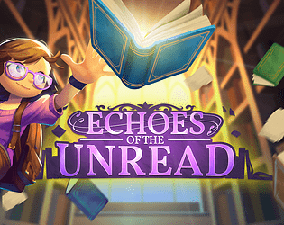
The title screen, while good, lacked the same polish that the rest of the games visual's possessed. The bookshelf motif is wonderful and works well for the game, but the logo lacked the same charm when rendered as simple line art. I had trouble remembering the name of this entry , which could be due to the logo, or the poorly named rom file submitted (acronyms don't work in a big list of roms, hint hint).
These criticisms are only meant to be helpful, I am highly impressed with the casual world building on display here and I really hope you continue development. This is a wonderful game.
Thanks! Point noted on the name of the rom file. That's a good suggestion.
I'm happy to hear you were inspired to explore more. I created the screenshots before planning to release a demo so you're correct that I should have revised the page.
Thanks for the feedback.
Very polished and ultra-charming!
I was gonna write that the map layout for the demo could benefit from being (a lot) tighter, but it seems that others have already addressed that (and for the full game, the very open layout seems like it will be part of its appeal, especialluly if there's ample enough content and non-linearity in regards to accessing it.)
This is the only game my kid (4) played through (almost) entirely unassisted, btw.
I'm not sure if the game's intended for an early childhood/all-ages audience, but we enjoyed it on that level very much.
On one hand, the difficulty curve is *very* accessible, and the gameplay quite cute. But on the other, the titlescreen aesthetic feels more serious, and I was always expecting the overall mystery to take a suddenly dark turn.
That said, the only thing that caught me off guard as I was reading the word balloons to the kid was the shootout and that boss's dialog. The violence/gunplay of which seemed to come just far enough out of left field to feel uneasy, but not far enough to feel absurd or humorous (which that unease may very well have been the intention; in which case, it was successful). Even though it occurs within a book, it felt more violent/real/high stakes than, say, in CatMercs which revolves around a screen full of bullets (which I admit I didn't think twice about while playing with the same child 😅)
Anyway, I'm not writing persuasively one way or the other. Just leaving the account of our gameplay here to give you a look at how it went down. We're both very much looking forward to the full version, btw.
I appreciate the feedback! And I'm very happy to hear it was accessible enough for the whole family to enjoy. This originally started inspired by Mario and Banjo Kazooie so that means a lot.
The game is meant to be pretty light-hearted. There is a horror section in the rest of the game that might be a bit scary I suppose. As for the gunplay, it came out of the fact the first area is a western and it felt like a simple first boss fight before getting the singing ability. I might revisit the dialogue as my thought was to remind you to use the money to buy a lozenge, and feel a bit remorseful for stealing it unknowingly.
I'm probably going to go back to what I had originally for the map and lock down the first few areas to guide you along a bit better. Enough people mentioned it and I agree I maybe went too much in the non-linear direction for the demo.
Great palette choices and in game graphics. Loved the humour, the brain boggling part made me laugh out loud. That transition between the book-world and the real-world where you just casually throw out a full screen hblank scrolling shimmer - love how suitably underplayed it was. "Oh what, this?"
I look forward to playing more. Probably the only constructive criticisms I have are a) I do feel it gets very expansive quickly which without a map, is confusing and b) that your title screen maybe slightly undersells the game inside? But that's a nice problem to have!
I wish that there could be community votes on these games here. This one was fantastic - there's so much variety in environments and gameplay that is presented. The fact that your low/med/high notes can affect the enemies in different ways is a really cool touch that adds a lot of potential for puzzle solving.
I wondered when someone would figure this out. It's going to be explained later in the game but I left it in as a "hidden" feature.
Wow, this one's super polished and professional, with so many fun little details. The library was neat, but the game got awesome when it went wild west and I kept playing til the end. My only complaint is it gets non-linear extremely fast. I'd recommend starting linear and let the player accomplish a goal first before introducing branching paths. Or perhaps a bit more explanation on what to accomplish.
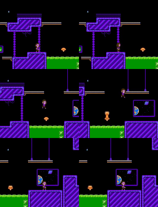
Bug report: there's a tile in the purple room that isn't a door but acts like one. It teleports the player to two different locations, depending on the scroll position. There's also a pit in the library which softlocks you.
Thank you! I originally designed the levels to only allow the player to go to the western area until they pick up the singing ability. But I opted to open up the levels a bit more. I may change it a little bit for the full release.
Is the bugged tile in the basement area? I may have overlooked an object used for the full game and the code got messed up when squashing the game down to 64KB.
I haven't finished yet but I'm really impressed by the sheer variety of areas and art. Also the writing is hilarious, I laughed at the janitor conversations. I got confused about where I was a few times, and lost out in the wild west for a while, but that's probably just down to my own poor spatial memory. Fun!
I'm glad to hear the humor landed. If it helps, there is a color variation between each floor of the library.
I've only explored the beginning so far but I really really like it! So much variety in environments, feels like a huge game?! Looking forward to spending more time with it!