
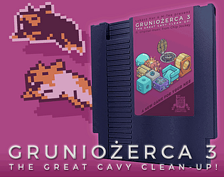
Thank you! Yes, there's quite a bit of sprite overlapping here, but most of it is controlled with subtle offsets to keep scanline impact low. (For instance, the leaf on the apple is a different color than the rest, but doesn't actually overlap.)
A member registered Jan 17, 2017 · View creator page →
Creator of

An anthology multicart for the NES.
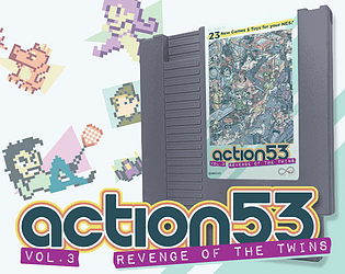
23 New Games & Toys for Your NES!
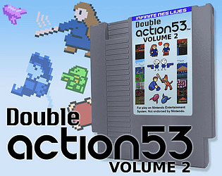
19 More Games & Toys for Your NES!
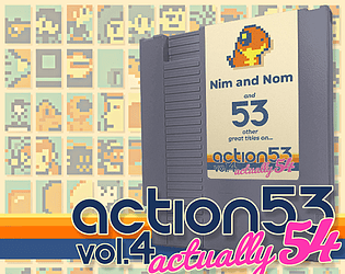
54 Awesome Games and Toys for Your NES!

20 Radical Games & Toys for Your NES!
Recent community posts
I put this spreadsheet together to compile voting between multiple team members; am sharing in case it's helpful for anyone else. This sheet's set up for a team of 3, but can easily be adjusted for varying sizes. If anyone wants to use it, and wants me to change it for team sizes, just ask.
Team Judging Spreadsheet
One cool thing is that Sheets automatically updates references to different sheets/tabs within the file; so you can rename tabs with contributors' names and the formulas still update.