Indie game storeFree gamesFun gamesHorror games
Game developmentAssetsComics
SalesBundles
Jobs
TagsGame Engines

A Lil' Murder Never Hurt Nobody

A topic by pfail created Jul 01, 2017 Views: 620 Replies: 17
Viewing posts 1 to 13
Submitted (5 edits) (+1)

I debated over and over about which title to choose for this jam. And though I was tickled by There Are Other Shotguns and intrigued by what a game called Thirst of the Wild could be, it was A Lil' Murder Never Hurt Nobody that got the idea bucket overflowing. Maybe I'm playing it safe with a theme that could loosely describe countless games, but I mostly wanted to use this jam as an opportunity to explore my own version of a brawler/hack'n'slash/fighting-type game. I think I've got some core mechanic ideas that will keep things interesting. 

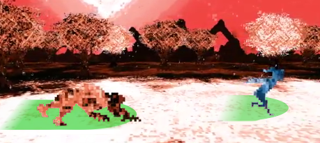
Try as I might, I'm no artist. My partner, who I'm working on a separate project with, is the talented one in that regard. So it's likely I'll end up having to use some pre-made assets for this, unless I get the framework finished early enough to sink a sizable amount of time into fiddling with art and animations. Anyway, I did some very simple pixel work to get started on prototyping. I'm actually hoping the game won't look like this at all by the end of the month, but I like the idea of sharing the development process.

Next up is coding the player movement and combat. Once I get something working and shareable there, I'll drop in another update.

Submitted

I can't wait to see what core mechanics you have in mind!

Submitted

As you can see from the edits to my previous post, I have officially trashed that garbage I called artwork. :) That image was basically a loose mix of concept building and getting my feet wet with pixel graphics, and I should've never shared it. It has very little to do with the direction my game is currently headed. I am, however, pretty happy with the character I've put together now, who is currently animated with enough movements to help me get the game's foundation up and running. I decided to make a quick video to show some of that in action. 

With the player basics prototyped (I plan on including three more versions of this move set), I'm moving on to an enemy prototype so I can get some interactivity going as well. Looking forward to share more of that soon!

Submitted

That running animation is GREAT.

Submitted

Appreciate hearing that, especially because that's the one animation that will likely be used by all of the various character states I have planned. Really glad to know it works well.

Submitted

As I continue to refine my process for making this game, I've decided that Sunday will be my official update day. Just FYI :)

So, quite a lot has developed for my game, both practically and conceptually. It turns out that my title,  A Lil' Murder Never Hurt Nobody, is a better inspiration for the gameplay than the game's overall tone. The more I thought about the core themes and mechanics I wanted this game to work with, the more and more it felt like it belonged in an abstract/supernatural setting. This also turned out to suit an art style I'm more confident working with and have come to really enjoy. Essentially, the game will take place in a sort of "limbo state," a place that appears vaguely familiar but is clearly unreal. There, the character will have to conquer certain personal demons (manifest as physical beings) before passing through to the "other side." Growth (i.e. a leveling/stat system) only comes through failure, though of course the player never actually dies. But in regards to win/lose game states, I've got some sneaky ideas in the works. 

Hopefully some of that seems interesting to explore. I know I can't wait to get into the nitty-gritty of coding it all. In the meantime, here's a quick look at where the game is as of today.

I'd love to hear any and all feedback! I'll be lurking around these boards all week, and you can expect another update from me next Sunday. Til then!

Submitted

Happy halfway mark, #NewJamCity crew! Hopefully everyone is still feeling jazzed about their projects and is gearing up for the homestretch. 

I've actually struggled a bit myself, trying to figure out what all I can put into my game's first iteration without cutting too much content or sacrificing quality. In fact, a lot of this past week has been spent whittling down my bigger ideas into their bare essentials. I'd planned a few major gameplay states for the player to have available, but that will likely be cut to just one for now. The amount of animating each state would require takes far too much time, and I'd rather spend that time making one simple, finished game work and look as best as possible.

As of now, I've got the basic combat trees in place, the enemy AI nearly finished, and the camera movement and particle effects implemented. My goals for the next week are to get the leveling system up and running and to start work on the audio. Hopefully by next Sunday I'll have some solid video to share of all that. 

Best of luck, everyone!

Submitted

This is looking real good. I like the idea of leveling on failure and how that ties in to the title (oh, I just got a little murdered, nice). I'd be a bit wary of making the game in such a way that "grinding failure" becomes an optimal strategy, but you probably don't need to worry too much about that sort of balancing issue for a jam game. It's also looking good in the literal sense; the aesthetic you've got going is great.

One thing that I always think about with 2D characters that can move along the third dimension is how hitboxes will work along that dimension. It'd be nice to have some sort of cue when characters are on the same plane (or about to be).

Submitted

Wow, thanks for the killer feedback. I may actually have some ideas in place that deal with the potential issues you mentioned, but I still hadn't considered them directly. Your point about hitboxes is right on the money, too. I've had that kind of frustration playing a game like Mother Russia Bleeds, and seems like something that could be solved fairly easily. Thanks again!

Submitted

Another week, another update, and today's is pretty major. 

Once again I've simplified my graphics. I did this mostly because, as I started adding new visual elements, I was losing control of my color scheme. Solution: a monochromatic environment that the player character will always stand out in. I think it was the right move, at least for this iteration of the project.

Perhaps even bigger is that the basic combat system is finished. The enemy AI is 100% built (save for its "death" state, which is when you beat the game), and I'm super happy with its responsiveness. I'm sure I'll tweak all of the parameters before the game jam is over, but for all intents and purposes it works great. I've included a few different clips of fight scenarios below, showing basically all of the enemy's capabilities and some simple FX. Bear in mind that the player character in this video is at what will probably be the lowest level. I wanted to show just how slow and weak you are at the game's beginning, even though you're not exactly helpless.

As for my other goals, I didn't start building the leveling system yet, but I did plan out how it will look and affect the player. I'm going to avoid the usual stats (Strength, Skill, Endurance, etc) and try to make something unique, if I have enough time to implement it properly. The sound is also slowly coming along, including original music that my friend is helping out with. That should all be in the next update!

As always, I'd love any and all feedback on this. @majugi had suggested I include something so you can tell when the characters are in range to attack, which is a good idea. I tried using shadows underneath each character, but couldn't get it to work/look quite right. I'd love it if anyone has a solution to suggest for that. Also, I'd specifically like to hear your thoughts on the health bars being attached to the characters in the game world. Do you think it works? Is there a better way I could implement it? I personally like it more than slapping a simple HUD canvas over everything, but maybe that would be simpler overall.

Until next time!

Submitted (1 edit)

This might be my second most anticipated game at the moment, after Pyre.

For the range marking, I think it could fit the style of your game to have the ground plane just change color in an area around each character. I think it could be made to look like some sort of corruption or force that's spreading out from each character (which would be more convincing if the range box left behind a fading trail so it doesn't just look like the characters are running in place on top of moving platforms).

Basically a better version of this:


It could be possible to roll the health bars into that visualization, since I initially thought your health bars were hitbox markers when I first saw them. Anyway, just an idea. Feel free to take it or leave it!

Submitted

Once again, an excellent suggestion! And bonus points for the visual aid. If I can figure out how to juggle this idea and the health system, I'm going to use it for sure. Thanks!

Submitted

Well, it's after 5:30AM now and I've finally submitted my game. I'm excited to have something finished, but far FAR more tired. I just wanted to quickly drop a note to say that...

1. I switched out the title at the very end, for a number of reasons, but it is still 100% the game inspired by A Lil' Murder Never Hurt Nobody. :)

2. I currently only have a build for Mac, because I'm somehow missing some components. As soon as I wake up tomorrow  (hopefully a bit later than usual), I'm going to get a few more builds up and available to download.

In any case, this has been a blast! Really hoping those last 12 or so hours of polish and bug squashing were worth it.

TIME FOR SLEEP

Submitted

Sleep is good. I'm going to be feeling the last minute crunch for a few days. I'm also still looking forward to a Windows build if you get around to that. Congrats on finishing your game!

Submitted

Just dropping in a quick line here to let everyone know I've updated my game. I think it's in a far better place than when I first submitted. Hopefully everyone gives it a whirl and throws some more feedback my way. I think I'm going to keep working on the project after I take a breather, so I'd really love to hear what works and doesn't work for everyone. Here's a quick rundown of what's in this new version:

  1. All character stats finely tuned and rebalanced. 
  2. Leveling system recalibrated. 
  3. New achievement system added, with 13 unlockable achievements. 
  4. Added UI capabilities. 
  5. Assorted bug fixes.

Enjoy!

Submitted

It's looking like I've made this game not very easy to understand, which is a major problem. In fact, I'm going to have to take a long look at how I implement these systems before I do any more work on this game. I might even scrap it altogether if I can't get it to make sense. For now, though, I made a video with two different playthroughs. Each one shows a different way you can win the encounter and the a few different achievements that are unlockable. Hopefully that helps it all make some sense!

Thanks again for all the feedback, everyone. It's been extremely valuable.

Submitted

Despite my fumbling, I don't think the game is that hard to understand. If the upgrade screen had a confirmation dialogue that showed up if a player tried to return to the game without spending points, I think I would have figured it out.

Submitted

Not a bad idea, though I did want to leave the option open for players to not spend any or all of their points. There's actually an achievement based around not ever leveling up your character.