Play game
Shadow Lighting's itch.io pageResults
| Criteria | Rank | Score* | Raw Score |
| Playability | #1 | 5.000 | 5.000 |
| Artistic Style | #1 | 5.000 | 5.000 |
| Cleverness | #423 | 3.000 | 3.000 |
| Theme | #426 | 3.000 | 3.000 |
Ranked from 1 rating. Score is adjusted from raw score by the median number of ratings per game in the jam.
Judge feedback
Judge feedback is anonymous.
- Great style, Great art, but I feel like it uses the jam's theme as a characteristic of it's antagonistic force rather than as a mechanic. I did really enjoy how you did HP as well, rather intuitive! This could definitely blossom into a really solid game, keep working on it!
Did you include your Game Design Document in your downloadable files?
Yes
Tell us about your game!
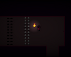
In this game you control a character inside a weird dungeon. Shadows are trying to take over the dungeon, but you can use your friendly torch to save yourself! All you need to do is solve puzzles and survive.
Move with WASD, interact with Space and move the torch with your Mouse.
Did you remember to include your Game Design Document?
Yes
Is your game set to Public so we can see it?
Yes
Extra Notes
I'm submitting it last minute, so maybe there's a lot of things unpolished, but I hope you can have fun anyway!
Leave a comment
Log in with itch.io to leave a comment.


Comments
Really polished puzzle design that's is a nice little jaunt. Good job.
This is a really neat game you've made. The puzzles were great and I like the simplistic art style and the mechanics of using the torches as not only a light source, but a weapon and puzzle elements. The last level was really challenging and I died many times but I managed to get through it with some determination!
Perhaps the last level was a little too difficult, but only due to how little health you have and not knowing how much you have left. I don't necessarily think it's a bad idea not to have any health indicators, but I did find myself looking for something to show me how much health I had left. Even some small visual change to the lil' guy's outfit or something could work.
I also noticed that you can't really see what's coming up to you when you move downwards/upwards. Like on the last level I got killed a few times by the spikes because I didn't see them until last second because of how the camera catches up to the player only when they've stopped moving + the low visibility with the vignette-type effect around the screen. It's not really an issue, just something I noticed.
This is a solid submission though. Great work :D
I'm glad you enjoyed my game! And its nice to see that you beated the last level.
So, a health indicator is something that I need to review. My idea was to make the game even darker when you lose health (I think you can see it), but it turned out to be a bit annoying. I really liked your idea about a visual change, so I'll try it out
Thank you for the feedback <3
Good concept. I think the last level is a bit too unforgiving since it is a long stretch for conserving health. I also played it a bit gung ho so that's probably it. I like that you can use your health as a resource to run through spike puzzles as a time save. Most likely needs some other puzzle mechanics to make any levels after this feel fresh.
Thanks for playing! Actually even I had some problems in the last level, but I thought it was my lack of gamer skills since I could pass it after a few tries lol
Anyway, I'll see how to balance it better
I liked the main mechanic it creates an engaging cycle where if you want to be safe and fend off the shadows you need to hold the torch, but the game forces you to leave it behind in order to progress, which makes you feel unsafe again. My main critic of the game is that it's pacing feels too slow, and the levels are too big which makes it feel dull at time this feeling is amplified every time you die and need to do the level all over again or when you have a long walk back to get the crystal to its place and advance to the next level. This criticism is very much hinges upon personal preference, I like it when a game is split into short segments you have to beat one by one, like Celeste or the boss in Furi. Btw I also liked the player walking animation it's very efficient. it can be made quickly in engine, and it looks great. It's a good trick, might steal it for my next game.
Even if it's personal preference, I think you're right about the levels, dying in a big level isn't very rewarding, so I gotta work on level design
About the animation, it's a little programmer trick I used to not waste time doing art, I'm kinda surprised it worked so well xd
Thank you so much for this feedback! The best part of developing is to receive this type of comments ❤️
At the end of the day every thing about video games is personal preference, you know some people like playing league.
A thing that really helped me with level design was giving friends and family (It's good to get some people who are good at video games and some that have very title experience playing games) my games and telling them to play it without helping them. When they are playing the game, I try to take notes about what they are doing how they are reacting to different things and ask them questions to clarify how they are feeling about this or that or why they took a certain action.
I love this type of small tricks, they can save you so much time and make your game come alive. In this jam I fell in love with animating a node's scale to create a squash and stretch effect it is super easy to do using code or even the animation player and it makes the game so much more alive and fun to play.
I too enjoy getting this type of comments, it feels so good knowing that someone else played the game you worked on so hard and had fun with it. I wish I had gotten more feedback on my game this time. All the comments I got were really nice, but none of them had feedback about what didn't work about the game for the person playing, and those are the comments I learn most from.
Fun game! Played the first three levels.
:o thanks!!