Play game
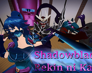
Shadowblade: Rekin ni Kaeru's itch.io pageResults
| Criteria | Rank | Score* | Raw Score |
| Playability | #258 | 4.000 | 4.000 |
| Artistic Style | #401 | 4.000 | 4.000 |
| Theme | #653 | 3.000 | 3.000 |
| Cleverness | #755 | 3.000 | 3.000 |
Ranked from 1 rating. Score is adjusted from raw score by the median number of ratings per game in the jam.
Judge feedback
Judge feedback is anonymous.
- The game was a bit difficult to control at times. The dash ability was more of a killer than a saver. It just felt a little clunky. The character also should have faced in the direction you were moving, not where you're aiming. Maybe a technical limitation due to the time constraint, but it just didn't seem intuitive with the movement mechanics. Keep at it. Looking forward to what you can do next!
Did you include your Game Design Document as a Google Drive link?
Yes
Seriously... did you include your Game Design Document?
Yes
Is your game set to Public so we can see it?
Yes
Tell us about your game!
You get invincibility frames when dashing
Extra Notes
nope :D
Leave a comment
Log in with itch.io to leave a comment.


Comments
I think there were some really cool ideas in this game but their execution was flawed. I think the fighting is the best part of the game, while it is a really simple hack n' slash there are a few abilities that make the gameplay diverse. However, the dash feels awkward to control because it follows the mouse instead of where the character is facing. I found this design choice rather confusing and it makes the game harder to play, especially considering that there is an emphasis on platforming using the dahs. While the platforming is rather basic, it's still hard to land where you want. If this mechanic was polished I think the game will feel better. Overall, there is a really strong foundation for a top down action game, and with some polish it could be a really fun experience.
So here is my list:
Not a bad execution at making a top-down hack&slash game. Missing the theme a bit, with exception of the attacks of the "shadow enemies"
Really valid/good criticism, and yes, we might have gone a little too overboard on the Shadow theme lol.