Play game
Dice At Five's itch.io pageResults
| Criteria | Rank | Score* | Raw Score |
| Aesthetics | #46 | 3.231 | 3.231 |
| Overall | #95 | 2.692 | 2.692 |
| Gameplay | #102 | 2.692 | 2.692 |
| Sound | #109 | 2.462 | 2.462 |
| Theme | #144 | 2.385 | 2.385 |
Ranked from 13 ratings. Score is adjusted from raw score by the median number of ratings per game in the jam.
Leave a comment
Log in with itch.io to leave a comment.



Comments
Nice art, the lighting was excellent, and the game felt overall good for speedrunning, you could possibly add dashing left and right based on where your mouse is, but it works without it. Good job!
Thank you very much.
Nice art, the lighting was excellent, and the game felt overall good for speedrunning, you could possibly add dashing left and right based on where your mouse is, but it works without it. Good job!
Very cool entry!
Gameplay wise, the game is very engaging, and has that very nice feeling of trying to overcome it every time you fail. The movement you have going on also allows for speedrunning in a very nice way, since it feels like you can take advantage of the overheat mechanic to go faster if you're good enough (I wasn't). The traps feel fair, as in there's enough of a window to avoid them if you're good enough, and you can always learn their patterns. Very engaging, I liked it a lot!
Themewise, I think you could've handled it a bit differently. Maybe like some sort of fire wizard or robot or something like that? I just think that the whole dice aesthetic is very cool and I liked the art a lot, but I don't think it meshes very well with your game concept and mechanics.
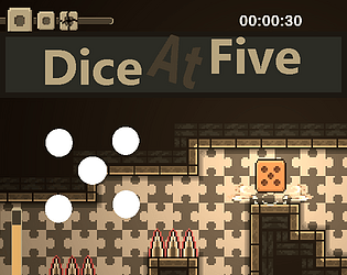
In terms of aesthetics, as I mentioned earlier, I really liked it a lot. I think the game looks very nice and polished, the light effect that comes in during overheating looks great and the animation on the die looks cool. The spikes also look great when they come out. My only recommendation would be to maybe use another font that looks more cohesive with your other assets.
Sound wise, I think it gets the job done pretty nicely, although for a game like this I think you could consider more upbeat music with the effects giving you more of a sense of speed, since that's kind of tied in to your game concept. That's clearly subjective though, and I think you treated your aesthetic with a lot of care, so it's just my two cents, maybe it can be helpful to you!
Overall, very cool entry, keep up the good work!
Thank you very much for the feedback.
I was drawing it in robot and machine trap at first. but it wasn't good. my drawing I mean. So it got redrawn. I keep the gun trap, however.
Using another font is a great idea.
Thank you for the music suggestion. I am not good with that one. I remember your game has excellent and suitable music.
Thank you for playing.
nice game check on mine too Rate PRo_SpeedRunneR inWork by Keshuspr for PolyMars x ScoreSpace - itch.io
I will take a look.
Really good looking game with smart level design, very difficult but fun to learn, great sounds too. I very much enjoyed playing!
Thank you very much.
Very good sound design, nice style, but the game is very difficult for me.
Thank you very much for playing
i like your game is really awesome simply unique game rate and play my game also plz!!!
Thank you and sure.
Nice! Great graphics
Thank you
Lovee the aesthetics! Right and Left Mouse to dash was a bit weird for me but I eventually got used to it.
Great game!
Thank you very much.