Play game
Dice: The Deliverance's itch.io pageResults
| Criteria | Rank | Score* | Raw Score |
| Graphics | #3 | 4.800 | 4.800 |
| Fun | #10 | 3.800 | 3.800 |
| Audio | #10 | 3.800 | 3.800 |
| Gameplay/Design | #16 | 3.600 | 3.600 |
Ranked from 5 ratings. Score is adjusted from raw score by the median number of ratings per game in the jam.
What would you like feedback on?
Especially the *presentation*: what looks good, what could be improved, how readable the UI is, where the game could use more feedbacks.
Other aspects like the gameplay mechanics, balance etc. are also important for me, but less so.
What did you update?
Overall polish, added monster introductory cutscene, some sound effects, movement tweens, etc. Also many bug fixes and a few gameplay changes.
Leave a comment
Log in with itch.io to leave a comment.


Comments
I'm writing this comment as I play through the game.
First of all, I like story in a games, don't get me wrong, but there's a problem. You don't want to overload a game with a story before player gets attracted. Because first instinct of any player (especially in a jam) is to get to the gameplay as fast as possible. You probably want to create a tutorial level first to explain how mechanics work and then add a story. Second thing, your music is way too epic for a story that is written.
Story: "Bard goes to the tavern and plays a sad song"
Song: "Epic adventure"
Maybe a switch to more calm song would do the trick.
About the tutorial, you shouldn't remove the text before the button is clicked. Sometimes I wanted to read the text twice to understand how the mechanic works, but then it just faded away. Also, I think tutorial should be a bit less "texty" and a bit more "try it out for yourself" kinda thing.
Gameplay:
I don't think that I understand the game fully even though I'm pretty far into it. Up until now I randomly placed cubes and haven't felt any trouble doing that. But now I'm kinda stuck on "Hal Fork". I don't get how the mechanics work and why exactly do I die. And I can't really play a tutorial level one more time now. I'm guessing that every player gets random stats and then you roll random amount of cubes that have random numbers on them. But I still die even when I place like 20 defence and Hal has only like 8 attack...
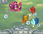
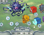
I like the interface in the game, but its a bit out of place. I think when you do 1v1 battles, enemy health and player's health should be placed somehow opposite to eachother. Maybe since your player's interface is at the bottom-middle, enemy's should be placed at the top-middle.
Presentation:
The art style is freacking amazing. I love it. Really great job on that part. But if you dig into that, I think main character shouldn't be less attractive to look at and less detailed than the enemies. Also there is no visual represantation of the fight whatsoever. You hear some sounds get cool first animation and then everything else happens behind the scenes. So, basically, everything that's happening after you placed your dices is a mistery. Need some feedback for the fight. It would add like 100 points.
Alright, I really enjoyed my time with this one!
So, I took a few notes, especially regarding presentation:
A few things that could add some juice:
Thank you so much for your thorough feedback!
Also thanks for the suggestions on more juice to the game.
I am glad you were able to defeat The Diceholder. He might not be overpowered after all! Another thing I would really like to add to the game in the foreseeable future is some ending final victory screen that would take you to the credits and so on. Sorry for the end being a bit anticlimactic.
OK, so you want presentation feedback, and it looks fantastic. Beautiful characters, monsters, UI, everything. If I want to get real nitpicky, maybe I don't like the way the font looks on the tutorial screen, but I have to stretch to criticize that. I think also maybe some double digits numbers have some overflow too -- my screen is 1920x1080 fyi.
As for understanding the game...well...so for most of it, my brain just says, put the big numbers in the squares. I was confused on what my health even was though until the fourth fight, when I realized it was the dice. Before that, couldn't find it and wasn't sure if it was part of the enemy's status box because all the numbers at the bottom were 0. I think also the bleed stat isn't really necessary -- it'd be more clear to just have a number pop up on top of the boss with a -5 in red or whatever, like in your standard JRPG. Your eyes aren't really looking at the UI, so it's hard to really glean information off of it, especially the bleed info.
Now, strategy does come into play at least on the 3rd and 5th fights with slime and diceholder (diceholder I gave up on after like 10 attempts). It takes a while to really understand what's actually happening -- that the enemy is not just nullifying one of your die's attacks/defenses, but actually stealing it and taking it for its own. Since it almost always seems to go after the largest die, it means you want to sacrifice your largest die on defense, then hope the other dice make up for it. On diceholder then, if you get less than 2 defenses, you're basically done, unless you get lucky next turn and get a heal. I think gameplay wise, having different jobs or different effectiveness (or different values of rolls meaning different things) for the different characters would have been better, because unless I'm mistaken, only the healer seemed to have a unique role. But maybe that's why I was having a tough time with the boss -- maybe one of the dice was resistant to getting their attack absorbed or something.
Thank you very much for a thorough feedback to our game.
The looks of the tutorial is currently a high priority item on my TODO list, but I intended to rework it completely and change it into some kind of dialogue (similar to the ones you see after defeating each monster for the first time) so it will take me some time to do that.
As for the overflowing numbers, do you mean in the combat stats UI? The rework on these parts is scheduled as well, I practically did not touch this since the GMTK jam ended, so it sure need some polish. I also intend to rework the combat animations so it is more readable what is going on, including all those flashy red negative numbers indicating damage and so on. If only there was more time!
You are right, that the strategy is mostly "put the big numbers in the squares". It gets a bit nuanced later on because you might want to save leveled up dice for another round if your roll was a bit unlucky but I agree that some element that would let you strategize a bit more would improve the gameplay significantly. It got a bit better when I introduced the monster abilities (these were not there for the GMTK submission), but it's still pretty much in the "use big numbers, don't use small numbers" state. I am thinking of adding elemental dice that would work better when paired with the right action but I also don't want the planning phase to become some tedious overoptimization until the best solution is found.
The diceholder has not been tested all that much since I added his mind control ability, so there is a real possibility he is currently too OP and would deserve a nerf. As for distinct hero roles, this was one of the more difficult parts of game design, because when we initially had the hero actions very distinct and characteristic, the game was not playable because you'd often roll useless actions (too much defense and heal and not enough attack). By adding more attacks though, the heroes lost a bit of their distinctiveness. I am not really sure how to solve this properly, maybe we could have more than 1 or 2 symbols per hero face (like 2-4 on each hero every turn)?
Yeah by overflow I meant topleft corner where the stats are. They overlapped over the icons a bit. I also thought maybe one neat thing you could do would be if your max health was the number of faces on all the rolling dice, that way your health increased overtime and it would make higher rolls for meaningful for healing. Idk how you would represent rolling dice HP though, would they all have their own health bars? It'd be kind of weird for the dice to have their health bars but not the characters.
Ooh, but that is actually a very good idea. If the dice themselve have "health" it would solve a lot of the current gameplay issues:
There's couple of problems that would need to be solved though:
Thanks for the suggestion, this could be fun to implement and it's a lot to think about.