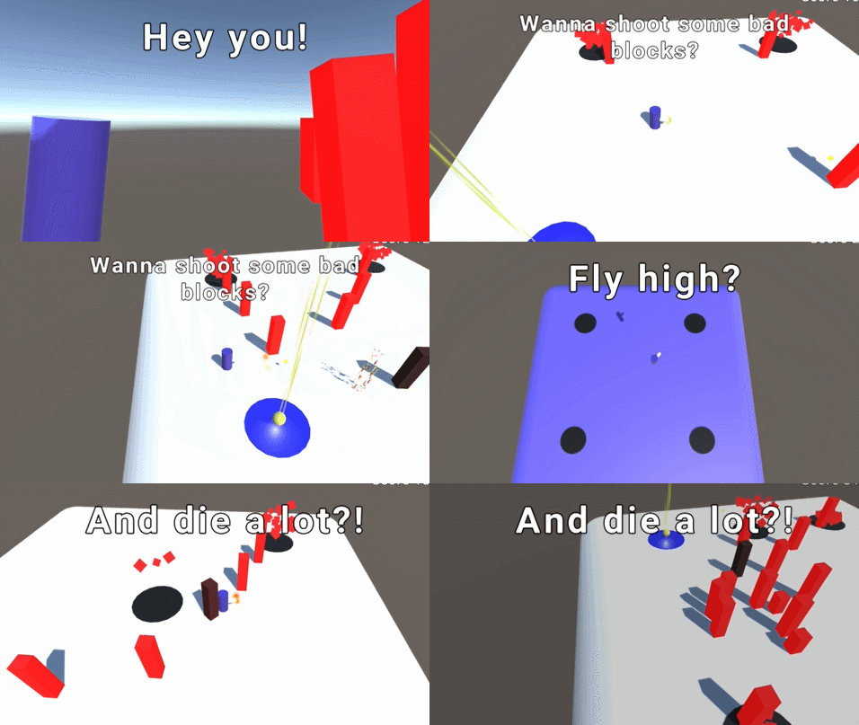
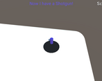
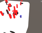
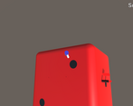
Play game
Luck Arena's itch.io pageResults
| Criteria | Rank | Score* | Raw Score |
| Fun | #25 | 3.111 | 3.111 |
| Gameplay/Design | #30 | 2.778 | 2.778 |
| Audio | #30 | 2.889 | 2.889 |
| Graphics | #34 | 2.556 | 2.556 |
Ranked from 9 ratings. Score is adjusted from raw score by the median number of ratings per game in the jam.
What would you like feedback on?
Game pacing, general feel of the game, color palette and sounds. Pretty much everything but the settings menu which uses default Unity UI
What did you update?
Changed volume on sound effects
Added music
Tried to adapt to a color palette
Added controls for music/sfx volume, full screen and screen shaking
Added a main menu and an in-game menu
Fixed player falling out of the dice
Added particles to enemies getting hit/dying
Added spike shield power up and a ground stomp power up
Added lighting cycle throughout the gameplay
Added blur when player is far from arena
Name of updated upload (if downloadable)
Luck Arena v2 - Windows (didn't test Web version so maybe this is better)
Leave a comment
Log in with itch.io to leave a comment.


Comments
I like how the game starts. That menu zoom-in is pretty neat.
Regarding the gamedesign you have few problems. First of all, is a lack of mechanics. You have like what, 2 weapons and 1 shield? At least I coudn't find anything more than a pistol and a machine gun. I kinda like the idea of an upgrades system, but when my machine-gun is taken away from me because I picked an upgrade for a pistol isn't really a way to go. Maybe you have weapon switch mechanic here, dunno, but I couldn't really find it. Also about the dice switch. You either should make some trigger to change the level or make it more like "waves". Right now that "dice roll" feels really weird. The fact that you die from a single hit doesn't make game more fun either. These kind of games should have health systems. Potential thing that could make pacing of the game more intuitive: slightly faster running speed, dash ability, some kind of obstacles/covers on the levels.
Nice game! I played the web version as I'm on a mac without windows.
I like the music you added and the darker colour palette. The particle effects are also a nice touch.
Something that might be nice to add is a rewarding sound when you pick up power-ups that would make it more satisfying.
For the ground stomp and spike shield power-ups, I didn't understand how to use them.
I like how there's immediate feedback when an enemy has been hit by changing their colour from red to grey. However, I still struggled to tell how many hit points they have, and I think having a way to tell would be helpful. Such as a health bar or getting smaller after turning grey until they reach a specific size and break apart.
I'm under the impression the goal is to get a high score, and there is no end to the game - but I'm not 100% sure, so that's something you may want to consider making more clear in the game would be good.
Overall, I found it challenging and fun to see all the different power-ups and trying to get a higher score. I bet it would be fun to play co-op with friends and family as local multiplayer.
Overall a nice game. It's a classic concept, that is well executed with an interesting twist of quickly changing between the different arenas.
I will divide my feedback into several sections. Don't take it too harshly, it's just a bunch of stuff I noted during my time with the game that I think could be improved or made better, I really had fun with your game, otherwise I would not be writing this extensive feedback:
Gameplay:
Graphics:
Sounds:
Miscelaneous:
Once again, a good job on making what looks like a fairly finished game, keep it up!
Wow! Thanks a lot for so much feedback! I tried to make it as basic as possible since it was my first try at a 3D game, focusing mostly on the action itself since it would take me too long to find good art/models (I had no idea about a setting for the game, I just wanted to make a shooter on a die rolling).
I plan on adding more guns, power ups and enemies in the future, for the Post Jam I figured adding my initial vision for the GMTK Jam, in a rather finished way, would suffice. But I really want to add a lot more stuff to this game.
I like the idea of enemy speed building up, I hadn't thought of it. In the near future, I'll add an animation to their spawn, as if they were build by those small blocks that drop from them. So there's a small start animation and they stand static until fully built!
I took the color palette from a website a fellow reviewer suggested me after the GMTK Jam, it's still not good enough but I'm slowly learning it, I have a real hard time with colors. Will sure look into those generators!
Thanks for the heads up on the AA, I wasn't aware of that option!
I'm glad you enjoyed the particle FX, I spent a good time of the Post Jam on them, I thought it was an easier way to add more juice to it.
About the enemies being too similar, I had thought of making them... bend when moving, so the small would bend a lot, the medium ones just slightly and the big ones would remain rather static. It could also be a way to point their direction (not that the player has any trouble noticing they just go straight into them). What do you think of it? Another thing that I will readd to them is they sort of blinking upon hit, after I switched to URP I lost their transparency, it was either having shadows or being transparent. But I'm sure within a few hours I can figure this out.
Thanks on feedback for the music! I knew it wouldn't turn out very good but I just wanted to try my hand at dynamically changing the music depending on the amount of enemies.
I will surely try to add more SFX to the enemies! You didn't mention, so I'll assume the enemy dying SFX was okay? I was afraid it would get boring or too repetitive.
Damn, I wasn't aware the windows build was bugged. Will fix it asap.
great intro sequence, the dice side transitions are amazing as well. I did find a pretty successful strategy of just hugging the walls. the sparseness of the environment made the game kind of abstract in a good way, there was nothing to do but shoot at the swarm and collect powerups. overall seems like a completed game
Thanks for the feedback!
I will definitely add some more twists to the game (I am planning sort of a boss encounter after some conditions are met), but I'm glad you liked the transitions! Regarding the wall strategy, I had tried adding an enemy that could set traps randomly through the map, as he didn't follow you, but I ended up scrapping it since it either added no challenge in the low spawn areas, or made the game ridiculously hard in the 5 or 6-sides. Maybe I could revisit the idea!
Nice game ! The visuals are pretty basic but works well. Though having some animated models would go a long way to make it more engaging. The color palette is ok and make it all looks pretty coherent.
Loved the dice rotation animation ! It's very trippy :)
In terms of gameplay, I pretty much agree with what has been said bellow and don't see much to add to that so I'll jut highlight some of them that seemed the most important for me.
A timer to indicate when the dice will rotate & maybe a way to impact it (lower or higher it if you kill a certain number of ennemies)
A higher fire rate on the default gun to keep up with the spawn rate. maybe lower the spawn rate a bit on the high value dice faces to avoid being overwhelmed too fast. And maybe a dash/dodge to get you out of tight situations ?
I encountered a small bug on the web version. when starting the game in full screen it seem to loop on something and the scene doesnt start I managed to go around that bug by leaving full screen and putting it bck when the fight start.
All in all It's a neat jam entry. The screenshake and particle effects definetly add some juice to it. good job :)
Thanks for the feedback! I will look into that bug, I just tried the web version briefly after uploading and didn't find that one.
About the timer, I will surely look into it. Still haven't decided if the player will have some action over it, but he definitely needs to have at least a hint of the next rolling. About the dodge, I plan on adding a dash movement with invincible frames, the player really is lacking actions. Do you think attacking with the dash would also be neat or should I just leave it to the guns/power ups?
Looks way better than what I played in the jam, but it is now difficult to see enemies after hitting them once (when they turn black), especially on darker sides of the die. Not sure how you have the lighting set up, but it may be caused by the direction/intensity of the lights on some faces.
Enemy spawn rate vs gun fire rate feels unbalanced, maybe tone down the rates on the sides with more pips or just increase the base fire rates. Love the powerups, I just think the basic weapon needs better juice.
I'd like more player involvement in the dice rolling, as is it feels very random. I don't think it needs to be entirely player controlled but maybe if it were more tied to killing enemies, or at least had an on screen timer of some sort to let you know when it will rotate.
Thanks a lot for the feedback!
The lighting uses a directional rotating light that increases in intensity when it is facing down (sort of like noon) and a blue/gray-ish point light that always rotates over the cube but has its intensity being inversely proportional to the first directional one. I plan on making enemies more on the red side, and flickering when hit also, but after I changed to URP I had some problem using transparency + shadows. I got so used to the way the game worked that I didn't notice enemies became harder to see.
I'm still trying to find some balance in spawning, the idea is that 6 will always be harder than 1, but it ends up with 6 kinda insane as you are forced to run away and 1 most of the time spawns an item and you gotta wait. About the base gun, I was planning on making it double once you upgraded it, as if dual-wielding (and perhaps adding a third one that would be like a drone shooting from above the player's head!).
I planned on adding a timer effect that warned the player the last 3 seconds before die rolls, with simple clock ticks. Currently it rolls every 8 seconds after player steps on a side, what do you think of a special enemy spawn that once killed activates the roll (with a 3 second timer)?
Guns akimbo would be pretty cool haha!
A particular enemy triggering the roll would be neat to explore. Or maybe "kill the number of enemies equal to the rolled side". Or you could leave it on the existing timer with a visible indicator, and just give the player some extra incentives like a particular enemy that when killed will make the next face have a powerup (or going back to the number idea, if you kill the right number of enemies on a given side it makes the next side have a powerup / modifier)
Got a high score of 3459. The graphical improvements to the game do make it feel better, especially the lighting and particle effects on enemy death. It also seems like in the original, the enemies spawn so fast and overwhelm you, especially with your measly pea shooter, so it feels more like you're just running and dodging the enemies than fighting them, while in v2 you're being a little more active. I still do think you feel pretty weak even in v2.
I like the addition of the ground pound move, and the way the die turns is perhaps the coolest part about the game, so then it's neat how you slam down after that. I was confused at the shield move at first, thinking I could take a hit; but it's just an orbiter. Really I think the shield should be slightly more powerful, being able to take more than 1 or 2 hits, but with it slowly decreasing in power over time, because otherwise it doesn't feel that meaningful of an upgrade.
But really the biggest thing you could do to give the game more polish is to have the characters and enemies not be cylinders and prisms. Or at least make them stylized, idk. That's probably difficult obvs, I'm not a 3d artist, nor do I have any idea what the character models should look like, but it's def the kind of thing that helps first impressions, which are pretty important.
I think sound doesn't work on the web version.
Thank you so much for the feedback!
Regarding the models, I'd need a bit of research into free models available, as art is mostly out of my reach. About the sound, I tested the online version and it somehow started with music and effects volumes zeroed, don't know why yet.
I plan on giving a few more abilities to the player (like invincible dashes, better guns) and add some boss encounters after x minutes. Did you find the texts readable enough?
Yeah I just tried it again and realized that sound and music do work but it's set to 0. And yeah no issue with text readability.