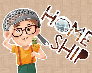
I love this one. I thought I would play a nice little cosy gardening game with occasional upgrades to build more and better stuff more quickly but the end game caught me off guard and I laughed out loud. Good job on the art and sound, the game looks polished.
Stopa
Creator of
Recent community posts
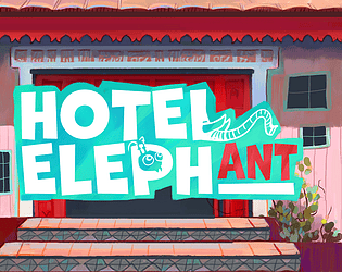
Wow, that was a lot of stuff! It took me a while to figure out how to play it and I was not really able to make the hotel profitable, but I was genuinely impressed how much was going on. Good job on getting such complicated concept done within the timeframe of the jam and the same for the visuals. Some tutorial to guide the player through the mechanics would help a lot.
Our game is a similar concept where you also build up a hotel and accommodate various guests, but it plays quite differently.
Thanks for playing our game on the stream. Unfortunately, the buttons in the left panel are too small so they look just like info icons. You can use the buttons to buy more rooms and other stuff. If you give our game another try, I promise a completely different experience (definitely not a slow-paced style :) ).
Thank you for the feedback. There actually is a camera pan, it's bound to holding right mouse button. The UI (and the controls as well) certainly could be improved. We wanted to fit everything in one column and unfortunately, larger buttons did not fit in that layout. Well done on reaching the elephants and thanks for playing our game :)
This was fun, I loved the level of polish on all the feedbacks and effects. I got to around 1.5k points before they finally got me. However, I was quite confused by the game mechanics. There seemed to be many different icons and it was difficult to react to them. In some ways the game felt turn based, but then there was the quite short timer at the bottom. At the beginning I was not sure if the game is meant to be more turn-based puzzle or action shooter. Some kind of tutorial would help a lot. I the end, I just blasted all the robodogs with as much wrench as I could yeet and it worked quite well :).
This was great and made me laugh with every piece of it. The funniest moment was when I was chased by a chef around a crate and saw the line he said once I finally "escaped". Good job on the level design, the timings of movement just outside the view-cones worked really well. The only part that felt a bit cumbersome was rolling the chefs towards the pot. It was perhaps one of the core mechanics you wanted in the game, but in my opinion, it would work better to be able to just pick up a body with E and have a slower movement when carrying.
I liked the idea, the game mechanics were clearly communicated and easy to grasp. I would work a bit on the level design though. The game played like a typical puzzle platformer but it did not really have any puzzles to solve. In all levels, I just went for the straight and most obvious way until I reached some wall, then switched and went with the other character and this worked for all the levels. I think what this game is missing is some dynamic effect like a switch or something that would change the sign of some platform/wall. Such an element would allow you to build levels which require multiple character switches. Good job on making the gameplay quite smooth without any significant bugs, glitches or nuisances.
The first play I was not careful and stabbed my way into slaughter by black bishop, but on second try I managed to beat the game. It was fun trying to find ways to eliminate both white and black pieces while completely avoiding opponent's queen. The AI had in my opinion a perfect difficulty such that it was not purely random but did not pose an impossible challenge for someone only vaguely familiar with chess. I think this is where the game could be improved furthermore. Having more "difficulties" could be interesting. The game felt nice, clean and polished and I did not encounter any bugs or issues. I also really liked the intro scene which explained the story behind the game. Overall, good job!
Thanks for the comment! Sorry about the grammar errors. We are not native English speakers and even though we did a grammar check and fixed a lot of errors, unfortunately, we lost a large part of it due to some crashes and unsaved progress. We tried to do the check again, but we probably did not manage to catch all the errors again in the limited time we had left.
And we love Diego Carlos Armando de la Mongoose too :)
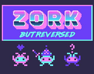
At first, I was asking myself what the hell am I playing, then I proceeded to click through all the different branches and read all of those references, fourth-wall breaking, physics and so on and enjoyed it a lot. After making sure that I really visited all the options, I am still asking myself what the hell was I playing though. It reminded me of the time spent with the book Gödel, Escher, Bach. Well-written, good job.
I loved playing this especially because our game has a similar idea of entertaining a player and receiving rating at the end. It was fun to try and get all of the different ratings, I really liked the idea of showing all the possible ratings as objects in the world and then lighting them once they are achieved. If I could improve something, it would be setting the stats of enemies. Letting the player choose arbitrary values brings you ultimate freedom of choice, but it gets a bit tedious and repetitive after a while. I think it would work better to have a predefined set of enemies (e.g. weak/medium/strong) and introduce some randomness. Overall, well done and good luck with your gamemaking dreams!
Yes, some of the choices are stored and referenced later. We first created all the dialogues in a big google doc and some of the references might have slipped when translating to working code. This was definitely supposed to reference a weapon the player found at the beginning of the story instead of [item1].
I really liked it! The graphics are awesome and the game is well-polished. I liked the duality of the gameplay, it was really interesting to play both sides in a way that makes sense. I was a little confused at the beginning and I would prefer some kind of introductory levels to show instead of tell, but after a short while I got into it and really enjoyed your game.
Fits the theme well and is a promising idea, but I think it could be greatly improved with a little bit more polishing: Add more SFX, maybe some VFX, and maybe a bit more variety with the monster types (they all seem to just do some damage and have some health), add some meaning to the environment (For example, are the rooms behind doors doing something?) Currently, it is a fun concept, but it seems that all player choices (what monsters and where to put them) lead basically to the same result.
This was great! The puzzles were challenging and required some thought, planning and trial-and-error to solve. The graphics is cute and the level of polish is great. The only feedback I would have is that I would choose a more varying palette for the "enemies" so they would be easier to recognize and that having to hold X while aiming with A/D is not really ergonomic (I used J with my other hand, but spacebar or ctrl would, in my opinion, work better than X).
I already played, rated and commented on your game during the GMTK. I did not notice many changes from the GMTK submission, but then the game was very well polished already back then.
Good job on reworking the map, it felt and looked much better now. The victory screen after the encounter is also a very nice touch.
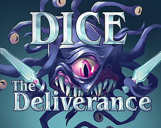
One thing that I was kind of expecting but was not really there is a way to skip the screen when a new die is collected. On a second or a third playthrough I was quite familiar with some of them and the screen felt just a bit too long for someone already familiar with the dice.
Apart from that I really don't know what else to improve, really impressive work!
A nice game that I enjoyed playing for a while, but I think it was a bit too long for a jam game, so I did not finish it.
I have written down some notes during my time with the game. Don't take them too harshly, it's mostly just things I noticed could be improved or changed or that stood out in some way. I divide the feedback into three sections:
Gameplay:
- I liked the lore. It is silly, it does not make any sense, but it works and it makes the game interesting.
- The game felt a bit repetitive after a while. Maybe I just did not get that far, but most parts seemed pretty obvious to me: Stay in the cracks or the middle of the room until you have enough moves to outrun the guards to the next pickup. Then either run back or reset to a checkpoint. Rinse and repeat.
- The dice rolling felt too random. Either just make it completely random and roll it for the player automatically or make the die roll slower so it's actually possible to hit the desired value at least semi-repeatably.
- The limited number of moves given by the roll feels more like an annoyance than a game mechanic. I know it was a submission to GMTK with the theme of rolling the dice but it just feels that real-time tick-based movement or a fixed number of moves per turn would feel much better.
- I really don't like the concept of power-ups that make some annoyance (slow resolving of enemy turns) slightly less annoying. It feels like the dev is rubbing salt into the wounds of the player by actually implementing something that mitigates the annoyance (and so acknowledging the awareness of it) but not removing it completely. There is no added value to the gameplay by letting the player wait until the enemy turn resolves, so you could as well just let the player skip it completely from the start.
- Swapping between the dice makes the gameplay more interesting but it took me a while to figure out how that works.
- Bonus points for having a dog protagonist!
Graphics:
- You use very simplistic pixel art and you managed to capture the characters, game items, and the environment very well, so props to that!
- The graphics are very readable and you use a pleasant color palette. Just sometimes it looks a bit inconsistent with the outlining, shading, etc. (for example the rock outline really stands out. Maybe change the color instead of giving it an outline?)
- Different pixel size on different things (small dice, inventory,...) feels a bit strange.
- Some things look more like voxel art than pixel art but this looks a bit inconsistent.
- Not pixel-perfect graphics along with the choppy tile-based movement does not look that good.
Sound:
- Great SFX that fit the game very well and provide good feedback to the gameplay
- The music is ambient and non-disturbing, which feels good during the game, although it feels a bit repetitive after a while.
Overall, good job on making a game that felt complete, worked well, and looked finished and polished.
Overall a nice game. It's a classic concept, that is well executed with an interesting twist of quickly changing between the different arenas.
I will divide my feedback into several sections. Don't take it too harshly, it's just a bunch of stuff I noted during my time with the game that I think could be improved or made better, I really had fun with your game, otherwise I would not be writing this extensive feedback:
Gameplay:
- Nice camera movements, good job on that.
- The feel of the game was nice, although the powerups sometimes felt a bit unrewarding (does the shield really shield me?).
- I also did not notice there are even some power ups for my first couple of playthroughs.
- The power-ups were a bit elusive to pick. I would increase its hitbox a little bit, it felt really bad to miss it by a tiny hair and then be thrown to a different dice face.
- Nice touch with the shifting spawning points, it made the gameplay more interesting and chaotic.
- The game usually ended for me with a small fast enemy spawning next to me and killing me before I could react. It would be nice to have the enemies for example slowly build-up speed after spawning or have some FX warning the player that they will spawn soon.
- I like the high score and overall menu layout with all those "start game", "try again" etc. options.
Graphics:
- The color palette seems a bit basic and without much meaning apart from blue good - red bad. I think it could use a bit more tweaking to create a more cohesive experience. Perhaps look up some color palette generator and take inspiration from that? On the other hand, I appreciate that the colors were not obnoxious and annoying, which is especially hard to achieve when only using basic 3D shapes with no textures.
- You are using the default Unity skybox and unfortunately, the skybox is very visible in your game. There are many awesome free skyboxes on the asset store that you can use. This would improve the "graphics" a lot for very minimal effort. Or if you really don't want to use any external assets, put the whole thing into some kind of a box yourself.
- I guess you are using URP? The default settings in URP do not use any antialiasing and it is very visible in your game. Turn AA on and it will instantly look much better. Turn on bloom for extra juice points.
- I like the particle FX for shooting and especially destroying enemies. Good job on that!
- The enemies all look very much alike, the only differentiator is the size, but it's hard to distinguish that with peripheral vision and thus it is very hard to differentiate enemies that are further away from the player, especially when there's a swarm of them. It would be nice to have some kind of obvious visual differentiator.
- It is totally OK to use basic shapes (it gives the game interesting abstract feel of "kill the red bad"), but even with basic shapes you can do a lot of cool flashy animation stuff. You can squish them and stretch them, make them bounce and so on. If the shape of the enemy did some kind of visual feedback on the hit for example (apart from the color change), it would add quite some juice to the game.
Sounds:
- I like that you created your own music for the game, but frankly, it feels a bit disturbing after a while. It feels like both the synth and drums are trying to play main melody as well as set the rythm. It would in my opinion work much better if the drums set the rythm (and played repetitive rythm section all over). This would allow the main synth instrument to vary the pacing a bit and play an interesting melody theme.
- I like the SFX throughout the game, but...
- The shooting sound could be a bit more 8-bit to fit the game and less realgunlike.
- The machinegun powerup changes the gun sound but then it somewhat stops working properly.
- The previous shooting SFX is audible when jumping but not otherwise.
- There is little SFX feedback from the enemies apart from dying. You could add for example:
- Hit SFX
- Proximity to certain dangerous enemies (like the fast ones)
- Spawning of enemies (especially the boss-like large ones)
Miscelaneous:
- Windows build v2 does not work, I got stuck on falling intro.
- Sometimes the game was a bit choppy. I blame WebGL, but this kind of game genre begs for some optimization in form of pooling the enemies for example.
- Entering the settings for the first time mutes all sounds.
Once again, a good job on making what looks like a fairly finished game, keep it up!
Ooh, but that is actually a very good idea. If the dice themselve have "health" it would solve a lot of the current gameplay issues:
- It would incetivise the use of low roll dice to soak up damage.
- It would mitigate the effect of "unlucky" roll of no defense.
- It would make up for more interesting combat by changing the strategy throughout the game. At first, all dice are fully healed, later they are damaged and must be used carefuly.
There's couple of problems that would need to be solved though:
- Monster attack would have to be stronger to balance out "more health" of the player. How to balance player's defense along with it?
- How would heal work? Currently it revives dead mana, would the new heal only heal damaged mana or only revive dead, or both? How to differentiate it substantially from defense?
- I think it could be interesting and perhaps even more intuitive if the same system worked for monsters too. They could have some "red" mana dice they would roll and use each turn and when all their mana dice are dead, they are defeated.
- How to display mana health on the screen? I think a healthbar for each die would be too cluttered, maybe a fill of the grayed out dead mana? Radial or linear? Would it reduce readability of the numbers?
Thanks for the suggestion, this could be fun to implement and it's a lot to think about.
Thank you so much for your thorough feedback!
- We are from Czechia and in Czech the opening quotation marks are at the bottom. I suspect one of us had a Czech keyboard switched on when writing the dialogues and it automatically made the bottom quotes. Thanks for noticing that, I'll fix it!
- This is definitely on our TODO list, unfortunately, our artist was too busy with work lately so we did not have time yet to create and put in emotions for our characters.
- Another item from our TODO list, adding some FX to the victory and defeat screen is probably the next thing I will add to the game. Some animation and sound of monster dying is a nice suggestion though, that would be cool!
- After your first fight, the rescued Mage tells Bard it's time to level up and Bard continues telling Mage they share XP with their mana dice. This was supposed to hint that you can use your points to level characters as well as dice, but I could add something more explicit directly into the level up screen.
- It does sound a bit odd, doesn't it?
- The whole combat animation will get a rework. I would like it to communicate much more visibly what is currently going on. It is not convenient to watch top and bottom bar UI numbers at the same time, so there should ideally be something happening in the middle of the screen directly on the heroes and monsters. And it should better communicate what is currently going on. And use less slurpy SFX.
- I am not sure I understand your Lime Slime glitch. The way it works is that as Lime Slime jellies a hero, their stats are subtracted from the total in the bottom UI. Then if the attack (after this subtraction) is less then Lime Slime's defense, the attack does not do any damage. This will probably be solved with the previous bullet about less readable combat animations.
Also thanks for the suggestions on more juice to the game.
- There are three ways the monster could say something to the heroes:
- There could be some catch phrase inside the introductory cutscene dramatically sliding to join the name of the monster. Something like: Dice collector <swoosh>'Tax or die!' <Whoosh>
- There could be a dialogue containing a piece of the story between the heroes and the monster similar to that at the end of the fight.
- There could be some in game "voicelines" from the monster in specific moments of the combat (at the beginning but also possibly during the combat or at the end)
- All options have their pros and cons in terms of implementation challenges, writing difficulty and added value for the player. I don't really know which one I would prefer myself, but they all seem interesting.
- The tutorial in the first combat definitely needs some rework for better readability and completeness. As for the level up, this I already addressed above: some explicit call on what you can do in the level up screen could help this.
- In another comment, I suggested that the number of actions for each hero could be higher. Currently each hero has either one or two actions, but it would not be much difficult to raise this number to 2-4 and then it would be really unlikely (if even possible) to not roll any defense with all heroes on the board. Adding a special "passive" ability to each hero is however a nice suggestion that could make the planning phase more interesting (for better strategy it would be interesting if the special ability triggered only when that hero has been assigned a dice with number less than certain threshold).
I am glad you were able to defeat The Diceholder. He might not be overpowered after all! Another thing I would really like to add to the game in the foreseeable future is some ending final victory screen that would take you to the credits and so on. Sorry for the end being a bit anticlimactic.
Thank you very much for a thorough feedback to our game.
The looks of the tutorial is currently a high priority item on my TODO list, but I intended to rework it completely and change it into some kind of dialogue (similar to the ones you see after defeating each monster for the first time) so it will take me some time to do that.
As for the overflowing numbers, do you mean in the combat stats UI? The rework on these parts is scheduled as well, I practically did not touch this since the GMTK jam ended, so it sure need some polish. I also intend to rework the combat animations so it is more readable what is going on, including all those flashy red negative numbers indicating damage and so on. If only there was more time!
You are right, that the strategy is mostly "put the big numbers in the squares". It gets a bit nuanced later on because you might want to save leveled up dice for another round if your roll was a bit unlucky but I agree that some element that would let you strategize a bit more would improve the gameplay significantly. It got a bit better when I introduced the monster abilities (these were not there for the GMTK submission), but it's still pretty much in the "use big numbers, don't use small numbers" state. I am thinking of adding elemental dice that would work better when paired with the right action but I also don't want the planning phase to become some tedious overoptimization until the best solution is found.
The diceholder has not been tested all that much since I added his mind control ability, so there is a real possibility he is currently too OP and would deserve a nerf. As for distinct hero roles, this was one of the more difficult parts of game design, because when we initially had the hero actions very distinct and characteristic, the game was not playable because you'd often roll useless actions (too much defense and heal and not enough attack). By adding more attacks though, the heroes lost a bit of their distinctiveness. I am not really sure how to solve this properly, maybe we could have more than 1 or 2 symbols per hero face (like 2-4 on each hero every turn)?
I like the idea, it feels kind of like fighting the weather. The UI could be improved for example by showing a number of symbols instead of just printing the number, that way it would be more clear how many of what moves are remaining without reading the panel. Also, there could be a couple of tweaks like removing the "fight mode" (is there some reason not to be in fight mode?), adding diagonal shooting (unless it's intentionally not there for gameplay reasons), and adding automatic end turn when you spend all actions. Overall good job on creating an interesting game like this!
Well executed gameplay mechanic, but there was really not much interesting about the game. There was nothing to do apart from running away from zombies and holding down the fire button. I noticed that there are some random events being rolled in the top bar, but it did not really affect the way the game was played in any noticeable way, so I could just ignore them. It would be cool if you had to watch the top bar and react to it somehow.
Thank you for the feedback, these are good suggestions. The initial idea certainly was to have some dice have special abilities. We wanted the mana dice to also have elements that would create different effects for different actions, but this did not make it to the final scope.
However, even in the current version, there are multiple reasons why not to use the highest rolls available. For example, you could have rolled 8 on d20 and 7 on d8, so you use the d8 to save the d20 to the next turn. Or you only rolled defense and you are able to get enough defense with smaller dice to save the big ones for the next turn. Finally, you could roll only attacks so you know some of your dice will die and the ones assigned to heroes die first so by not using the strong ones you are again saving them for the next turn.
The strategy has probably not been so important because we made the game intentionally very easy so if you don't skip levels you can win all combats with ease.
Really impressive that you made so many 3D environments, models, visuals and effects. The gameplay has potential but it could use some more polishing and tweaking. For example, I was constantly out of dice and the speed of the enemies meant that I just shot whatever I currently had, which removed most of any tactics in the fights. It was also very hard to aim at enemies which were really close, I think that some kind of autoaim would be much more rewarding. Also I noticed that different enemies react to different elements differently (or I think they did?) but it would be great if that was indicated in some way so the player could tell which elements to use on which enemies beforehand.
Overall really good job on putting this together in such a short time, you chose an ambitious scope and did a good job on executing it.
Fun game with an interesting idea of rolling to get the number of action points available. Apart from the undo button that so many people already mentioned, I would also add a "restart" button (because there is a bug in level three where I could not get back from the rightmost column and could not finish the level) and I would change the turn icon arrows to these ↺ ↻ for less confusion.


