Indie game storeFree gamesFun gamesHorror games
Game developmentAssetsComics
SalesBundles
Jobs
TagsGame Engines

nizbel

226
Posts
17
Followers
3
Following
A member registered Apr 19, 2022 · View creator page →

Creator of

Recent community posts

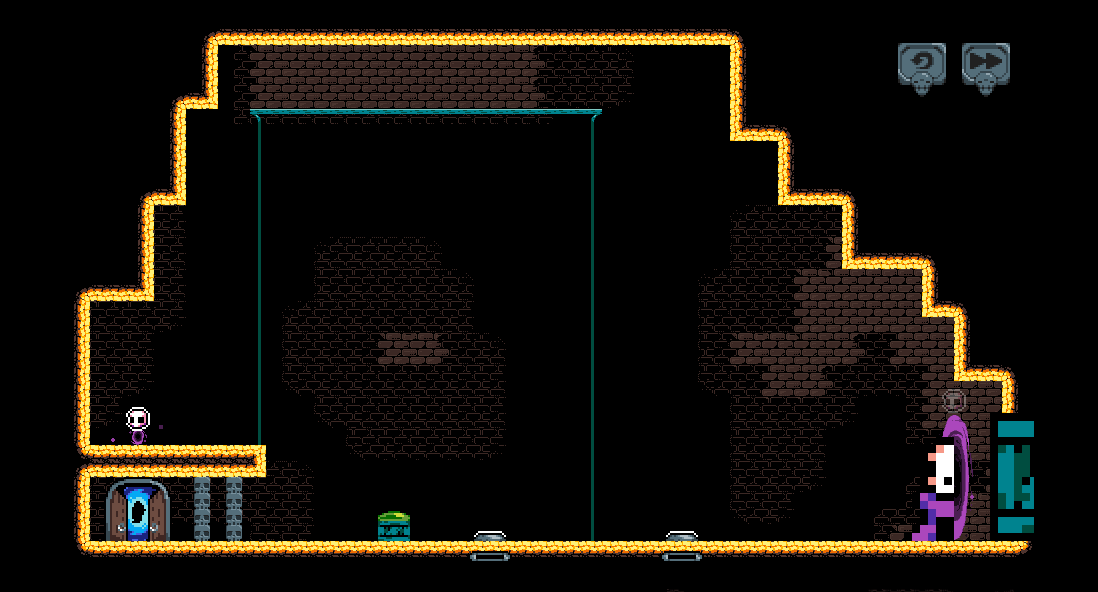
Feels nice to be playing this again! I didn't manage to lock myself or the boxes in any weird point of the map this time!

Finally managed to get through the first level with 2 boxes, not sure what was the problem previously though.

I normally dislike levels that require you to do things in a time attack manner, but having the retry button fixes that, also it wasn't that long so no problem.

The only weird thing I found was that somehow the character falls from the thin platforms if I move left and right real quick. Not sure why, but if I change directions real fast it reacts as if I pressed down and jump.
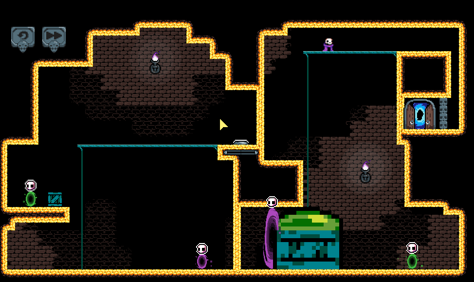
Wish I had played it during GMTK, but that was one hell of a week for me.

At the beginning when it's showing the credits it feels a bit weird to transition into the menu without transitioning, maybe it was supposed to be some sort of fading effect?

OMG this game made me  feel so horrible! I mean, the starting cutscene was very good but damn... poor geckos!

Art is cute! Music is also nice, although it's sort of funny to have such an upbeat song with such a sad background story.

The hitbox in the tail is kinda unforgiving sometimes, not a big deal I guess.

Overall this was amazing, really neat idea and nicely polished. I'd only complain about the hiccups in entering the menu and starting the game for the first time with the tutorial. Congratulations!

Welp, this is kind of a nightmare for someone colorblind.

I liked the song and the idea, wish the shooting felt a bit more powerful though.

Took me a while to understand what the right click actually did, at the end I prefered to simply waste the bullets that wouldn't be useful. My first playthrough was in some walled area that I could shoot the balls out of bounds, the second one was in a closed room that made it easier to shoot, but, there were 2 enemies and one of them would get pitch black depending on its position regarding the light.

I can see the potential here and with some more movement and juice it could be kinda fun, however I wish there was another way to match the bullets to the enemies as these current colors can get a bit frustrating.

Well, I thought it was a bit too simple but very neat. Now I see myself at the end of the journey wondering "damn, it's over?!". Congratulations!

The visuals are really amazing, I like the chill vibe it gives as you try again and again to correct course. I feel the music default volume was a tad low, but the settings menu fixes it quickly.

It was really cool to have the last angle, weight influence and trajectory available!

Would be nice to have some sort of explosion effect instead of just having the ship torn to pieces on collisions, although I'd love to know how did you manage its destruction behind the curtains!

The black hole was very neat. The wormhole at first I though was some sort of "reverse black hole" that pushed you instead of pulling, but once I decided to launch the ship right into it and saw the "wormhole detected" message I understood the idea.

Oh, just a nitpick but clicking on retry shouldn't allow you to click on retry again. Maybe locking player input on retry would feel better.

Awesome game!

Interesting start, and kudos on allowing players to skip!

One minor nitpick I got was that the Thick Fog title would feel better had it more of a smooth movement instead of just switching between straight and bent state, if that makes sense.

The settings menu feels a bit off because I can't see the minimum and maximum points, actually, now that the cloud passed I can see it, maybe make it a different shade or add some outline?

The dialogue didn't convey much emotion, sometimes it felt like someone just reading lines instead of a tired man talking about cleaning the mirror. Also I had to decrease  the music a lot to hear it when the spirit appeared.

It seems to be adding clicks to a queue, I clicked the door multiple times and it kept on activating its dialogue reaction even after I left to some other room.

I played the bird song to the spirit but I guess I had something wrong in the combination, so nothing changed. That made me quit because it was too long to play all the horn parts.

Overall I liked the setting and the art style kind of grew on me, but the puzzle was too harsh/boring. Maybe if we could play the horn before the sound ended?

Hello there!

1) Oh, the idea is that if they are more than 5 units of distance, the new link changes color to show it is not possible, so you can and should connect as many computers as possible, as long as they are close enough.

2) It is possible already, through the settings menu.

3) I'll work on that! I was thinking maybe adding some ballon with an alert nearby, or maybe making the connection "broken", sort of like two plugs far apart.

4) Neat, currently I just change the "wifi waves" on regions to red in order to show there's a buggy connection in that region, but I can think of some other alerts to indicate new machines.

5) It's a nice idea! At first, that health bar was supposed to be a "general internet satisfaction meter" and it would involve many parameters, such as bugged connections, computers able to send all the data they had, expectations of a bigger network through time... but it got a bit too unwieldy for a jam game so I made it just about bugged links and non-connected computers.

Thank you so much for the feedback!

Thanks for playing!

I think I can work on that drag and drop idea! My plan initially was to show a set of options whenever you clicked an element, be it a link or computer. Though I didn't get much time to implement that so it ended up being one action only each click.

Oh, regarding the tutorial, in the settings menu you can enable/disable it!

Thank you for playing!

Oh, the idea is to connect as many to computers as possible. Currently you can only connect if they are at most 5 units of distance apart, when the distance is bigger the link changes color to show it's not possible (although maybe it is too subtle).

When you zoom out,  the "wifi waves" in the regions indicate there's a bug by turning red, but yeah zooming can be a tad difficult. But I enjoy the idea of giving some grace while zooming, perhaps making time pass waaaay slower during zooms? I'll look into it!

Thanks once again!

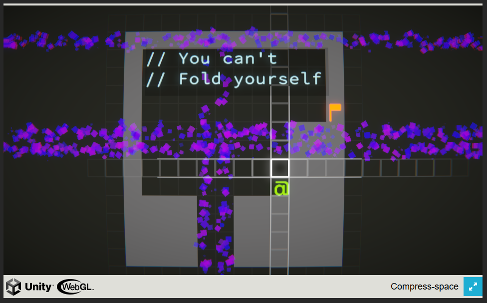
I find it really gorgeous and creative. Not sure why but the first time I click anywhere in the menu it goes full screen, but it's no big deal, I just press Esc and go on.

The game was brutally difficult for me, did not make it past level 7, also, I found some sort of bug that I'm not sure how to reproduce on level 7.  Somehow I folded the exit and when I unfold it is now part of the wall.

I tried skipping levels into 18, didn't quite understand the 3D mechanics and I couldn't figure a way to solve that one either.  It also glitched with some folds, making  the circuits not connect anymore.

Overall this is a super cool puzzle, I wish I were better at it.

The premise is odd but could be interesting.

In the settings menu, it would be nice to have background on the values. Music and some of the controls become hard to read depending on the position on the screen.

Visually it was alright, although, I really enjoyed the effect from the menu to the game, nice effect between scenes.

The music felt a bit... unfitting? A bit too serious for something this cartoonish. The jump sound effect could be a bit shorter, gets annoying fast.

I couldn't make it past the first level, didn't understand where was I supposed to go. I seemed to reach the end of the level and got a crystal, but nothing happened after that. Also it's a bit odd to respawn after dying but all ants are gone up until where you died. It does makes it easier to advance but it feels too empty. However, really nice touch to add some unexpected things like the moving spikes and the ant laughing when it kills you, that was really unexpected and it was fun! Once I killed an ant that gave me a new heart or something like that, didn't quite get what changed.

The hitboxes make it harder than it should be, I collide with platforms while not even being close to them, it's hard to figure where can I position myself for jumps.

It's a neat little platformer that could use some polishing in collision detection. Also more unexpected events to make use of the silly premise.

Damn this game oozes with style! Well done on the art and music, really amazing!

I liked the slow start and how you really show the basics in the initial levels, well done on that part. Although on the first stage where you are building the tetris pieces many times I fell back on the first tutorial cloud and it would say the same thing over and over, wish it would disappear or maybe after the first time it took some button to reactivate the message.

The tetris/platform blending was great, although it got a bit hard for me quicker than I'd like to admit! Also, I am playing on PC so the wall jumping gets infuriating at times. In many occurrences my double jump became a wall jump and I had to restart the stage.

Kudos on yet another amazing entry!

Okay the credits were super cool, kudos on that detail.

I enjoyed the visual style, really takes me back.

The sound was a bit too repetitive and didn't seem to convey much of the grandiosity/action. 

I made a pacifist run of sorts, avoiding conflict with monsters because combat was too hit-and-miss for me. Also, although the movement felt a bit janky with the floatiness, sprinting around fixed the slow move speed.

I enjoyed seeing the world diminish as I got bigger and bigger soldiers, was just a bit odd to see new bigger monsters around when there were none before, but that's  nitpicking I suppose.

Some doubts: what was that "I'm also here" guy? And the scary head above my soldiers at the end?

Overall, it was a nice idea! Congratulations!

Wow this was super crazy. Quite chaotic to understand what is going on at first.

The visuals are amazing and I wish the audio accompanied the vibe. Also, nice touch on the game over animation, really neat.

I couldn't make it much further in the game as sometimes enemies just took me outside the screen and I couldn't react. It also took me a while to understand my shooting, I wish there was some sort of particle effect to see I was firing. Maybe also allowing the player to just hold fire instead of clicking.

One bug I found was that once I resized the screen to small as possible, killing all enemies (yeah!), I couldn't scale it back up. For some reason as soon as I clicked to drag the size it just went with the current size, and no enemy spawned anymore.

Overall a very nice bullet hell, the screen resizing was a great touch.

Thanks a lot for the feedback!

I plan on adding some mouse sensitivity settings, I tried playtesting to make the camera movement speed quick but not hectic, but that wasn't enough. Oh regarding the simplex/duplex links, I was planning on making it more useful as in early stages it would be more about switching which computer transfers and all that, but due to time constraints I trimmed a lot of the content in order to get to the scale magnifying part.

Once again, thank you!

Thanks for playing! Once I get back to developing this one, I will make sure to check what's causing that bug. I managed to find out that full screen bugged the alert placement, but maybe that was just one symptom.

Man, that was hard! Tower defense with a tilting map gets crazy too quickly.

The presentation was amazing, I just felt like during the fights the music could be a bit more... battle-y?

A way to speed up the chat would go a long way, I wanted to read what they said but it felt too slow.

I didn't last long in the game, but I wish there was some score. Also, when game over appeared, the characters' chat continued.

If you guys plan on updating the game, maybe adding a way to check the weight impact of every slot placement would be nice? It's a bit complicated to figure out if the balancing and counter balancing will work at times.

Also, when I tried to replay after losing, I skipped all the chat and placed a tower, but nothing happened. Either it bugged or perhaps the first wave has some sort of fixed time to start?

Anyways, really great job, it was one of the most interesting concepts I found so far! Well done!

Holy shit the scale is absolutely bananas lol. When I scrolled the mouse wheel and it went straight into the world I was blown away!

Couldn't get past 510 score because a black hole outta nowhere killed me lol!

That was fun, I like the graphics and wish there was a bit more of sounds.

Kudos on making something so crazy! Also, how do you even escape the black hole? When the screen got all wobbly I knew I was done for everytime.

The visuals are amazing, I love the low poly parts and the environment.

The music was a tad too low, but once I cranked up the volume I could see it was quite chill and seemed to fit building.

The controls felt complicated at first, I tried rotating the parts while dragging them to no avail. And even reading the instructions it took me a while to get the hang of it, but that might be on me.

Once built, it was super cool to see the physics and how commands influenced the movement through every wheel attached, really freaking awesome!

Congratulations on making such a complex game in so few time, that was great!

From the start, I was charmed by the features' description featuring the gnome hats haha!

The visuals and sound effects were nice, kinda get that feeling from early 2000s MMOs. I wish there was a bit more of gameplay, because I hunted some gnomes at some point but that was it. Also, the spells took way too long to cast for the first time after logging in.

But, well, while it wasn't very heavy in gameplay, I can only say thanks a lot for the amazing job at capturing the whole spire of madness at the beginning of a new game, the hard to scroll chat (which I wish you guys didn't make auto scroll down because at points I gave up on reading all messages), the excitement to the bots and ruins of an online game. I was really blown away by nostalgia to my old days of Granado Espada.

Also, well done with the credits and the revival project, took me back to some other past MMOs.

I tried to find my chat friends in the map but I couldn't, it's hard to differentiate names, maybe with some more time their names could be in different heights when too close by? Saw another player with Babadook on their name, neat.

All in all, thanks for this experience.

Oh, I saw some people mentioning that refreshing the screen fixes it, not sure if reducing screen zoom could also help. 

I was initially already impressed by the the amount of levels and settings you have as a solo dev, well done!

The graphics are super cute and fit very well. I like the tension of the music, although I missed some sound effects for B-0, would be neat to have him beeping and buzzing.

Some minor situations I found playing (that could be reverted by simply restarting the stage anyway):

  • After leaving the game to change some settings, the tutorial in the first stage wouldn't proceed from "Pretty robust...".
  • The robot movement is a bit hard to control at times when you have some tight jumps to do, it feels a bit slippery. It was a bit frustrating to lock yourself in a corner and have to restart all over.

Overall an incredibly polished game with some clever puzzles, congratulations on such an amazing entry!

I like the simple art style, some goofy background music could work wonders here. The clapping sounds when you clear a stage are a cool touch, though. 

Good job on the grass moving when the ball passes over it, I love these tiny details!

I had to full screen in order to see the whole game, at first I was just seeing the mouse right click help, but something green spawning above (it was just a corner from the portal animation), Maybe you can change the Itch page to accomodate the entire screen?

Some feedback on the levels I got:

  • I didn't understand at first why couldn't I hit the ball.
  • The second level would only let me pass through if I created the first portal at the left, took me a few tries.
  • At the third level the ball managed to clip through the stage and disappear, it was only then that I understood the idea of scale/portal entrance (lol I'm an idiot!).

It would also be nice to be able to hit the ball while it's still moving.

Played through 4 levels. Overall an interesting idea for a puzzle game! Congratulations!

Thank you so much for the feedback!

Hmm, that might have been a bug, as computers should never stop appearing. The idea is that the camera zooms out more and more as the network grows, so you have to keep an eye out for any computer that wants to connect. Although the scaling got a bit off due to lack of playtesting the later stages. In my original idea you would be dealing with regions in the endgame, but I had to scrap that for time and it became a "look for buggy connections around the globe".

Thanks!

Thank you for playing!

Yeah I should have added a short notice that lots of clicking would be required as the game progresses.

Thanks for the feedback!

Yeah I'll ask someone who has a better eye for colors on the next version of the game, I tried to choose colors that allowed good contrast but I might have failed miserably lol. Would it be better to warn the player that time is paused during the helping text? Or really allowing them to build? I thought pausing would suffice because reading while the satisfaction meter drains was too punishing.

Thanks a lot for the feedback!

Yeah I thought about making the computers/links change in size or change colors while hovering but I had time. I chose to make the tutorial dialog stop time so the player could have time to read, but I didn't think about opening it back, noted! The loss condition is due to network satisfaction, the tutorial only brushes through it, but the idea is that you're building the internet, and there are lots of doubters so every bugged link counts against you, so does every computer that is not connected (in my head I had all this lore of people feeling like the internet was this elitist club lol).  The zooming generally ends in a game over because I removed the time pausing during zooming, but I'll fix that!

Once again, thank you very much for the feedback, I really appreciated it!

Thanks for playing!

So, the satisfaction meter (that blue bar) when you start new regions change to only increase by 1 per second per region that has no bugs, however every computer not connected to any other computers decreases points every second. I didn't have much time to test the end game so it got stupidly hard.

Thanks for the feedback!
I haven't seen that one, I left a (not very efficient) visual cue indicating whether it was possible to build a link, if the link is larger than 5 units, the color turns... some transparent gray-ish, not sure it was the case, did the link remain blue-ish before building?

I really like the idea! As someone who thought of making something about scalable infrastructure this looks cool.

The sound effects get a bit repetitive quickly.

The tutorial at first had this previous button that allowed me to click, felt a bit confusing.

Nice touch with adding random names for the servers! On my first try the link to the server didn't work even though I managed to connect to the up arrow.

Took a while to understand how to delete a link without deleting all routes.

Is there a way to lose? A server once got overloaded but I seemed to have no penalty.

It would be nice to see how much memory my devices have, and also be able to keep a steady message speed. Maybe adding a "auto pay" to keep message speed over a certain threshold.

All in all, a rather addictive network maker, I spent a good dozen minutes looking at the messages flying around.

The robots are very cute! 

The song is super chill, it really compliments the feel good mood of the small robots.

The robot jumping made me smile lol.

Took me a while to notice that the buttons were connected to the open latches. Maybe a different color could help.

Level 11 took me a while, but I managed to finish the game.

Really cool concept, I wish I could see some more levels and different robot combinations. Congratulations!

Really nice style! I loved the ocean water.

I found the music volume to a bit too low. Had to crank up the volume to listen, but it is a very calm cool song.

Took me a while to understand what did the drawings on each box meant.

I didn't understand why some boxes would get bigger or small, but it was fun trying to scale my boat and shooting those pesky seagulls.

Managed to last 2:25, but a ship just 4 meters big.

Maybe you could also get some gems sometimes, it gets hard after a couple minutes with pretty much only seagulls spawning.

Congratulations on making a stylish fun game!

The song is so cute! Fits nicely with the aesthetics. Damn I really love your GMTK entries lol.

The small dust clouds when the characters lands feel a bit odd, due to being so static.

On the 4th level (I guess, the one where you scale a box appearing on a portal up), I think I died while spawning carrying the box, dunno why.

Sometimes carrying a big box through the portal bugged the box, like it clipped out of the stage.

By the way I couldn't get past this stage, either I'd get softlocked or would die not able to spawn again when carrying the box through the left portal.

Kudos on making such a charming fun puzzle!

I really like the blocky style. A song would go a long way on the difficulty ramping though (I saw on your credits that you had music, but I had just the shooting sounds when I played).

The tutorial was a bit confusing regarding the "shop auto refresh", I assumed the shop was the lower part of the screen. Alsom, "Everything cost 2G" could be on the same line, to be clearer.

The firerate and the range blocks are a bit complicated for some color blind people to differ, just a heads up.

I really wish I could rotate blocks.

There could be a very rare "1 tile" block, that could be an easy mode haha.

I didn't understand exactly what counts as a tower, each tile is considered a tower? So a 4-sized block creates 4 towers?

Overall really cool tetris/tower defense mash. I managed to last 4 minutes only.

Amazing factory-ness you got in such a short time. I like how complex it can get.  

I wish some of the tiles had a description, some like the bridge I had to test in order to see what really happens (and lose a few of my poor dollars).

The arrows are very helpful, but there could be a way to not show them once the full system is working, it would be neater.
Maybe I didn't find it, but is there a way to speed up the game? It would help replayability, when you get the hang of it, the start is too slow.

The tutorial is helpful but I got a bit lost on my first playthrough. Though something more visual with all the tiles functioning wouldn't be feasible for a jam.

A nice song ramping up the pace would do wonders for this game!

I deleted a server once with a file in it, the file kept existing at least. Good job on dealing with that possibility!

At one time I had 0 dollars, barely managed to put an output back, but then suddenly I got 370 dollars after a file.

Very nice, I just wish I was better at it because I kept losing money and couldn't make much long in the game, barely got a couple download inputs. Congratulations!

This is interesting. My first idea for the jam was to somehow develop APIs that could scale but I didn't think of a way to make the gameplay loop. 

One neat detail is the name of the servers, like posh-cicada, that was nice.

While visuals are really cool I wish it had some calm focused background music, it would fit very well.

I couldn't find a way to delete handles or servers, so I basically restarted levels everytime. Couldn't get past the micro-services level, tested a couple of micro-services and application combinations but it would either crash or go over budget.

It's a really nice concept, a bit too trial and error for me.

Okay the graphics are stunning, very beautiful art, menus and fonts. 

The sound seems fitting, I enjoyed the background music a lot. Player for like half an hour and it didn't get repetitive. Kudos on the sound effects too.

Overall the game is amazing, there's a lot going on behind the curtains here, well done.

Here's some feedback:

  • I thought the compass at the bottom center could be a bit easier to read, not sure if just changing the text color.
  • When I got to the game over screen, the ship still boosted as I clicked, it also was showing the speed under the compass, as if I hadn't really lost.
  • I think there's a small typo on "missle module".
  • The background felt a bit janky when you moved, as if the camera had some lag to update.
  • What were the buttons like maximize in the Upgrade Spaceship window supposed to do?
  • I wish the shop would open a bit faster. Also once I opened it up an asteroid hit me and the explosion smoke got in front of some of the shop elements like my ship base and the "Add slots".
  • It's damn hard to control the ship when you want to make short turns.
  • Do health power ups have a timer to explode? At first I thought my laser could destroy them. Maybe having some visual cue that they are going away soon could help.
  • Upgrading the ship made it have disconnected slots, maybe there could some placeholder for when you still haven't put armor enhancers? The single empty slot at the center didn't collider with the asteroids.
  • Near the score at the top right of the screen, I had this "654 kills" written, what was it?

That's it! My highest score was 30459 points for 3:37 minutes, it felt like just putting a lot of lasers on the initial ship was the way to go for me. Congratulations on a fun game!

38 High score!
That's a funny game, felt a bit strange to get going (but mostly because I barely read the description), but once I understood it's a nice level of challenge! Awesome art and music, congratulations!

Top-notch mood.

I liked the visuals, the alien Cthulhu-esque looks of the body parts was very cool. Perhaps a bit more effects when we hit the parts to feel a bit more gross, instead of just disappearing. Just to match the descriptions the narrator give us. I just thought the playable screen on Itch was a bit too large, lost a bit of screen space until I managed to find the full screen button.

Music was brilliant. The moment I saw Moustronaut was involved I knew it would be amazing. Sound effects are also very fitting for the claustrophobic gross environment. The narrator is on point pretty much all the time. I'd just make a few lines when the player picks items to be less cheerful, more sullen.

The gameplay was pretty simple to understand. Some crevices are more challenging but it never feels frustrating or rage-inducing.  Sometimes I wouldn't pick the oxygen tank because it collided visually but it's collider seemed to be a bit more at its top. Also regarding collisions, perhaps there could be a grace period or a cooldown for the submarine hitbox, because when you get stuck it's easy to hit walls multiple times and lose a lot of life. One thing that felt unfair though was the submarine slowly sinking while I was reading the logs, there was one time in which it hit the wall while the narrator spoke and it registered as damage.

I thought the upgrades were a neat addition, although it didn't feel very fitting to have the player being forced to die to upgrade the ship. At the end I got to the heart but I wasn't heavy enough, I shouldn't have to kill myself in order to advance.

Overall, a super cool and moody entry, congratulations!

The grappling mechanic is cool as heck! I'd like to see it more developed.

Visually it's pretty amazing. Liked the art and it was especially cool that you guys managed to get an intro with images (although one of the last ones I didn't understand exactly what was depicted). The tutorial is pretty cool and the only minor problem I had with the graphics were the green/orange-ish spikes on the walls, they felt like they blended a bit too much with the background so I didn't figure it would kill me, until it did. Also, the jumping and spinning while double jumping are super charming, kudos on the animation.

On the sound department I think music is a must in this game. The frustration from dying time and again felt worsened by the sheer silence. I like the jumping sound effect but the dash one was quite uncanny, felt like Gigio was suffering somehow. The death sound is super cool though! And brutal.

I really enjoyed my time playing with the grappling hook, but Gigio's momentum is a tad too unforgiving. I actually gave up on the tutorial because I kept on falling while in the jumping parts. His falling speed felt a bit too fast, making missteps pretty certain death as it was near unreactable to me.

Also, regarding the checkpoints, I've reached a few of them but I'm not sure they are working because when I die I seem to return to the beginning of the map. Maybe some indicator of how deep you are could help?

Other than that, there were some really minor typos that you guys are probably aware, like the "Options (not aviable)".

All in all, I had a lot of fun trying to survive falling around. The grappling mechanic really is super neat and when you get to save your skin using it, avoiding spikes by an inch, it feels amazing! Congratulations guys!