Play game
The Dogshank ReDICEtion's itch.io pageResults
Criteria | Rank | Score* | Raw Score |
Gameplay/Design | #23 | 3.250 | 3.250 |
Audio | #27 | 3.125 | 3.125 |
Fun | #28 | 2.875 | 2.875 |
Graphics | #29 | 3.125 | 3.125 |
Ranked from 8 ratings. Score is adjusted from raw score by the median number of ratings per game in the jam.
What would you like feedback on?
I was rather surprised by the middling rating this got (sitting in the bottom 45%, which is the lowest I've ever done out of all 6 GMTKs), despite personally feeling more confident about it than previous years. In essence, have the improvements I've taken made the game clearly better? To compare, the original is jamVersion.zip or you can play it online at https://notthefuture.com/dogshank/jam/
What did you update?
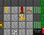
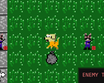
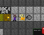
Changes made include adding collectible upgrades (which makes this into a metroidvania), showing the walking direction of enemies and making their routes more visible, making the game fullscreen so you can get a wider view, making the graphics slightly voxel-like, among plenty of other tweaks.
Name of updated upload (if downloadable)
postjamVersion.zip
(as opposed to the jam's jamVersion.zip)
Leave a comment
Log in with itch.io to leave a comment.
Comments
It really has improved comparing to the original jam version, especially the camera distance. However, I feel like the moving gimmick becomes more of an annoyance to the player. More often than not I found myself hitting space repeatedly so guard movement could be fast forwarded.
The sound and graphics are nice and very fitting to me! I liked the setting (very outlandish and funny) too, but the movement really turns me off. I saw that a bit ahead you get a second dice, that helped to alleaviate the randomness in movement. Also, when I got past the first guards the game told me stuff I hadn't noticed, (regarding guards moving in straight lines and walls/cracks), maybe if there was a way to tell that info to the player beforehand? I spent a while trying to get past them at first, but then again maybe that was just me.
A nice game that I enjoyed playing for a while, but I think it was a bit too long for a jam game, so I did not finish it.
I have written down some notes during my time with the game. Don't take them too harshly, it's mostly just things I noticed could be improved or changed or that stood out in some way. I divide the feedback into three sections:
Gameplay:
Graphics:
Sound:
Overall, good job on making a game that felt complete, worked well, and looked finished and polished.
Yeah, there's already a lot of good points mentioned by others. This game has the potential to turn into an interesting strategy game, with the ball-and-chain mechanic being notably unique, but there are just so many minor annoyances, it almost seems like you *want* to make the player rage-quit. I'll sort them by how annoying I found them to deal with while playing.
Pain Point #1: Area of View
There are so many times I ran into a situation where I only realized I was doomed after taking a few steps, but there was nothing I could do about it. I know this may sound a lot, but when I can roll up to a 6 and guards can roll up to a 6, I feel like I should be able to see at least 12 tiles in any direction. That doesn't necessarily mean this needs to be the default area of view, but at least give the player the option to zoom / pan the camera so they can see that far.
If you want to keep a bit more of the cramped prison atmosphere, you can think about adding a line of sight algorithm that hides tiles that are blocked by walls, or maybe grays them out if they have been previously explored, but are not currently visible. Sort of like old strategy games like Age of Empires.
Also, bonus pain point: I only realized on my second try the area of view was actually bigger in full screen. I don't think that's something that should happen.
Pain Point #2: Slow Guards
I absolutely second what Szym said about this. Why isn't the guards' speed much higher by default? This is not a power-up, this is a convenience feature! Ideally, guard speed should be a setting that can be adjusted to the player's preference, but yeah, I don't think you can go very wrong by just setting it pretty high as a default. As long people can follow the guards' movement visually, it should be fine.
Bonus nitpick: The music change is just soo jarring. Maybe think about adding a cross-fade there.
Pain Point #3: Too Few Ways to Counteract Bad RNG
I originally wanted to say this game is too random, but on further inspection, that's not the problem. Slay the Spire is a very random card game, but one of my favourite games of all time! And you're already doing the right thing by using input randomness instead of output randomness. So, why does the game still feel so random?
I think the main problem is that oftentimes, there's just not much you can do to counteract a bad roll. Trying to sneak behind a guard in a 1-tile corridor but rolled a 6? Tough luck, no choice but to run into them.
Adding more dice and keeping them as backup numbers is a very nice start, but it's introduced at a point of the game where I believe you might have already lost the interest of a lot of players, so I would do that much earlier. I'd also like to see a simplified dice selection method, maybe just click on the one you want to use or something.
Pain Point #4: Unnecessary Guard Turns in Safe Areas
I would mark certain areas of the game as save zones. As soon as the dog enters them, the turn-based system is paused and you can move freely until you leave the zone again. Admittelty, there's not a lot of safe spots in the prison, but when I have to move through one at a excruciatingly slow pace of 1 pip per turn, I do get a little annoyed.
Pain Point #5: Counting is Annoying
I don't want to spend every turn thinking a long time about where I can go and where the guards will go. I would love a few UI improvements to help with that.
A very simple thing that I love in puzzle and strategy games that require any sort of counting is using a checkerboard floor. Not only does it make counting easier, it also helps with quickly evaluating the parity of entities.
If you want to be even nicer to the player, you could think about adding (optional) path markers for the guards' intended movement, assuming they don't run into dynamic obstacles. Also, you could mark the squares that the player can end up on given their current die. This doesn't really give the player information they can't figure out on their own and unless the process of figuring things out is interesting in itself (which I don't think it is here), I'm always a big fan of giving the player the available information in the most digestible form.
Some More Suggestions That Didn't Fit Into the Format
I would consider switching to a completely mouse-based movement system. Click the dog and drag a path to wherever you want to go. Backtrack to the dog to cancel movement.
The graphics are cute, but a little jarring. I think the main problem is that the contrast between background tiles and sprites is too low. Increasing that contrast might already help a lot, for example by brightening / desaturating floor tiles.
Sorry If this sounds overly negative. Again, this is a game that I think has potential and is mostly dragged down by a bad user experience, but if you put some time into fixing the main annoyances pointed out by the people here, this could turn out to be pretty fun!
EDIT: One little thing I really wanted to mention because it stood out for me but totally forgot: Having the sound effect match the number shown on the rolled die is a great touch! I love it!
I second everything Szym said. The base ideas here are cool and could produce a very nice puzzley game, but as is there is a lot of frustration.
I love the idea of preventing backward movement, and the randomness of your moves makes sneaking around more tense which can be cool. The theming is great, and I like the pixel art.
What I would recommend adding/investigating:
* Try removing the randomness of the guards movements. Keep the randomness of the player movement, but make the guards predictable. Maybe have a visible effect to show where they will move next turn.
* Zoom out the view more, or provide a way to move the camera outside of the players own movements. It can feel very unfair to pop out where a guard is who was offscreen and you had no way of knowing they were there. Giving me a way to see where I will be going would help that a lot.
* Movement hurts my eyes. The jarring jump of the entire world on each tile is not pleasant to look at. Having a smooth movement and some animation to it would alleviate that, or having the camera zoomed fully out so you see the whole level and it never moves may work as well.
* Change the music. For this kind of contemplative game, you want something that is present but doesn't draw a lot of attention to itself. This often happens when there is a lot of repetition of harsh noises. I'd recommend putting it on in the background and listening to it at a normal volume while you do other things. If it doesn't annoy/distract you, then it is usable as background music.
* Don't have a single tile wide hallway open into a guards path. This feels very bad when you are forced to walk into the guard.
* Clean up the background pixel art. A single floor tile shouldn't be so busy as to draw attention to itself.
I played the first jam version before trying the new one and I can say that most if not all issues I had with the first version were solved in the next. One of the most welcome changes is showing the enemies' roll on your turn and the direction they are facing, which makes the game less dependent on luck. The context-based tutorial tips were also very helpful in explaining mechanics. For example, in the previous version I couldn't explain how the enemies would move but in the new version, it's revealed that there are cracks on the floor, which I assume prevents enemies from wandering beyond their confined area.
Is the second die new? I like that an option to switch is given since sometimes movement has to be so precise to avoid enemies. I have not yet finished the game actually since I think I encountered a bug when the player has enough movement left but there are no available positions ("R" couldn't return me to the checkpoint either). Other than that, great job on improving your game!
I assume you want honest feedbacks on the game to understand why you ranked low on the jam, so I'm gonna do my best to be thorough.
The concept is good and could be enjoyable to play but there's a lot a painfull gameplay element that make the experience very frustrating, some due to the core concept of using dice others that can be fixed by tweeking the game a bit.
The guardians movements are partially random which make them unpredicatble even if you understand the pattern. You have one part of random due to the dice roll (core to the gameplay and the jam theme) and another one when they hit a wall/crack where they choose a random new direction. This mean if the guards is near a wall /crack you better pray he wont go your way. Dying because of random always make the player feels like he have been cheated and lost because of the game and not because of its own mistakes. Which is not a good incentive to keep playing a will make most player ragequit.
You could solve that by defining & displaying a clear path that each guard will allways follow, wether it's a round or a back & forth (and in case they hit your ball they just go back in the opposite direction, reversing their path)
You could also display their next dice roll earlier so that you can plan your movement accordingly.
Some long corridors combined to the short range of view sometimes make you end up right in front of a guard walking toward you before you can even realize you're screwed since you cant go back. Again, same point as above about dying because of random/unfairness.
Those also make you want to skip on gathering bones since there's a good chance you'll get caught because of random.
The first time I picked up a guard speed boost, my first thought was : "why is this a bonus ? it basically makes me wait less and make the gameplay less frustrating... it should be like that by default." Loot/bonuses should bring new gameplay elements or improve the one you have. like the black & the gold dice or the second red dice that are actually very interesting adds to the gameplay and bring really cool new possibilities or the key & bone detector that makes the search easier. In short, If a bonus makes the game less frustrating, then it should be in there by default.
The level design honestly needs a lot of rework. There's a lot of long corridor in there. I think the whole thing would work better as a succession of short rooms to solve like puzzles (avoid guard > get key > avoid guards > get to door) with an optional bone to collect in some rooms to make it more challenging. The huge rooms filled with lots of paths and guands wandering around are very frustrating and don't really bring much to the gameplay.
in term of visual design, the sprites looked ok, but the absence of outlines on the dog & guards kinda make them blend in the background making the whole thing a bit fuzzy looking. Adding outlines on obstacles that can collide with you would also help a lot with readability.
The sound design is also ok & coherent but I have to admit that the music loop kinda got annoying pretty fast so i just muted the game. :s
I went a far as the forest with the gold dice (not sure if I was close to the end or not).
All in all, It's a decent game with a nice concept & with a few improvements to remove some frustrations could be a cool game.