Play game
Welcome, Archer's itch.io pageNames and Email Addresses of Team Members
Ash - ash.itch@peter.co.za
Categories Your Team is Eligible for
Overall, Tech Excellence, Art. Not living in SA, happy not to receive prizes.
Leave a comment
Log in with itch.io to leave a comment.


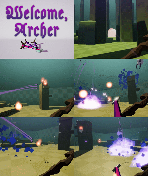
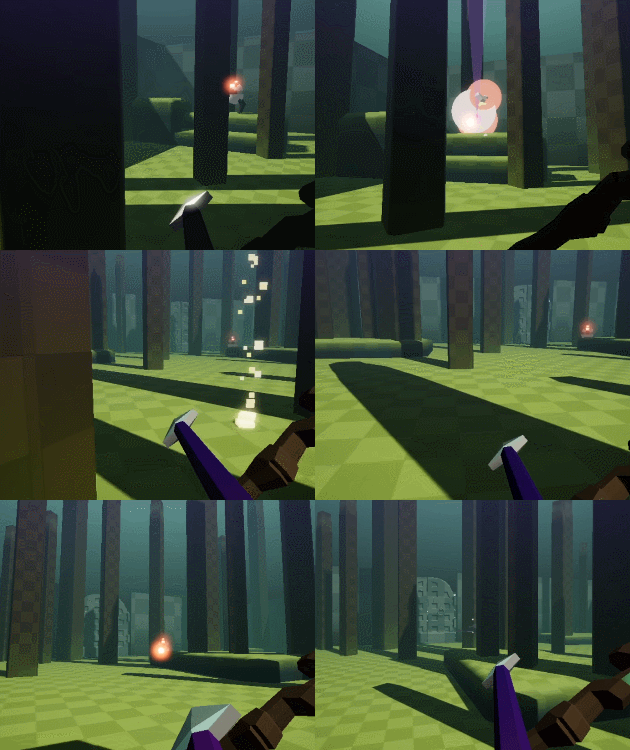
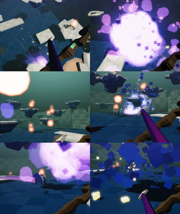
Comments
I kind of loved that the upgrades could make it difficult to get other upgrades (like getting explosions meant that I might clear my own upgrade slots by accident). It might have been a little too chaotic in this regard, and that would have bothered me in a serious game, but it was still a novel interaction that was surprising and fun.
I guess I loved that there was a commitment to using the arrows as the main means of interaction.
The kind of joke that I would personally find awesome would be arrow-based interactions that become absurd with more arrows or exploding arrows... like a William-Tell-Shoot-An-Apple-Off-My-Child random shop... where you get something if you can hit the apple and not kill the child.
The upgrades themselves felt like they resulted in some very satisfying strategies! Really impressive to have acheieved this in a jam!
If you spent longer on this, I think the area that has the most room for improvement is the enemy design and the level design. But for a jam it works super well!
Thanks, this is great feedback.
Totally agree with you on level and enemy design being best areas to work on, that's where my head is too.
Love the music in this game alot! I enjoyed how the UI in the game was in the game. I think the term is diegetic. Overall really fun shooting the little robot things. Great physics with the arrows too!!
Thanks. I think that track is an absolute banger, so I'm happy to promote Nana's stuff: https://www.youtube.com/channel/UCR8WNU7NJOQYJMfQgBAUSqg
Ah ye, that's diegetic UI alright. I wish I had time to make the health and stamina bars a part of the in-world bow :)
Wow that was really fun to play! The difficulty curve was really well done, my proficiency ramped up pretty perfectly with the game
Thanks. The difficulty curve feeling good is really encouraging feedback for me.
Great little game, loved to play it to the end :)
Thanks!
Edit: Just checked out your Dog Walk prototype, so cool!
I had so much fun playing this! I was really bad at it in the beginning but the difficulty curve is perfect and therefore every time I got a bit further I always felt that I can do a bit better the next time and I wanted to go back in. I eventually had a run where I picked the perfect upgrades for my defensive playing style and I got to the last level and only had three drones to go... and then I got cocky and let my guard down and... well... there was some swearing.
I would suggest "game over" text instead of "restart" when you die, and/or some kind of juicier indication of the area popping up on screen when you get to a new area/start a new game, because for the first few games I thought I was just restarting the level I was on and it really confused me then when the upgrade system kept changing; consequently I didn't understand the system at all for the first few games. Once I understood it I really enjoyed seeing what the different choices would result in.
I think the fact that it's procedurally generated is crucial to what makes this fun to play over and over. I also like the fact that there are subtle changes to the play area as you progress, including to the palette.
I like the visual design of the upgrade system but I think the player HUD could use some love if you want to make a polish build. (I actually think this game would be good as a "training" system for a larger game.)
It's a nice touch that the drones have to rotate to face you and that they can be tipped over and will roll around. I had one in a game that just would not die as I kept unintentionally just clipping it and it ended up rolling all over the place, which was really funny. Having read your explanations about the environmental damage, which I began to suspect was the case later in the game, I presume it just wasn't close enough to anything to break it for a while.
I love the choice of music.
Getting distance shots and trick shots right is incredibly satisfying.
Some small notes:
Typo "Cick, hold, release to fire".
Why not call them arenas rather than areas?
Please remember us arrow key players and that we need a jump key nearby our right hand.
The music in the area prep spot/staging area/behind the big wall that plays before you start an area doesn't loop - possibly also the music that plays when you're playing.
With Strider you can go into the area you've just finished and fill up your health bar before you go to the next area. I don't know if that's an intended perk or me taking advantage of a loophole, or if it doesn't really matter because you can use Strider to regain health anyway when you start the next area and you're in the staging area. That area was really necessary for me as a defensive player in the later stages of the game (Strider or no Strider) as I wouldn't have survived five seconds running straight into the mayhem, as I'm sure some gamers do and are good at, so I have to disagree with Ben about making it go away. I would hate this game if I was always pushed forwards. (I already just learnt to let the disappearing gold go later in the game, which was frustrating but was the tradeoff that I realised I would have to make to stay alive and so I had to make gold using upgrades instead.) So that's your challenge if you work on this game further - how to balance completely opposite play styles.
On the whole, though, well done!
Hey Mandy! Thanks for such great feedback.
It sounds like overall you had good difficulty progression with this, so I'm thrilled about that. I've definitely had stuff way too difficult in the past, which has led to folks giving up early and not getting to enjoy fuller experiences. Your comments made me feel like I'm making progress in this regard and it's really validating.
On restarts and area progression: Great points. These are things that didn't occur to me while testing and now that you've mentioned them, it would really benefit from improvements.
You mentioned improvements to the HUD, I agree. I'm curious to know if there is something specific you had in mind or something particularly that stood out as irritating / visually gnawing to you?
OMG my spelling game continues to be terrible. Good catch on "Cick" :)
I actually had arrow key players in mind after your input on previous jams! I didn't know what would make a comfortable jump button though? Right shift? Right control?
Good catch on music not looping.
On the starting area: I personally like that you're able to use it defensively and that you as a player found ways to take advantage of that. My concern, like Ben, is that right now it's too easy to just hang out there forever and never move into the arena. I'm thinking this can be addressed with upgrades and level design. Ideally there would be upgrades that help you out defensively and some arena level designs that have natural advantages for defensive builds (breakable cover, a period of invulnerability when first entering the area, deployable cover, etc). Basically right now you can hide out at the start forever, that's a low-effort, high-time way to make progress... I'd like to find solutions that are higher-effort but higher-reward :) As you pointed out, that would be the challenge in designing this.
Again, thanks so much for your kind words, time and thoughts writing this.
No real thoughts on the HUD. It just needs graphic design love and a better font. Nothing was irritating, it just felt small and too minimalist at the top. I understand you don't want anything in the way but at the same time you don't want it tiny and stuffed in corners.
Probably the best key would be the right control but keyboards vary so the best option would really be to let people select their own key(s).
To be fair, in modern archery no one is running around because the stance is very important. Defensive players advance slowly, systematically clear out a section, move forwards when it's safe, and like to snipe (and defend areas but there's nothing to defend in this game and that's fine). There always came a point where I had to venture out because I couldn't reach or couldn't see the final bots so for game design it would be figuring out how to place more of those types of bots and likely use scenery to help with that too.
A much as it as really helpful for me as is I think Strider should be adjusted if you want to push players a little more - maybe you can only gain health when a bot dies or maybe there are one-use health "pools" in the environment that you have to reach in order to heal, or maybe you just can't heal in the staging area so people would have to duck out a little bit, at least. It's tricky because one time I had a bot right above me on a platform (seriously, it could not have been closer - the platform wasn't even in my initial field of view and I couldn't understand why I was dying), and way too many of them on the other side, so I did have one level where I had to act particularly fast and it was very dangerous.
So... experimenting and testing, I guess. As the game stands now, though, I had a really good experience and the difficulty progression was perfect for me. And the game was fun - let's not forget that crucial aspect!
I really enjoyed this game (once I managed to get the sensitivity right ;) ).
I hardly know where to start since there is so much good stuff going on in this!
I really like that you went with a mono-modal system. It was a smart choice especially since a bow is usually more tricky to get the hang of. Though hilariously it did remove some upgrades a few times by mistake because of a mixture of split arrows and ricochets.
I like that you went with the bow instead of the default of using a gun. The pullback, reload and having to lob your shots add some good tension. I like the use of stamina draining while you draw and I like the idea of the trade-off of sprinting vs firing but I think the balance was a bit off because I found it quite frustrating at times. Another minor gripe is that the
I like that the gold disappears which creates a push forward momentum to the game instead of hiding and being overly cautious.
The arenas were cool, and I liked the variety you gave with the different biomes. One thing I did notice is that the entrance "door" allows you to cheese the enemies by poking out, shooting, and then hiding. I think the door should just disappear and throw you into the thick of it haha.
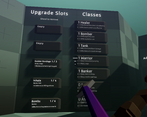
I know the shop, upgrades, classes system come from autobattlers but it feels like that set of mechanics should have its own name. I've been quite into those games lately and was wondering which inspired you to add them in? You managed to get a really good breadth of abilities and synergies which is super cool! I imagine it's a tough thing to balance but the randomness definitely helps in that regard.
Honestly, the only the main issue I had was with balance, the shop upgrades needing to get a bit more expensive over time, the enemies getting a bit stronger (and maybe have a bit of archetype variety) but I can imagine that that was more down to lack of time than anything else. I hope you work on this some more. I'd love to see where you go with it :)
Overall I can't believe how much you got done just by yourself. Big props to you!
-Ben
Hey Ben! Thanks for such thoughtful feedback, appreciated.
On the mono-modal interactions... that's partly lazyness and time pressure :P Once I'd got bow physics working it was easier to just make physics buttons and interaction than building out a whole UI and switching to pointer input. Generally I prefer immersive interactions though, so I'm thrilled that came across. Sorry about the accidental upgrade removals ;(
On bow-vs-gun, I generally don't enjoy violent stuff so lent away from gun. You also technically don't kill the drones with arrows, just knock them... they only die to impacts with the environment. I don't think this is very clear in the current build but I'd want to make that clearer and more meaningful. I also like the sprint vs fire trade-off... and I also don't feel like it's balanced right. I wanted the stamina to be quite limiting initially to make stamina-affecting upgrades more tempting but I'm not sure that worked? I'd be curious to know if you have any thoughts on how to improve balance / feel there?
Oh yea, you're so right on the entrance door! I was pretty concerned that all the challenge would disappear because of it, I didn't get time to address that concern. I considered having bombs spawn after X seconds near the entrance to push the player out ... but your idea of a breakable entrance is great. It makes me think there should be MORE breakable cover in arenas and increasing it's health, size, etc should be an upgrade tree!
On autobattlers I've barely played any, but I tried SNKRX earlier this year and had a great time with that. Immediately felt like that shop & upgrade system was an exciting space to explore. I read an insightful post by the snkrx dev, which I assume you've seen because you're always so on this stuff, one thing that stuck with me is that the "auto" part of the formula is actually a detractor, because it's largely waiting or low interactivity which by definition is less engaging. That felt very true to me and so with this I tried to keep both the "play" and "shop" parts highly interactive. It's a really powerful system and it's so rewarding to see players stop and spend time considering their options in the shop. Two things I'd love to explore more here are:
1) teaching the shop (it's tricky by nature and takes people a while to figure out ... but once they do it's magic!)
2) testing class synergies (during the jam I just kept quickly playing through and seeing how things felt, but I imagine there are smarter ways to explore combinations quickly at higher levels)
Which autobattlers are you enjoying most?
Another good insight on the enemies, I would have loved to get to more type and challenge levels + larger area sizes.
Again, thanks for taking the time to play and share your thoughts.
Fantastic game. I loved how smooth the gameplay was, and the overall atmosphere. Only issues I found were that the sensitivity changes didn't seem to work, and that maybe at the end of the game there could be a restart/quit option. Everything from the upgrades to the terrain made the game very fun to play! Congrats on the wonderful work
Thanks for kind words!
Oof, you're 3 / 3 on complaints about the sensitivity. Thanks for that, I'll upload a quick fix now that makes adjusting the sensitivity more obvious.
Very slick, music was on point and I liked that all the ui options were triggered by my arrows. Little touches like the signposts responding to physics was very cool.
The sensitivity controls didn't seem to work for me?
I found it a bit annoying that the drones keep shooting if you knock them over but they don't explode. A few times I knocked over a guy thinking he was dead, only to discover later that he could still shoot me.
Seriously cool game, found the upgrade system very interesting as well. Well done.
Thanks Japes!
I suspect the sensitivity controls work but they're very small increments so it's not immediately obvious that it's changing. So that's good feedback for me, thanks.
Hmm, with the drones I kinda wanted them to only break on impacting the environment. So if you knock them over too gently then they don't die. I can see how that's not clear and can be frustrating. Esp in a game like this with limited, persistent health.
So glad you liked the upgrade system, that's where I spent the bulk of my time :)
This is really cool! The game feels very clean and the upgrade system is very diverse and interesting. The sensitivity was hella high though, even after reducing it to the minimum
Thanks for the kind words Eggmeister.
Good to know on the sensitivity. I'm regretting not using a slider for that now :)