Play game
portal's itch.io pageResults
| Criteria | Rank | Score* | Raw Score |
| Theme | #16 | 3.792 | 3.792 |
| Overall | #34 | 3.083 | 3.083 |
| Aesthetics | #36 | 3.167 | 3.167 |
| Sound | #39 | 2.750 | 2.750 |
| Gameplay | #50 | 2.625 | 2.625 |
Ranked from 24 ratings. Score is adjusted from raw score by the median number of ratings per game in the jam.
Leave a comment
Log in with itch.io to leave a comment.


Comments
Frame rate continued to drop, and the visuals are really hard to tell. In other words, this isn't compatible for the web. I can't really see through the portals, until I'm really up-close to it. Which is a bit of problem because this is pretty difficult to navigate through. Portals that were placed on areas where I could fall down into the void were impossible to make. I couldn't build any speed to make that jump, which was frustrating. Also, after going through some portals my camera continued to spin out of control and I didn't know where I was going, until I spawned back.
Also, I don't know if Valve's music is opensource for the public to use on commercial or personal products. But pretty bold move to take one of their soundtracks, and not credit them or the composer with the rest of the team on the main menu.
Level design definitely needs more work.
yeh Definitely over scope. We should have gone with something a little simpler. And I totally forgot to mention the music it was really tight. the Initial submission was not really playable so we managed to fix some stuff before the deadline but not all of them. With the frame rate I was gonna use occlusion culling but then it just made the game wired after implementing it, so i had to go without it because I couldn't fix it before the deadline. With the portal part we initially were going to use portals that are not see-through. But we over scoped again closer to the end and we thought we can make it work in time. Definitely learned a lot from this game jam. At the end of a day it's a game jam, it's not really possible to make portal in 3 days.
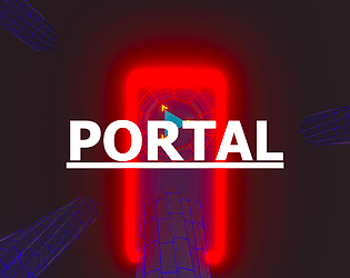
Inspired in Portal portal movement with a touch of Tron Very Cool!
Not sure if it was me but every now and then the game would stop responding to me moving the mouse to look around and I would have to click to get it to work again, otherwise good game.
Good work, should be improved.
I absolutely loved the look and feel of this game, and I think it would be super cool to watch someone stream this. I personally had a pretty difficult time figuring out how to play, but I was still super impressed by the look and feel of it, it felt really professional. Nice work!
Love the aesthetic and the challenge. The level design has some great moments too- flying through chains of portals feels great. Always fun to play a 3D game too! Excellent work :).
Always respect a 3d project, very good look, btw, nice colors, the sound fit just right with the art and puzzle is very cool.
Overall, very interesting game, keep up the good work, congrats!
Nice vibe. Feels like portal.
Really cool aesthetics. Really cool game. The character movement was a bit too floaty for my taste
Great job for 3 days! I had some performance issues playing on the web.
Cool game. Great visuals. I love the wire frame models!
Great job!
Really cool looking atmosphere, I love the way the portals look and the fact that you can see where it teleports you to.
Cool Portal game. It's a bit laggy and which makes it hard to manuever around.
i like the music and the overall aesthetic of the game, but i do have troubles navigating through the level, i think something about the camera height
i would also suggest to add an edge to the floor so the player know where the floor is ending
Nice and simple. Overall good game.
Pretty colors
Cool game! I like the portal influence but with a different way of shifting momentum. I had a lot of trouble maneuvering it for the double down portal and ended up not making it passed that part. Great aesthetics! I did have trouble getting a feel for my position. I think if there were some pattern on the textures (I think portal did the grid), it would help! - Josh
I couldn't get past the part with double arrows. The visuals are neat, and the one track that (I think) isn't stolen from Portal is also good! Overall, impressive that you guys managed this in 72 hours!
Wow, great game. I want to play this game again. More people should give feedback to your game, like mine.
sure thing check out the game now we managed to fix some issues before the deadline