Play game
Sky: Tournament's itch.io pageResults
| Criteria | Rank | Score* | Raw Score |
| Theme | #54 | 3.223 | 3.462 |
| Sound | #60 | 2.435 | 2.615 |
| Aesthetics | #61 | 2.650 | 2.846 |
| Overall | #64 | 2.650 | 2.846 |
| Gameplay | #76 | 2.292 | 2.462 |
Ranked from 13 ratings. Score is adjusted from raw score by the median number of ratings per game in the jam.
Leave a comment
Log in with itch.io to leave a comment.



Comments
Cool idea, but it was really difficult for me.
Pretty fun, though a little slippery and slidy at times, and I wasn't always sure of where to go.
Overall, I have just one word to summarize my thoughts on this game:
"BRUH"
its actually good and hard at the same time. Kudos for the innovation.
Gameplay:
I found a little bit hard find the way, maybe some sort of path signs would help the player!
Nice project tho!
Another advice: quick restart without going back to the main menu
Thanks for playing! In new version everything will be fixed.
Beautiful game but unfortunately I cant play it :(
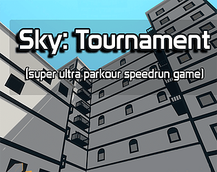
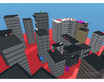
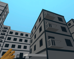
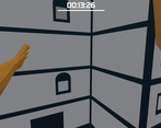
Building on the screens are nice
Thank you for your feedback. Why can't you play the game?
Because I use Mac
Fun for a while but the character felt too floaty for me, it was kind of hard to control in the air.
I was hoping to make the game hard to play and made movement like trash. It could be better, sorry
I liked where this was going, though it felt a little janky on the movement. It took me a while ti even figure out how to make the first jump and it felt a bit slow on the jump movement. A few other notes:
Thanks for playing! Funny fact - music in the menu was made in 15 minutes before the deadline) and also I wanted to say
bruh