Nice one, remember me the mechanics of World of Goo :)
Play game
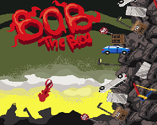
Bob the Blob's itch.io pageResults
| Criteria | Rank | Score* | Raw Score |
| Aesthetics | #2 | 4.440 | 4.440 |
| Overall | #12 | 3.690 | 3.690 |
| Theme | #15 | 4.160 | 4.160 |
| Sound | #32 | 3.040 | 3.040 |
| Gameplay | #40 | 3.120 | 3.120 |
Ranked from 25 ratings. Score is adjusted from raw score by the median number of ratings per game in the jam.
Comments
Great art and gameplay. Kinda hard. Alo the controls sometimes are unresponsive. But I really liked it.
Very nice game! I was so hype to play it because I watched a documentary on the blob recently. :p Very nice idea to have the blob follow your mouse in the menu, it was so spooky! The game is hard as the games you used as inspirations are. We also really feel the influence in the aesthetics, really like dit! It lagged a bit on my laptop web version. Very nice job keep creating game!
Really well made game, great coherent graphics and sound effects, great level design.
I just couldn't get past the frustration of the controls. Obviously the game was designed to be very limited in how you could control it but the delay between each stick was just too long and was often the cause of my falls.
Still really love the game, it does an amazing job of what it was intending to do. I gave it full votes!
Well done! BG and music fit very well. Hook mechanic is hard but when you realize how it works game become very interesting :)
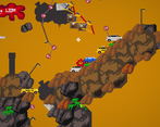
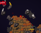
This is an super impressive game with just 3 days of work. The SFX/BGM and art are professional levels, and I really love this idea of sticking to and pulling yourself up to objects in the environment. But the delay that you've implemented after sticking to something makes the cursor appear so that nothing is grabbable. That's probably intentional, since the player isn't able to grab anything during that time.
But it's already hard enough to tell what is/isn't intractable in the environment, plus dealing with the constant falling, that you can't plan your next course of action; it turns into frantic clicking and internal praying. I would've loved a 3rd cursor to show when something is grabbable but the stick option is on cooldown, or some sort of effect on the white cursor to show it's on cooldown but lets you plan where you wanna stick next.
Nevertheless, I'm giving this game high votes. And I know other people will love it for what it is: a well-constructed, challenging, and overall impressive game. 😊
First of all, thank you very very much for such warm words. Unfortunately we didn’t see that our game is brutally hard and frustrating because we were the developers and played our game a lot so we were more skilled and patient. Yes our game needs a lot of fixing in controls and stuff the player can do so he feels that he can beat the game and has inspiration to do so. But now, even at the beginning player loses his motivation to go up because he can’t even go to the side and that’s our really really big fall; controls and map design...
Totally get the sentiments of finding the game you develop easier to understand than your audience... I once made a platformer where a player couldn't even get past the first tutorial level. 😅
Giving the player an better feel of what he/she can and can't grab onto, while using some sort of UI to show that delay in the stickiness after using it, is probably a good area to tackle. That, and differentiating what's obviously grabbable from what isn't in the foreground. Personally, though, I really enjoyed how well thought out your map's design was!
Nickolas thanks a lot for such a deep feedback! We are very happy you enjoyed the game, even we made it too difficult and the gameplay a bit uncontrollable. Your idea with the grab delay is great! I’ll make something like that after the jam ends, that’s super useful for sure. We find that the map became too difficult for others since as always, while devs are testing the game they play it a lot so they can’t see if it is difficult or not. That’s why the game is unbalanced. But we wanted to make a focus on increasing your grab skills, to make streamers available to finish the game fast as possible if they play it a lot.
Anyway thanks again, I’ll try to implement the idea about crosshair you said and give the controls a bit more influence!
If only we had a week, rather than 72 hours right? 🤣
As I mentioned above, I actually think your map design was very intuitive! Just a bit hard to discern what was grabbable and what wasn't in the foreground. But you guys already have something special here, and with some playtesting and a little tweaking, it's only gonna become more so!
Very haaard !!! But still, impressive work in the course of 3 days !
Very impressive art and good audio...well done !
That game is really really hard. It took me quite a time to figure out how I'm able to get upwards :D
Aesthetics, Sound and Theme are implemented in a really good way!
Nice and pretty hard game, i don't really understand how the crossair works but overall it's really good! I really enjoyed the music too!
Pretty solid game, but it was hard to figure out the controls, if I ever even really did. The aesthetics are wonderful though, I like the vibe and the homage to Getting Over It. Great job!
Looks really good and polished! It did take me a while to figure out how the controls worked though, I think that could be improved.
Very nice game. Love the art style and aesthetics. Gameplay is kinda frustrating but I guess that's the idea. :D
Nice job!
A good entry! Loved the artstyle. thoguh I did find the controls fiddly, the cross hair would change even if I was not in range of the object and it took me a few minutes to get over the first lamp post xD. The jump also felt a little weak, the early game would've been a lot easier if I could jump just that little bit higher to start, it is something that would be adjusted as the player got climbing.
I love the game overall!
The visuals are spot on. I love the music nice is nice and relaxing no mater how stressful it gets. The only thing that was an bit rough for me is sometimes I get the white cross-hairs that indicate the ability to grip when its not in range and that kept throwing me for an loop. Edit (Turns out I thought that the red cross-hair was the grip ability my bad) However still overall amazing game!


Leave a comment
Log in with itch.io to leave a comment.