I was really surprised to discover there was voice acting for the little dudes in this! It actually made a huge difference cos it kinda made me really care about em :3 Didn't want the poor fellas to die! Unfortunately, they did, alot xD because I suck at this kinda thing, haha. I thought it was a really neat idea though, and I was definitely panicking trying to make sure the poor guys didn't get nommed!
Play game
Unsafe Passage's itch.io pageResults
| Criteria | Rank | Score* | Raw Score |
| Enjoyment (Best Game) | #7 | 3.545 | 3.545 |
| Sound Design | #11 | 3.636 | 3.636 |
| Story | #27 | 3.182 | 3.182 |
| Horror | #32 | 3.091 | 3.091 |
| Aesthetics | #37 | 3.636 | 3.636 |
Ranked from 11 ratings. Score is adjusted from raw score by the median number of ratings per game in the jam.
Comments
I felt like this was a really neat way to explore this kind of story. I enjoyed the setting and the fact that, in spite of them being 'worthless grunts', I was concerned with the welfare of those I was responsible for. It's a small detail, but the last line which said 'keep your mouth shut ... you're promotion will be handled in person" was such sinister way to cap off the players 'character'.
I'm generally a fan of these types of game systems, the disembodied drone handling strategy & with a view of the surrounds. As you likely remember from the comments you left on my submission, there are a number of issues to be faced in designing this kind of game space; legibility vs challenge, uniformity vs variety, realism vs practicality. I feel that we ended up on opposing ends of the same problems; namely that this games environment is more regular and understandable, but can feel like a bit of a 'solved problem' for the player - where my efforts cultivated fear of the unknown but at the cost of players patience. This being said, having multiple floors and some different interactions on each does keep things spicy here, so it's far from bland.
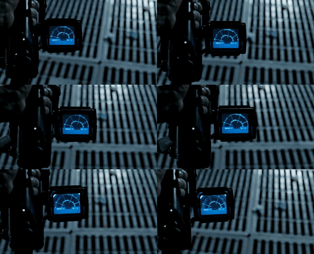
The layout of the level needs to work with the gameplay, which here means evasion of the alien and direction of the 'poor souls' to collect the various things necessary to clear the game. And I think it does, but there is more to say here about the 'solved problem' term I used earlier. Essentially, I felt my job was to evade, but I wasn't ever too worried about HOW to do that. With a very clear view of the map and of the alien/creatures location I felt capable of planning ahead & keeping safe (though I still lost 6 or so good men that day so it can't have been that easy!) The traps help with this of course, those were nasty when they suddenly caught my attention. But in terms of information available, I reckon I'd have been more worried I had less at certain times. Since we both looked to alien for inspiration, the best example I can think of are from those films. The motion sensors (such as in Alien Isolation also) will only pick up nasties within a certain range. Also, when the marines head into the hive for the first time in Aliens, their squad leader's video feed was patchy & unreliable. This ratchets up tension, since the alien could in fact be rather close and you may not know. There could be many ways to try this, such as if the yellow dot were to fade in/out or only appear when close or opening a door.
Hopefully all that made sense, overall I think you've done a great job! As you said, it's so interesting how different our games ended up even given the similar inspirations. Nice work! :D
Thanks for your feedback! I'm glad that you picked up on that last line; I was worried that people wouldn't get/notice it. I liked your analysis of the trade-offs between knowledge and suspense, and I agree that I think I went a bit too far in the knowledge direction with this. Originally, I was going to have the readout on the monster/alien fade in and out like you suggested, but when I tried to implement it, it was taking too much time to get right and so I scrapped the idea for the sake of progress. I was planning on having radar upgrades around the map that would decrease the interval between readouts as well. I agree that the suspense can really be ruined at points when you KNOW that the monster is about to get you. But thank you for your kind words. This was my first game jam, and I've been blown away at how supportive everybody is!
No worries, you should be really pleased! For a first game I feel like this shows some really well considered decisions, I've only been doing them for about 5 months, but they are such brilliant learning experiences. Using the time to try new things is invaluable!
Just a note on the response there too; it was more that the suspense was missing when you knew the alien was far away. Knowing he is over there is much more reassuring that hoping he is not nearby!
Love it, I love the idea of horror where you're trying to help someone survive and you're not the one in peril, it makes the danger feel more true, and it really works here. I liked moving between monster and peril and I'd love to see a more polished version of this.
I like it, reminds me of duskers a little. The text was _very_ hard to read.
Nice, this was a fun/tense entry! Once I reached the bottom and started coming back up I got kind of confused and couldn't figure out what to do -- none of the stairs seemed to work? I might have just missed something though
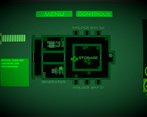
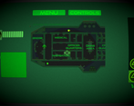
Thanks so much! The stairs with the icons above them are the ones you can use. I don't know if you tried those ones? It could also be that you somehow dropped the package. You normally can't transverse levels if you dropped the package, but I think that in the rare occasion where the subject dies as he's leaving a level, it might result in the package being left in the previous level. That might have been what happened.
-Joe



Leave a comment
Log in with itch.io to leave a comment.