Play game
Bath House's itch.io pageResults
| Criteria | Rank | Score* | Raw Score |
| Horror | #20 | 3.600 | 3.600 |
| Enjoyment (Best Game) | #71 | 3.000 | 3.000 |
| Sound Design | #76 | 3.100 | 3.100 |
| Aesthetics | #81 | 3.300 | 3.300 |
| Story | #93 | 2.100 | 2.100 |
Ranked from 10 ratings. Score is adjusted from raw score by the median number of ratings per game in the jam.
Leave a comment
Log in with itch.io to leave a comment.



Comments
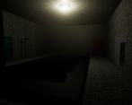
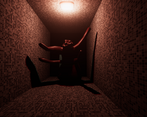
This was the most effective jump scare we have come across so far, having rated over 80 games this jam. The visuals were good, but it was so dark it was hard to really appreciate them, and at times it was difficult to see anything at all. The darkness does add to the creepy atmosphere, which was really well executed, but maybe just a little more lighting could make the game feel more like a puzzle. Overall really solid game, and definitely one of the creepiest :)
Don't think I'll ever go to a bathhouse after playing this game!
As devs in Finland we don't know whether to be honoured or horrified by the addition of a haunted sauna...
Dude you did so good! The understand horror, I can see it in the moments when the creatures appear, I loved that you subverted our expectations, made us think it was all about a crab, and then expanded on the premise by putting us in horrifying situations, nothing like putting pressure on the player to act. I loved it!
The story was sort of minimal but I don't think that takes away at all from the experience, the sound design was minimal as well but it got the work done and the aesthetics like the menu and such could be better, but overall a great experience.
Damn that was scary, I actually screamed XD that jumpscare was one the of creepiest!
I think most people already said this, but it was too dark. Otherwise I liked the design and sounds, they were really convincing. That was a nice experience!!
The enemies' design were so creepy! However, the lighting is simply too dark and navigation became more frustrating rather than scary as there were moments I could not tell where to go.
Having the contrast at the start so that the player will naturally approach the lit area to see the key and spider which establishes the objective and obstacle is really good! However, after that, it is not clear where to proceed. Thus, players are forced to test the doors one by one and hope that they did not miss a door because they could not see it. You should place lights around areas or doors that the players should proceed to so that they can at least try walking straight towards them even if they cannot see their surroundings.
However, it is pretty good for your first game! Good job!
Yea I agree that the final result was dark, also the doors had signs but I removed them due to noob mistakes :D
Thank you for your constructive :)
Short horror game. Loved the animation of the giant spider, and the aesthetics. Only issue I had was the lighting. Couldn't see where I was going most of the time, but that also added to the horror aspect. Great job!
Thank you for your kind words. I absolutely agree :)
@TigerStriped nice job on the sound design and texture design, it was scary the mutant monster was matching the environment although I felt like the little flicker was not pleasant to my eyes also there should be something to warn the player that this gate could be open and this is a close example when we hover over them "press E or something appears" but its a really nice game good job on that :D
I was doing good until that jump scare in the hallway lol. Good work!
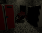
I really enjoy the monsters design , i am a nerd for mutant and concept art like that, the lighting could be a bit brighter i found myself quite the few times going getting stuck in something mostly the locker area, the jump scared also got me good, its a work in progress but if better explore the naked concept or add a bit story to it , it could become some great stuff.
Thanks, your words mean a lot. I agree with everything you say totally 100%. Naked concept? :D I thought about that when looking down you can see a blurred out part of a player model XD
1st idea, an infinite procedurally generated labyrinth with these mutants chasing you. Maybe one day. Thank you for the honest review!
Not the worst idea, well since you are in a sauna the fear of being naked could be explore ahah , mostly likely going for some really gore rape scenes but that might be too much or explore the vulnerability well its a horror game so its fine. Yeah focus on making more games with decent quality! you will get better everytime! Dont be afraid to make your ideas its just an amazing feeling to see people play it so go strong! :)
Neat!
Thanks for the review and the kind words! I appreciate it a lot :)
Pretty good for a first game! That hallway jumpscare definitely got me. Could have had a more fulfilling ending but I assume that is due to time constraints.
But overall nice job!
Feel free to check out our game :)
As a first time jammer, your words already made it worth submitting :D
Thank you very much,
Im going to go throught the most of the games in the next few days and make sure to check out your submission - looking forward to it :)
Cheers!