Play Puppeteer's Purgatory
Puppeteer's Purgatory's itch.io pageResults
| Criteria | Rank | Score* | Raw Score |
| Story | #306 | 1.890 | 2.500 |
| Aesthetics | #318 | 2.457 | 3.250 |
| Sound Design | #323 | 2.079 | 2.750 |
| Horror | #329 | 1.890 | 2.500 |
| Enjoyment (Best Game) | #377 | 1.701 | 2.250 |
Ranked from 4 ratings. Score is adjusted from raw score by the median number of ratings per game in the jam.
Leave a comment
Log in with itch.io to leave a comment.


Comments
I could't type 4 into the touchpad in the safe...
And when I tried to exit the safe UI I wasn't able to walk again...
The graphics were really good though. I really liked the sky box
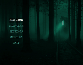
(I feel like the start menu's background could have been a screenshot of the actual game, isted of a wallpaper that didn't really feel like it fit...)
cool! I like the concept, but it was difficult to find the tools I wanted and i wish it had a few more scary moments and sound effects. thanks!
Cool game!
Observations:
1. The UI/Menus are very high quality.
2. The keypad in the basement feels like its a little skewed upwards, pressing the lower parts of the keys and it doesn't seem to register.
3. Having the code for the safe on the wall is a little dumb, I'd imagine it'd be better if it was like a little puzzle you have to solve to get it.
4. Pressing tab is doing something weird. Was it supposed to be an inventory? Right now its just disabling movement and mouse controls.
5. Like @Alice Loverdrive said, the creepiness is definitely lowered by the jank. You could also improve the creepiness by making it darker, adding blood or playing random sounds that trigger randomly to just creep you out.
6. The flashlight doesn't do anything?
7. The soundtrack is slightly fitting but I think if it included more mechanical/moving parts noises to signify the puppets moving, it would improve it. Also, it would be slightly better if it looped more satisfyingly than just fading out at the end; Adding some ambience to the end for a bit would fix it I think.
8. I pressed E on the mannequin once placing it on the table, it disappeared and now idk what to do from here. lol
9. The player moves a little slow.
10. The artstyle is pretty cool, just needs some polish. Some of the assets are higher quality while some are lower quality so it is slightly jarring.
EDIT: I figured out how to progress, i'm just a dummy :)
EDIT2: I think you could decrease the confusion of number 8 by adding it sitting on the side of the table fixed. As if you moved it over to prepare for the next puppet to fix.
I hope you'll polish this one after the jam, because right now the creepiness of the scenario is buried under a lot of jank.
But I must say that objects constantly moving around and making me doubt my own perception was awesome!
Thank you!
And yes, we have to really polish this game, I spent the whole night trying to finish it to submit it, so a lot of things went... Underdone?
Anyhow, thanks a lot!
nice ,thank you robin chuan