gud, my brain too small to finish
Totsnuk
Creator of
Recent community posts
Why am I so small? Is Thul a short king? Who knows? Maybe the necromancer was a giant. Now it makes sense why Thul would not be able to please her.
This was great. Short and sweet. Feels like a complete game aside from some polish. Menus are nice too. Good art. Funny dialogue. Agree that the announcer feels un-needed. I could never rack up a combo that was good but hey, maybe I'm trash. Combat was a little same'y, wish there was more than one swing animation because it could add that illusion of more variety of attacks without having to do much in terms of actual gameplay. Maybe a charged swing? Steal that idea.
Overall - 8.9/10 (for a jam that's good)
Art - 4.5/5 (art is gud, majora's mask vibes but very unique in its own right)
Lore - 3.5/5
Sound - 3/5
Music - 3.5/5
Combat - 2/5
Movement - 2.5/5
Level Design - 3.5/5 (some areas feel a bit annoying to platform through but, again, could be due to the movement being a bit unwieldy)
UI - 4/5 (except for the fonts and basic buttons, i like the minimal hud)
Critiques -
First ambience song doesn't fit the battle theme (good battle theme) and most SFX sound out of place to me but otherwise fine.
Dash feels a little delayed or sometimes doesn't register.
Gravity is a bit too strong. Maybe its more-so an issue of momentum.
Dog barking constantly, maybe make it happen randomly, not forever looping on aggro. Kinda annoying when you suck at platformers like me lol.
Combat feels very much like a last minute addition, No blocks, parrys, etc. that would otherwise make it more interesting than spamming left click.
Vines - some of them are not intended to be used for the wallgrab ability but still confuse the player a bit. Maybe making the texture a bit more vibrant would distinguish them more.
Can't say that this is a full review because I couldn't get past the 3 mask statue area, I think I soft-locked myself because I got the key and then saved and now it doesn't open anymore so I am stuck.
Overall - 6.5/10
WOW! Really well done! No ending but still, damn good.
Observations:
1. Really damn good animations and camera movement for a week jam.
2. Clown is a little buggy. I couldn't tell if he was supposed to chase after me? He didn't, I kinda just walked through him.
3. Jumped off the back of the train into the void, lol
Observations:
1. Dialogue is a little slow.
2. I like the UI, Text, and the scanning TV line effect on the screen. Good vibes. Also the animations are smooth.
3. It would be scarier with random ambience and I'm imagining whatever killed paul (in my head its a cultist) peaking his/her/its head out on you from behind a tree, just to scare you.
4. haha goofy jumpscape
5. Misspelled happened as happend
6. car in the woods lmao
Spoookyyyyyy!
Observations:
1. Very atmospheric. The droning bitcrush soundscape really gets the point across that this is a horrible place to be in. Good work.
2. Needs more zombie hit anims as well as player and zombie walking anims.
3. No walking sfx, also the zombies sound a little dumb. They could sound better with some of that bitcrush I mentioned.
4. Player is a little slow.
5. I think the zombies could be a lot creepier if they were on all fours and ran really fuckin' fast.
6. How do you get to the shotgun?
7. The pickups would fit more if they were actual items on the ground as opposed to doom-powerup themed.
Cool game!
Observations:
1. The UI/Menus are very high quality.
2. The keypad in the basement feels like its a little skewed upwards, pressing the lower parts of the keys and it doesn't seem to register.
3. Having the code for the safe on the wall is a little dumb, I'd imagine it'd be better if it was like a little puzzle you have to solve to get it.
4. Pressing tab is doing something weird. Was it supposed to be an inventory? Right now its just disabling movement and mouse controls.
5. Like @Alice Loverdrive said, the creepiness is definitely lowered by the jank. You could also improve the creepiness by making it darker, adding blood or playing random sounds that trigger randomly to just creep you out.
6. The flashlight doesn't do anything?
7. The soundtrack is slightly fitting but I think if it included more mechanical/moving parts noises to signify the puppets moving, it would improve it. Also, it would be slightly better if it looped more satisfyingly than just fading out at the end; Adding some ambience to the end for a bit would fix it I think.
8. I pressed E on the mannequin once placing it on the table, it disappeared and now idk what to do from here. lol
9. The player moves a little slow.
10. The artstyle is pretty cool, just needs some polish. Some of the assets are higher quality while some are lower quality so it is slightly jarring.
EDIT: I figured out how to progress, i'm just a dummy :)
EDIT2: I think you could decrease the confusion of number 8 by adding it sitting on the side of the table fixed. As if you moved it over to prepare for the next puppet to fix.
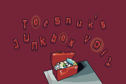
https://totsnuk.itch.io/totsnuks-junkbox-vol-1
Have you ever thought to yourself - "I wonder if there's a goofy little goblin out there cobblin' sounds together, I'd love to have a look and see just what sounds that pesky critter would cobble into... uhmmmm... a song, per say?"
Well fear not! Totsnuk's Junkbox has finally arrived. With not one, not two, but 14 songs (and 13 sfx) all bundled up for just the low low price of 12 silver coins... or free depending on if you wanna steal from that fella, I bet he'd never even find out... Goblins don't have good eyesight, do they? I hope not :D. For your sake at least! It will definitely be of the highest quality. Definitely... I give you my verbal only, non-contractually obligating, guarantee! It even comes with sounds made by the Celestials, which I've heard are said to grant the listener magical powers but, refer to my previous guarantee for the validity of that statement! But hey, I'm just the messenger! Don't take my word for it, go check it out yourself! It's at the giant toolbox over there! Oh, I almost forgot...
Here's a mini Junkbox! -


