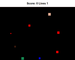
Play game
Survive!'s itch.io pageResults
| Criteria | Rank | Score* | Raw Score |
| Graphics | #7 | 3.000 | 3.000 |
| Gameplay | #7 | 3.400 | 3.400 |
| Player feedback | #8 | 3.200 | 3.200 |
| Overall rating | #8 | 3.200 | 3.200 |
Ranked from 5 ratings. Score is adjusted from raw score by the median number of ratings per game in the jam.
Leave a comment
Log in with itch.io to leave a comment.


Comments
I enjoyed playing. Good variation in speeds and sizes of the enemies.
I didn't notice any increases in difficulty as time went by. This might be nice, but maybe not so necessary since you only have one life.
The movement seemed a little granular at times - I'm wondering if this could be smoothed out a little?
The window size / scrolling did cause some issues at time, but this isn't indicative of the programming - more the setup in Itch.io.
The simplistic style is quite nice, and the gameplay loop is fun! I just wish that this could have been done in full screen, as the scrolling makes it very easy to get lost in a part of the screen, and then have to use the scroll bar to reposition, and do it over again. Other than that, it was fun!
Can you update the game page so we can see the whole game board? currently I'm fighting the browser scroll to be able to even see where I am. Other than that, the game has a good concept. However, there seems to be no real incentive to collect coins. To improve the game, Instead of 1 life, I might add a hunger system, so you're forced to move around, collecting the colored squares as food. Contacting the red boxes may continually drain your hunger while in contact with them instead of an instant kill to add more flavor to the game. To make the game have a softcap and not be endless, you can gradually increase the rate that hunger builds. You're not too far from a roguelike game here.
This was a decently enjoyable experience! Something about the segmented movement of the player character was really fun, as was the large area of the game. However, I feel like it would benefit a lot from being full-screened. Your game doesn't have enough space on the page to be seen in full, and the scrollbars that move what the player sees are also moved by the arrow keys, resulting in the player's view sliding away from the player character when they make long horizontal movements. The graphics are simple but readable, and it was never too hard to notice items on the screen.
Hi, the Survival game was a cool concept how you have to move around the enemy and survive for as long as possible. The timer was a nice bonus to the game. What could be improved maybe instead of having a square add some spites or sound effects other than that good job.