Play game
Ghost Town's itch.io pageResults
| Criteria | Rank | Score* | Raw Score |
| Innovation (DESIGN, Unique Game Systems, Use of Theme, Creative Ideas) | #5 | 3.500 | 3.500 |
| Visual (AESTHETIC and Art Direction, Lighting, VFX, Animation) | #6 | 3.750 | 3.750 |
| Overall (THE BEST of the best, All other categories considered!) | #7 | 3.250 | 3.250 |
| Audio (SOUND Music, Sound Effects, Quality and Use of Sound) | #8 | 3.375 | 3.375 |
| Gameplay (FUN, Game Flow, Intuitive Mechanics, Difficulty Balance, UI/UX) | #10 | 3.000 | 3.000 |
Ranked from 8 ratings. Score is adjusted from raw score by the median number of ratings per game in the jam.
Team Members
William Imaican, Diego Rodrigues, Emily Yuan, Andrew Stetson, Bryan Choo, Clement Lee
Third-Party Assets
Abaddon Pixel Font (https://caffinate.itch.io/abaddon), 32x32 Pixel Isometric Tiles (https://scrabling.itch.io/pixel-isometric-tiles), Trees (https://cainos.itch.io/pixel-art-top-down-basic), Buildings #1 (https://leonardobanana.itch.io/pixel-constructions), Buildings #2 (https://maxparata.itch.io/counrty-side), Xelu's Controller Prompts (https://thoseawesomeguys.com/prompts/)
Source Code Link
https://github.com/WatDuhHekBro/SGDA-Jam-S24
Leave a comment
Log in with itch.io to leave a comment.


Comments
So, what I really liked:
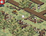
- I thought the visuals were cool, I liked the pixelated aesthetic, and the characters had a cute design!
-The SFX gave great feedback to the player, I knew when I was using an ability and when an townsperson saw me.
-Cool mechanics, I really liked the Middle Mouse ability that takes you back to the last location you were at!
Feedback:
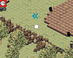
-Visuals, but this is because there isn't clear visual contrast for the walls you can walk through or walls you can dash through. From the get-go, I wasn't sure if I could use both of those abilities on any wall or not as well. Nice visuals, but maybe the player path could have a certain color tint, and for each ability any wall you can walk/dash through could have visual contrast compared to the overall environment.
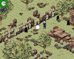
-This might be due to the visuals, but for me the 3rd level felt hard since I couldn't tell what parts of the environment I could utilize. It felt busy
-I also thought the opening storybook implied that both light and dark beings were hostile, maybe it could add that the place the player is going to is only hostile against townspeople.
Also, I'd appreciate if y'all left feedback on our game "Rogue Shadows"
Thanks!
Things I liked:
- Visual aesthetic looked nice, especially the storybook at the beginning.
- Cool mechanics.
- I liked the sfx for when you're noticed by a villager.
Things I didn't like:
- The visuals felt a bit crowded. Not only was each level chock full of stuff, but there's not a lot of contrast between "stuff that's important" and the background.
- More of a nitpick, but the opening storybook implied that the ghost is despised by both light and dark...but only the townspeople seem to be hostile, while the dark creatures just kinda vibe.
- There's not a lot of levels that put the mechanics to the test. Like I said, these are cool mechanics, and I'd have liked to see how they could be used creatively to get around seemingly impossible situations.
Regardless, good job!