Incredible game and very fun and stylized! I really enjoyed the mechanics once I took some time to learn them, and the life/heart system gives you plenty of chances to get acclimated. Really interesting concept and engaging gameplay! Having a lot of fun with this one!
Play game
Bulbo's itch.io pageResults
| Criteria | Rank | Score* | Raw Score |
| Theme (Max 4 if Flavor isn't used) | #2 | 4.077 | 4.077 |
| Visuals | #3 | 4.154 | 4.154 |
| Creativity | #3 | 4.154 | 4.154 |
| Overall | #3 | 4.015 | 4.015 |
| Game Design | #3 | 3.923 | 3.923 |
| Audio | #9 | 3.769 | 3.769 |
Ranked from 13 ratings. Score is adjusted from raw score by the median number of ratings per game in the jam.
Who all was involved in the creation of your submission?
Me by myself!
How does your game fit into the Theme?
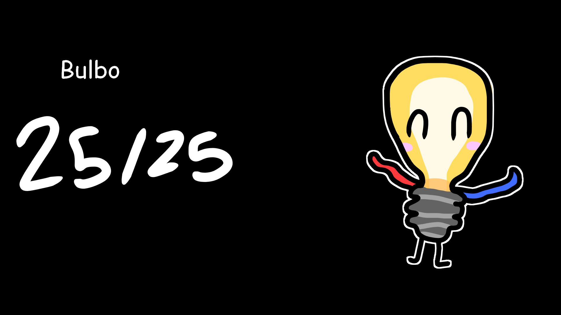
It's going to be "down to the wire" arms upon Bulbo's body to traverse through the dangers of the power plant to help out his friend, Robo.
Does your game contain sound effects?
Does your game contain music?
Comments
The mechanics are fun and it’s easy to tell what to do after a little bit, though I got a little confused with the grapple mechanic at first as I wanted to hold down the mouse button and not press it once, though I got used to pressing it once fairly quickly.
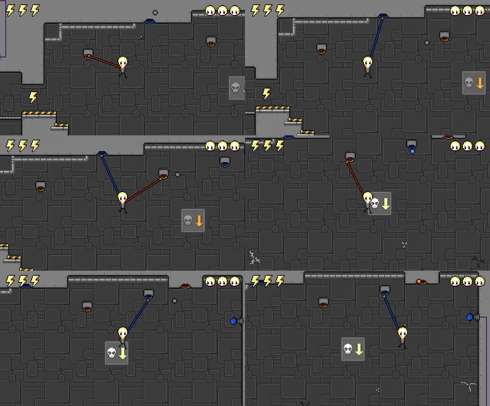
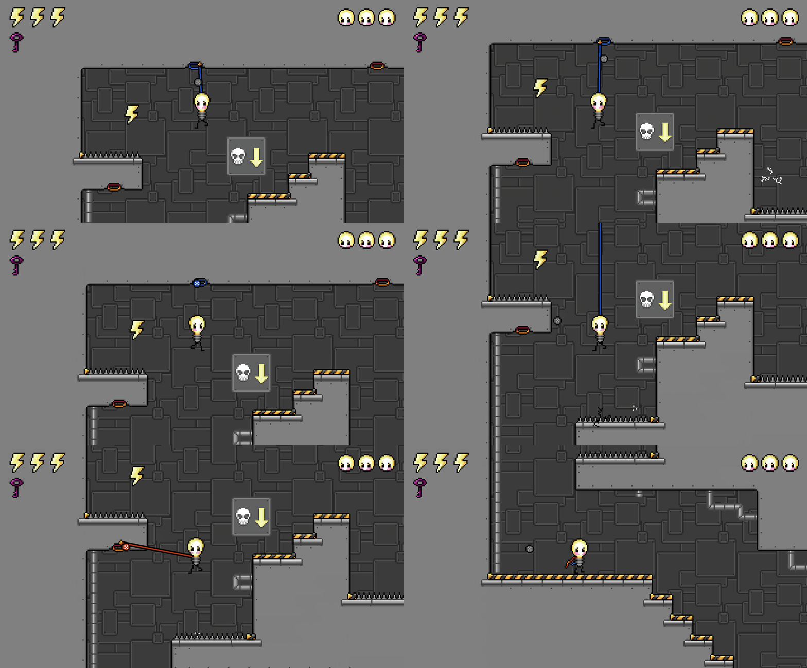
Absolutely amazing game! The grapple mechanic is really fun and easy to understand with clear use of colour to indicate the grapple points. The level design is spot on and it's always clear which way to go and what is a hazard, and the checkpoints are also really well placed. I love the music and SFX, and all the pixel art too, and the UI is perfectly implemented. Adorable character design and great interpretation of the them. A truly impressive feat for a solo entry! You even have cutscenes.
Tips to improve even further: There is one or two points where the grapple points you need to target are off camera or, right at the top. Polishing the camera system to offset a bit and show these areas better, or tweaking the level to lower the targets would get around this. I love the timer addition too, I'm already addicted, chasing that perfect time! Although the timer doesn't reset between plays and requires a restarts. I also personally love the challenge aspect, but adding a larger collision radius around the grapple points with a subtle lock-on mechanism could make it more accessible.
This was a very nice game. Solid concept that fit the theme well all wrapped up in a nice aesthetic. I will admit that it was kind of frustrating at times. The level design got challenging for me pretty quickly, and some situations looked like they just had to be done with brute force while taking damage. This aside, it was quite a fun experience, and I could see this being expanded into a bigger game if you have the time and will. Great work!
Hey thanks for commenting! I'll be honest, it is clear that level design was not my strong suit ;A; it's been a learning experience! You *can* finish the game without taking damage, but it's a bit challenging, even for me. I plan on continuing to work on this game after the jam, so we'll see how I can play with the level design moving forward ♡
Very imaginative, but the controls are a bit stiff and imprecise. This does have a lot of potential, though, and I do like Bulbo as a character. I think you should continue working on it!
Hey thanks for the feedback! I'll be honest, I messed with the controls a LOT before settling for what it is currently; it's not exactly how I imagined it but they get the job done 😅 I do plan on continuing to work on it and I also plan on remaking it in Godot (this version was made in Construct 3).



 yes
yes
Leave a comment
Log in with itch.io to leave a comment.