Play game
Nightfall: Bloodlust Unleashed's itch.io pageResults
| Criteria | Rank | Score* | Raw Score |
| Theme | #5 | 4.100 | 4.100 |
| Horror | #15 | 2.500 | 2.500 |
| Gameplay | #18 | 2.500 | 2.500 |
| Creativity | #20 | 2.700 | 2.700 |
| Story | #20 | 2.100 | 2.100 |
| Overall | #20 | 2.717 | 2.717 |
| Presentation | #22 | 2.400 | 2.400 |
Ranked from 11 ratings. Score is adjusted from raw score by the median number of ratings per game in the jam.
How did you choose to implement the Theme: Thirst for Blood in your game?
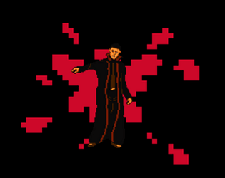
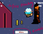
Main Player is a vampire who needs to kill x number of people per night to survive the next day. Horror element inclided are
1. Vampire
2. Blood animation
3. Horror Music
Did you implement any of the optional Bonus Challenges, and if so, which ones?
I have implemented the bonus Challenge
1. Vampire
2. Out For blood
Leave a comment
Log in with itch.io to leave a comment.


Comments
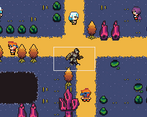
The camera being so zoomed in plus the player being so slow makes the game a bit of a slog to play. There are also some wonky collisions and layering that needs to be addressed before I can say personally that this is presentable. Basic mechanics are there but the polish is needed
Pixel art vampire reminds me a bit the game "Faith" which I love. Very nice art. Game is super zoom, complicated to move around. You did submit a full game with an overall consistency, and the priest art is very promising.
The inconsistent pixel size and zoomed in camera view make this game difficult to enjoy. The gameplay itself was not challenging and felt buggy. Z order of sprites and bounding boxes need to be considered for your next game. You did include key elements of the theme into your entry and you did ship a playable game, so kudos to you.
Cute little package here - i like the concept of the heartbeat, I also did manage to survive the night.
Per my son, "Okay so the presentation was bad, the horror was bad. You did a good job on the theme though. Gameplay was bad, me and Raeleus can't really say that because we both think the gameplay is incomplete. Good job on completing the game!"
I truly appreciate the constructive criticism. It's incredibly valuable, and I'm aware that there are several areas in which the game can be improved. I'm committed to working on those improvements and revamping the game. Your feedback means a lot.
Cool concept that would be a lot easier to play if the camera displayed more of the environment. Maybe show the Knights sight radius and close up the space so timing was more of a variable. Being so close with the camera the Knight was never on screen while I could see a villager.
Can definitely see potential with the core gameplay loop.
Thank you for the suggestin. I am working to improve the game :)
Ah, yes, the moonwalking vampire!
The close-up camera makes it hard to predict the knight, which might be a good thing. Pretty tense atmosphere. Fun!
*Also I noticed it starts on night 0 on the top left, a programmer alright! :D
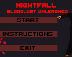
A solid concept and decent execution, I had fun playing it and going after the townsfolk. The titlescreen's art was really solid and I liked the blood animation. In-game, there was no "left" walking animation, so it led to the vampire just moon-walking and some odd clipping from environmental layers. There was also no in-game music, and the cheery-ding being near victims felt a bit off-vibe. However, the consuming noise was very fun and creepy, making game progression satisfying. I enjoyed the general gameplay loop, and the title screen music was very nice. All in all, it's a fun arcade-style game that can be enjoyed, and I hope the developer continues to make fun projects in the future.
The Arcade aspect is interesting, but how you implemented it falls flat in various areas. Other than the clipping glitches and the sprite not turning around, it feels unfinished and I can't help but wonder if the makers of this game just didn't have enough time to finish this project or if they did everything half-baked
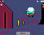
Nice concept. Some several objects were being clipped through when I walked past them, maybe check your layer. Also the sound for the kill button could be something less `bright`. I don't if you did it on purpose or if my screen was buggy, but the camera was claustrophobically close, making it hard to spot the townsfolk, also walking was unbearably slow. The aesthetic is nice, could use models that look more similar tho. Here is my game, I'd be glad if you played and reviewed as well https://itch.io/jam/themed-horror-game-jam-14/rate/2223375
Thanks for reviewing my game. And Sure i m exited to play and review you game