Play game
Border of life's itch.io pageResults
| Criteria | Rank | Score* | Raw Score |
| Presentation | #13 | 3.917 | 3.944 |
| Gameplay | #20 | 2.869 | 2.889 |
| Concept | #21 | 3.476 | 3.500 |
| Overall | #21 | 3.145 | 3.167 |
| Challenge (Tough but Fair) | #24 | 2.621 | 2.639 |
| Use of Theme | #24 | 2.814 | 2.833 |
| Story/Writing | #26 | 1.821 | 1.833 |
Ranked from 36 ratings. Score is adjusted from raw score by the median number of ratings per game in the jam.
Leave a comment
Log in with itch.io to leave a comment.


Comments
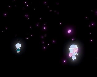
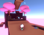
Super cute! Really fun to play, I feel the controls are a little wonky, it could be great a little fix, also the amount of intensity in the "cherry lighting" was overkilling a little my GPU and making the game quite laggy. Love how Yuyuko is a little similar to Peach from Mario 2
Thanks for playing and sorry for the laggy experience!
Well that's very cute. Naturally i love the little models and the screen effects to make it rosy and relaxing (but maybe a biiit too much bloom). I'll make this comment based on the new version since obviously the change was to the barfy controls, but I gotta rate based on the original submission. Anyway, this was a much more peaceful game to play, and for what the game is I like it, and I like the fact that dying didn't have big penalties, it's much more exploration-based.
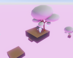
But as far as nitpicks go I have a couple. For the level design, I do really like a lot of the segments, particularly that one where you had to go under the moving platform at its peak to reach that one big island (but idk why it wasn't consistently happening for me), but I felt a lot of it just wanted me to wait around. A pinch less of Moving Platform Syndrome would have made some parts less repetitive. The first level was also one of my least favorites and got me worried they'd all be kind of obtuse, but thankfully it was an outlier. I wasn't a huge fan of having to observe a little divot in the first area, especially when it seems like that higher platform is where the player would logically learn to jump or similar, since there's something right behind it. I hate to be that picky about it but it felt a bit like an anti-tutorial.
Also Yuyuko and Youmu didn't really feel like they had a distinction besides Youmu being a worse version of Yuyu (also her dash had too long a recharge time) in terms of what general movement you can accomplish. I feel like one of them should have had more verticality to create a different playstyle. It might also have been neat to be able to switch between them to choose how you want to tackle a level, instead of having it be predetermined, but that comes with its own design challenges as well.
Anyway, I liked the tranquility and exploration behind the core gameplay a lot, and at no point did I not want to press on, so this game is a good addition to the world.
But please do the thing I referred to in my other comment with your game files.
Thanks for the feedback!
I agree, the first level isn't really explaining the dash move at all, like a tutorial should do. I also agree about the playstyles being too similar between the 2 characters.
Sorry for uploading the update post deadline, didn't think it would be a problem since I kept the original version.
I'll keep the newest version hidden until the voting ends!
Yo heads up before I review this I gotta lay down some law, if your post-1.0 versions are uploaded after the jam deadline please remove them. If there's some bug or accessibility issue that's effective locking people out of a lot of gameplay you can reupload it with a disclaimer in the filename that it's post-deadline and not for rating consideration.
Hi, happy to see you reply to comments as well, so I don't have to explain where is the problem anymore.
Sadly for me, I played v1.0, and got stuck and rage quitted the platform bug, silly me since it was already updated, so thanks for that.
So, yes, the game is really gorgeous. But trees are in the way every time, specially on level 3. Also the lack of music is kinda sad.
And I guess Youmu dash is the main goal to make this a puzzle game, but I felt so frustrated on the level I mentioned just because she dashes in the direction of the camera, on top of that, a dash+jump combo would feel great, loved to do that while playing enchanting swordplay reverie.
Thanks for playing and the feedback!
I added camera collision in v1.3 that should help with the trees being in the way, but I agree, they are kind of annoying in some levels.
Ragarding the dash+jump combo, I didn't add the ability to jump because i wanted to make a jumpless puzzle/platformer (similar to captain toad). Sadly the puzzle part is kinda lacking because of the time limit of the jam. I would have liked to make much bigger and complex levels.
The dash away from the camera instead of youmu's direction is easier in my opinion, especially since she doesn't turn immediately but has a lerping effect on rotation.
Also, I would have loved to add music and sfx, but I ran out of time, much like the last jam. I'll try to manage my time better for the next one!
Inverted controls. :l
Artificial difficulty, I guess?
JK, just didn't notice while testing
I really liked the game visually. The simplistic approach works really well, and the particle effects are lovely. The main thing holding this game back for me was how the game felt to play. As others have mentioned, the camera controls feel pretty funky, in that the camera is reversed horizontally, and is very sensitive. I felt that I had to turn down the mouse speed to play effectively. It would have also been nice to have some sort of indicator of where I was gonna land when dashing as Youmu, and when I was going to start falling as floaty Yuyuko. All of that said, I thought the puzzles were pretty well designed, at least in the levels I played.
I honestly don't get how I didn't notice the camera being inverted until you both commented about it... Thanks for the feedback!
I have to agree with Brogrammist here, the camera controls feel a little awkward. My mouse hitting the edges of the screen (both when invisible and visible) didn't really help with that either (even in 1.1..? perhaps it has to do with me alt-tabbing often or something).
I also found that waiting for Youmu's cooldown was a little annoying, I feel like it could've been a little shorter.
Other than that, I really like the simple yet effective look of the game. I'm normally not fond of these levels of bloom, but they work here, and the little details on the terrain look nice as well. The particle effects are great, and both the Youmu and Yuyuko models look good!
You're right, the camera movement was bugged (mouse hitting the edge) if you played fullscreen or with a window the same size as the screen! Also, thank you!
I really loved the 3D aesthetic to the game, especially the way Youmu runs around! What hindered my appreciation for the experience is the thirdperson camera, which is (in my opinion) inverted on the horizontal axes and it made the game excruciatingly difficult to control.
Otherwise, it was a fun 3D platformer.
Thank you for the feedback! Still trying to figure out a good camera/player movement for 3D games