Play game
Neon dodger's itch.io pageResults
Criteria | Rank | Score* | Raw Score |
Aesthetics | #2 | 4.000 | 4.000 |
Overall | #4 | 3.333 | 3.333 |
Gameplay | #4 | 3.333 | 3.333 |
Theme | #5 | 3.000 | 3.000 |
Sound | #5 | 2.889 | 2.889 |
Ranked from 9 ratings. Score is adjusted from raw score by the median number of ratings per game in the jam.
Leave a comment
Log in with itch.io to leave a comment.
Comments
Hi there, we played your game and had some feedback:
This is a weird one to rate because the game itself is technically really good. The music is cool, the aesthetics are gorgeous, the game play is simple and fun...the problem is more with the theme.
I understand how it's related to the theme: as you go over different colours time is affected differently, however the whole concept of time as a mechanic seems almost like an after-thought; like Neon Dodge was a totally different game and the time aspect was added after the fact.
Not that that's a problem but it should be more apparent (a the very least through some instruction or tutorial) that time is a mechanic in the game.
As it stands, it's a really good game over-all but it would definitely benefit from a bit of explanation.
Thanks for your feedback. :)
I completely understand your issues regarding the theme and I wish I had the time to fix every problem with the game^^.
Our original time limit for production was 2 days, so we decided to go with this - in it's core - extremely simple gameplay. For us, it was simply not possible to create a more elaborate system within our time limit and to our personal quality standards. That's why we put fun before the theme, accepting that the games' connection to the theme was relatively weak.
No instructions of how to play resulted in me giving up after 1 minute of playtime. It scores well for aesthetics but less for sound as there are no apparent sound effects just a sound track. I gave it 1 star for theme as all i know is its space themed but don't know how that makes it time related in itself. In summery I would have probably scored it higher overall if some instructions on how to play were provided.
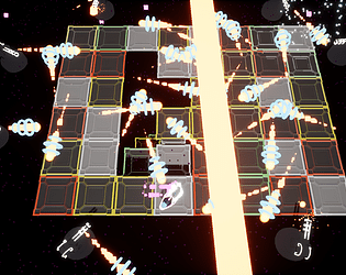
It is time themed in the mechanics, because each colour that you step on affects time for the bullets - grey stops it, green slows it down, yellow speeds it up and red reverts it.
I have included controls for Movement and restarting because I thought the rest could be figured out easily.
Thanks for your feedback!
Sorry but I didn't figure it out =/
Nice game, good gameplay and good graphism ^^
I put 4 stars for all
This is a brilliant game, I really enjoyed it. The neon art style looked great and the gameplay was smooth and re-playable. I agree with Azules's comment, you should definitely implement a hit counter so you know how many hits you've taken.
Overall, a really great game, I fell in love with the way you linked time into the projectiles!
Thanks for the feedback, I've send it to the team immediately :)
I don't know if I'll continue work on this at some point, but a hit counter is definitely on the list of priorities
I played your game for about 10 minutes and here are some quick impressions:
Here are some things I think would improve the game:
I hope that helps and good luck!
-Azulles
Thanks for Your Feedback :)
I agree with your criticizm, but I'm a beginner in programming and decided not to mess with HUD this time
I have just uploaded a little update that also adds a particle effect when you get hit and introduces a starting scene, instead of tossing the player into the level immediately.
-Stefan
I am a beginner as well! I started making games when this gamejam started, lol. I've always wanted to try my hand at creating a game and this seemed like a good opportunity.
I'll try the game again since you've added some stuff, but honestly this was, I think, a great first attempt especially with only one month to figure out new stuff and make it mesh together. Again, good job and thank you.
Actually I've done 2 projects in Unreal before, but programming has always been a secondary thing, where I helped by being more of an idea giver and spectator. This game here was made in just 4 days (2 days at first and then 2 days to redo it completely, fix errors and tidy things up). It's crazy how fast you can learn by just doing stuff :D
Hi, just tested the game it looks ok so far the text might me a bit hard to reed and maybe destroy the character when you die, and maybe specify how the panels drop but the rest is good, GJ